DevExpress Scroll View for .NET MAUI
- 3 minutes to read
The DevExpress DXScrollView component for .NET MAUI is a scrollable container that can hold any content. You can use the DXScrollView component to scroll content in both horizontal and vertical directions.
Add a Scroll View to a Page
Download and install the DevExpress.Maui.Core package to obtain the DXScrollView component.
Refer to the following help topics for additional information:
- Install Packages from NuGet.org: Visual Studio, VS Code, and JetBrains Rider
- Get Started with DevExpress Controls for .NET Multi-platform App UI (.NET MAUI)
The following code snippet adds a DXScrollView instance to a ContentPage:
<ContentPage ...
             xmlns:dx="http://schemas.devexpress.com/maui">
    <dx:DXScrollView>
        <!--...-->
    </dx:DXScrollView>
</ContentPage>
A DXScrollView can only contain one child element in DXScrollView.Content. Since Content is a content property, you can skip <Content> tags in XAML. A DXScrollView can also be added as a child element to a layout control.
Do not nest scrollable components inside a DXScrollView to avoid incorrect behavior. For example, you should not use DXCollectionView) or another DXScrollView as child controls.
Use the DXScrollView.Orientation property to define directions in which users can scroll content. The ScrollOrientation enum lists possible directions: Horizontal, Vertical, Both, and Neither.
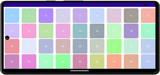
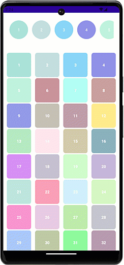
The following example adds two scroll views. The first contains a DXStackLayout and enables horizontal scrolling. The second contains a DXWrapLayout and enables vertical scrolling:
<ContentPage ...
             xmlns:dx="http://schemas.devexpress.com/maui"
             xmlns:local="clr-namespace:ScrollViewExample"
             x:Class="ScrollViewExample.MainPage">
    <ContentPage.BindingContext>
        <local:MainViewModel/>
    </ContentPage.BindingContext>

    <Grid RowDefinitions="120,*">
        <dx:DXScrollView Orientation="Horizontal" Margin="20">
            <dx:DXStackLayout ItemsSource="{Binding Items}"
                              Orientation="Horizontal"
                              ItemSpacing="10">
                <dx:DXStackLayout.ItemTemplate>
                    <DataTemplate>
                        <dx:DXButton BorderThickness="2" BackgroundColor="{Binding Color}"
                                     WidthRequest="70" HeightRequest="70"
                                     Content="{Binding Text}" CornerRadius="35"/>
                    </DataTemplate>
                </dx:DXStackLayout.ItemTemplate>
            </dx:DXStackLayout>
        </dx:DXScrollView>

        <dx:DXScrollView Orientation="Vertical" Grid.Row="1">
            <dx:DXWrapLayout ItemsSource="{Binding Items}"
                             ItemSpacing="10" Margin="4,20,4,4"
                             HorizontalOptions="Center">
                <dx:DXWrapLayout.ItemTemplate>
                    <DataTemplate>
                        <dx:DXButton BorderThickness="2" BackgroundColor="{Binding Color}" CornerRadius="10"
                                     WidthRequest="{Binding Width}" HeightRequest="{Binding Height}"
                                     Content="{Binding Text}"/>
                    </DataTemplate>
                </dx:DXWrapLayout.ItemTemplate>
            </dx:DXWrapLayout>
        </dx:DXScrollView>
    </Grid>
</ContentPage>
using Microsoft.Maui.Controls;
using Microsoft.Maui.Graphics;
using System;
using System.Collections.Generic;

namespace ScrollViewExample {
   public class MainViewModel {
       public List<LayoutItemInfo> Items { get; set; }
       public MainViewModel() => Items = GenerateItems(100);
       public List<LayoutItemInfo> GenerateItems(int count) {
           List<LayoutItemInfo> items = new ();
           Random rand = new ();
           Color color;
           for (int i = 1; i <= count; i++) {
               color = Color.FromRgba(rand.Next(256), rand.Next(256), rand.Next(256), 120);
               items.Add(new LayoutItemInfo() { Text = i.ToString(), Height = 90, Width = 90, Color = color });
           }
           return items;
       }
   }
   public class LayoutItemInfo {
       public string Text { get; set; }
       public int Height { get; set; }
       public int Width { get; set; }
       public Color Color { get; set; }
   }
}
Respond to a Scroll Action
The DXScrollView component raises the Scrolled event when a user scrolls DXScrollView content. You can use ScrolledEventArgs.ScrollX and ScrolledEventArgs.ScrollY properties in the event handler to obtain the horizontal or vertical displacement in relation to the DXScrollView’s origin point (top-left corner). You can also use the control’s ScrollX and
ScrollY properties to get these values.
Scroll Programmatically
DXScrollView ships with the following methods that you can call to programmatically scroll content:
- ScrollBy
- Scrolls the content by given horizontal and vertical displacement values.
- ScrollTo
- Scrolls the content to the specified position.
You can use the read-only ContentSize property to check whether the passed values fall into content boundaries.
Manage Scroll Bar Visibility
Use the IsScrollBarVisible property to manage whether to show or hide a scroll bar when a user scrolls content.
Add Bounce Effect
Bounce effects indicate that a user has reached a content boundary. To enable/disable these effects, use the AllowBounceEffect property.
| AllowBounceEffect = “True” | AllowBounceEffect = “False” |
|---|---|
 |
 |