.NET MAUI Buttons as Cards with Custom Content
- 2 minutes to read
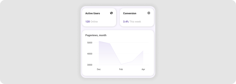
The DXButton control allows you to imitate cards and fill them with custom content.

Card Content
You can place custom content directly into DXButton as shown in the example below:
<VerticalStackLayout>
    <dx:DXButton ... >
        <Grid ColumnDefinitions="*, Auto" RowDefinitions="*,*">
            <Label FontAttributes="Bold" Text="Active Users" VerticalOptions="Start"/>
            <Image Source="online" Grid.Column="2"  VerticalOptions="Start"/>
            <HorizontalStackLayout Grid.Row="1" VerticalOptions="End">
                <Label Text="120" FontAttributes="Bold"/>
                <Label TextColor="DarkGray" Text="online" Margin="4,0,0,0"/>
            </HorizontalStackLayout>
        </Grid>
    </dx:DXButton>
</VerticalStackLayout>
You can also use the ContentTemplate property to specify custom content. (The only difference between this and previous examples is that you explicitly define a template property. Content management capabilities remain the same.)
<VerticalStackLayout>
    <dx:DXButton ... >
        <dx:DXButton.ContentTemplate>
            <DataTemplate>
                <Grid ColumnDefinitions="*, Auto" RowDefinitions="*,*">
                    <Label FontAttributes="Bold" Text="Active Users222" VerticalOptions="Start"/>
                    <Image Source="online" Grid.Column="2"  VerticalOptions="Start"/>
                    <HorizontalStackLayout Grid.Row="1" VerticalOptions="End">
                        <Label TextColor="Black" Text="120" FontAttributes="Bold"/>
                        <Label TextColor="DarkGray" Text="online" Margin="4,0,0,0"/>
                    </HorizontalStackLayout>
                </Grid>
            </DataTemplate>
        </dx:DXButton.ContentTemplate>
    </dx:DXButton>
</VerticalStackLayout>
Card Appearance
You can customize a DXButton control to make it look like a card. For this purpose, use the following properties:
BackgroundColor- Gets or sets the background color of the button.
- PressedBackgroundColor
- Gets or sets the background color of the button in the pressed state. This is a bindable property.
- BorderColor
- Gets or sets the border color of the button. This is a bindable property.
- PressedBorderColor
- Gets or sets the border color of the button in the pressed state. This is a bindable property.
- BorderThickness
- Gets or sets the border thickness of the button. This is a bindable property.
- CornerRadius
- Gets or sets the corner radius of the button. This is a bindable property.
- PressedScale
- Gets or sets the scale for the button in the pressed state.
<VerticalStackLayout>
    <dx:DXButton
            BackgroundColor="Transparent"
            PressedBackgroundColor="Transparent"
            BorderColor="Gray"
            PressedBorderColor="Gray"
            BorderThickness="1"
            CornerRadius="20"
            PressedScale="1"
            HeightRequest="100"
            WidthRequest="300">
        <dx:DXButton.ContentTemplate>
            <DataTemplate>
                <!-- ... -->
            </DataTemplate>
        </dx:DXButton.ContentTemplate>
    </dx:DXButton>
</VerticalStackLayout>
Related Scenario
This example turns DXButton controls into clickable cards with custom content.