DxDrawer Class
A side panel that supports minimized layout and expand/collapse operations.
Namespace: DevExpress.Blazor
Assembly: DevExpress.Blazor.v25.2.dll
NuGet Package: DevExpress.Blazor
Declaration
public class DxDrawer :
    DxComponentBase
Remarks
The DevExpress Drawer for Blazor (<DxDrawer>) allows you to add a side panel to your application. Use this panel to host navigation controls or display additional information about the current view.

Add a Drawer to a Project
Follow the steps below to add the Drawer component to an application:
- Use a DevExpress Project Template to create a new Blazor Server or Blazor WebAssembly application. If you use a Microsoft project template or already have a Blazor project, configure your project to incorporate DevExpress Blazor components.
- Add the
<DxDrawer>…</DxDrawer>markup to a.razorfile. - Add drawer panel content in the BodyTemplate markup. For instance, you can add a DxMenu component to implement a navigation side panel.
- Optional. Define the drawer’s HeaderTemplate and FooterTemplate.
- Specify the component’s target content (TargetContent).
- Write code that manages the Drawer’s visibility.
API Reference
Refer to the following list for the component API reference: DxDrawer Members.
Component Structure
The DxDrawer component consists of a drawer panel and a target content area. The drawer panel can include header, body, and footer. If a header or footer is not specified, the body occupies the free space.
<DxDrawer IsOpen="true" >
    <HeaderTemplate>Header Template</HeaderTemplate>
    <BodyTemplate>Body Template</BodyTemplate>
    <FooterTemplate>Footer Template</FooterTemplate>
    <TargetContent>Target Content</TargetContent>
</DxDrawer>

Drawer Visibility
The DxDrawer component allows you to implement different visibility scenarios.
Permanently Visible Drawer
Set the IsOpen property to true to display the drawer permanently.
<DxDrawer IsOpen="true" PanelWidth="20%">
    ...
</DxDrawer>

Expandable Drawer
- Add an element that toggles drawer visibility.
- Implement two-way binding for the IsOpen property to show the drawer in code.
<DxButton Click="OnClick" IconCssClass="tb-icon icon-hamburger"
    RenderStyleMode="ButtonRenderStyleMode.Outline" />

<DxDrawer @bind-IsOpen="IsOpen" PanelWidth="20%">
    ...
</DxDrawer>

@code {
    bool IsOpen { get; set; } = true;
    void OnClick() {
        IsOpen = !IsOpen;
    }
}
Minimized Drawer
Enable the MiniModeEnabled property to change drawer width instead of closing. Use the MiniPanelWidth property to specify the width of the minimized panel.
Responsive Drawer
Combine DxDrawer and DxLayoutBreakpoint components to adapt page layout to different devices. For instance, you can use the XSmall breakpoint to change drawer settings for small screens.
<DxLayoutBreakpoint DeviceSize="DeviceSize.XSmall" IsActive="isXSmallScreen" IsActiveChanged="IsActiveChanged" />
<DxButton Click="OnClick" IconCssClass="tb-icon icon-hamburger" />

<DxDrawer IsOpen="IsOpen" PanelWidth="180px">
    ...
</DxDrawer>
@code {
    bool isXSmallScreen;
    bool? isOpen;
    bool IsOpen {
        // Hide the Drawer on small screens initially and display it on large screens
        get => isOpen ?? !isXSmallScreen;
        set => isOpen = value;
    }
    // Apply Overlap and Shrink modes on small and large screens, respectively
    DrawerMode Mode => isXSmallScreen ? DrawerMode.Overlap : DrawerMode.Shrink;

    void IsActiveChanged(bool isActive) {
        isXSmallScreen = isActive;
        isOpen = null;
    }
    void OnClick() {
        IsOpen = !IsOpen;
    }
}
Static Render Mode Specifics
The DxDrawer component requires interactive render mode to change its IsOpen state. In static SSR mode, you can use a permanently visible drawer or implement one of the following strategies to dynamically change drawer visibility.
Add Query Params to Control Drawer Visibility
- Use the [SupplyParameterFromQuery] attribute to specify that the drawer’s IsOpen parameter comes from the query string.
- Use the query parameter to toggle drawer visibility or to save the component state while navigating to another page.
<DxDrawer PanelWidth="240px" IsOpen="@IsOpen">
    <BodyTemplate>
        <DxMenu Orientation="@Orientation.Vertical">
            <Items>
                <DxMenuItem Text="Home" NavigateUrl="@GetUrlWithParameter("/")" IconCssClass="icon-home" />
                <DxMenuItem Text="Weather" NavigateUrl="@GetUrlWithParameter("weather")" IconCssClass="icon-weather" />
            </Items>
        </DxMenu>
    </BodyTemplate>
    <TargetContent>
        <div class="top-row">
            @* Toggle button that controls drawer visibility *@
            <NavLink href="@(new Uri(NavigationManager.Uri).LocalPath + "?IsOpen=" + (!IsOpen).ToString())">
                <img src="images/menu.svg" alt="Toggle Drawer">
            </NavLink>
        </div>
        @Body
    </TargetContent>
</DxDrawer>

@code {
    [SupplyParameterFromQuery]
    public bool IsOpen { get; set; }

    string GetUrlWithParameter(string url) {
        // Save drawer visibility state while navigating
        return url + "?IsOpen=" + IsOpen.ToString();
    }
}
This approach is used within DevExpress Blazor project templates.
Specify CSS Rules to Control Drawer Visibility
Switch drawer visibility (set width to zero) based on toggle element state.
<style>
    .dxbl-drawer:has(.navbar-toggler:not(:checked)) .dxbl-drawer-panel {
        width: 0 !important;
    }
    .navbar-toggler {
        appearance: none;
        cursor: pointer;
    }
</style>

<DxDrawer PanelWidth="240px" IsOpen="@true">
    <BodyTemplate>
        <DxMenu Orientation="@Orientation.Vertical">
            <Items>
                <DxMenuItem Text="Home" NavigateUrl="/" IconCssClass="icon-home" />
                <DxMenuItem Text="Weather" NavigateUrl="weather" IconCssClass="icon-weather" />
            </Items>
        </DxMenu>
    </BodyTemplate>
    <TargetContent>
        <div class="top-row">
            <input type="checkbox" title="Toggle Drawer" class="navbar-toggler icon-menu" checked />
        </div>
        @Body
    </TargetContent>
</DxDrawer>
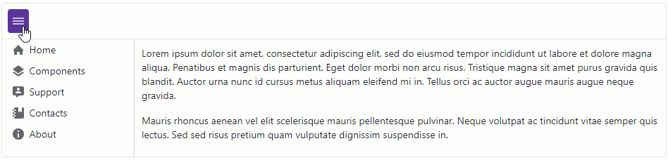
Drawer Position
Use the Position property to specify the drawer position relative to the target content.
<DxDrawer IsOpen="IsOpen" Position="DrawerPosition.Right" PanelWidth="20%">
    <BodyTemplate>
        <DxMenu Orientation="Orientation.Vertical">
            <Items>
                <DxMenuItem Text="Home" IconCssClass="menu-icon-home menu-icon" />
                <DxMenuItem Text="Components" IconCssClass="menu-icon-products menu-icon" />
                <DxMenuItem Text="Support" IconCssClass="menu-icon-support menu-icon" />
                <DxMenuItem Text="Contacts" IconCssClass="menu-icon-contacts menu-icon" />
                <DxMenuItem Text="About" IconCssClass="menu-icon-about menu-icon" />
            </Items>
        </DxMenu>
    </BodyTemplate>
    <TargetContent>
        @* Lorem ipsum dolor sit amet, consectetur adipiscing elit ... *@
    </TargetContent>
</DxDrawer>

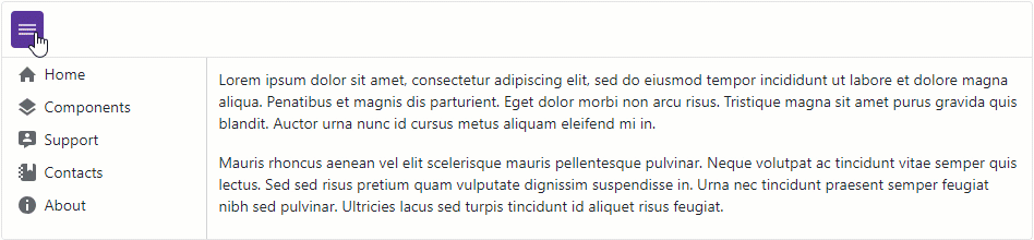
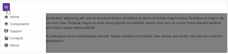
Drawer Open Mode
When the drawer panel opens, it can overlap or shrink target content. Use the Mode property to specify how the panel interacts with the target content area.
<DxDrawer IsOpen="IsOpen" Mode="DrawerMode.Overlap" PanelWidth="20%">
    <BodyTemplate>
        <DxMenu Orientation="Orientation.Vertical">
            <Items>
                <DxMenuItem Text="Home" IconCssClass="menu-icon-home menu-icon" />
                <DxMenuItem Text="Components" IconCssClass="menu-icon-products menu-icon" />
                <DxMenuItem Text="Support" IconCssClass="menu-icon-support menu-icon" />
                <DxMenuItem Text="Contacts" IconCssClass="menu-icon-contacts menu-icon" />
                <DxMenuItem Text="About" IconCssClass="menu-icon-about menu-icon" />
            </Items>
        </DxMenu>
    </BodyTemplate>
    <TargetContent>
        @* Lorem ipsum dolor sit amet, consectetur adipiscing elit ... *@
    </TargetContent>
</DxDrawer>
Drawer Appearance
The DxDrawer component allows you to customize its appearance with the following properties:
- CssClass
- Assigns a CSS class to the
DxDrawercomponent. - ClosedCssClass
- Assigns a CSS class to the Drawer component when the panel is closed.
- MiniCssClass
- Assigns a CSS class to the Drawer component when the panel is minimized.
- OpenCssClass
- Assigns a CSS class to the Drawer component when the panel is open.
Accessibility Information
In overlap mode, the Drawer component is assigned the dialog role and aria-modal attribute. This informs assistive technologies that the component is separate from the rest of the page, and the content outside the Drawer is inactive while it is open.
To ensure a component is fully accessible, it must be labeled correctly. The label depends on your application’s content and cannot be set automatically. Pass the following ARIA attributes to the Drawer’s Attributes property:
- aria-labelledby – Reference the ID of another element on the page (usually a visible header) that defines the accessible name. This is the preferred method.
- aria-label – Specify a string value that is used as the accessible name. Use this when a header element is not present in the Drawer.
<DxDrawer IsOpen="true"
          Mode="DrawerMode.Overlap"
          aria-label="Navigation">
    <BodyTemplate>
        @* ... *@
    </BodyTemplate>
    <TargetContent>
        @* ... *@
    </TargetContent>
</DxDrawer>