DxDateRangePicker<T> Class
A component that allows you to select date ranges.
Namespace: DevExpress.Blazor
Assembly: DevExpress.Blazor.v25.2.dll
NuGet Package: DevExpress.Blazor
Declaration
public class DxDateRangePicker<T> :
    DxMaskedInputBase<T>,
    IDropDownOwner,
    IFocusableEditor
Type Parameters
| Name | Description |
|---|---|
| T | The data type. Supported types: DateTime, DateOnly, and their nullable instances. |
Remarks
The DevExpress Date Range Picker (<DxDateRangePicker>) for Blazor allows you to select a range of dates in a drop-down calendar.

Add a Date Range Picker to a Project
Follow the steps below to add the Date Range Picker component to an application:
- Use a DevExpress Project Template to create a new Blazor Server or Blazor WebAssembly application. If you use a Microsoft project template or already have a Blazor project, configure your project to incorporate DevExpress Blazor components.
- Add the following markup to a
.razorfile:<DxDateRangePicker>…</DxDateRangePicker>. - Configure the component: specify start and end dates, set the range of available dates, specify the display format, and so on (see the sections below).
API Reference
Refer to the following list for the component API reference: DxDateRangePicker Members.
Static Render Mode Specifics
Blazor Date Range Picker does not support static render mode. Enable interactivity to use the component in your application. Refer to the following topic for more details: Enable Interactive Render Mode.
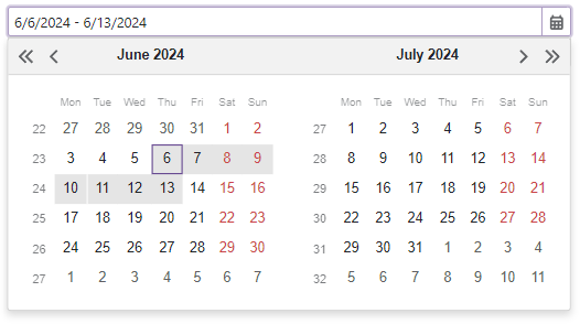
Set Start and End Dates
Use StartDate and EndDate properties to specify the date range selected in the component. You can also use the @bind attribute to bind these properties to data fields. Refer to the following topic for details: Two-Way Data Binding.
<DxDateRangePicker StartDate="DateTime.Today"
                   EndDate="DateTime.Today.AddDays(7)">
</DxDateRangePicker>

@* --or-- *@

<DxDateRangePicker @bind-StartDate="@DateTimeStart"
                   @bind-EndDate="@DateTimeEnd">
</DxDateRangePicker>

@code {
    DateTime? DateTimeStart { get; set; } = DateTime.Today;
    DateTime? DateTimeEnd { get; set; } = DateTime.Today.AddDays(7);
}
If you do not use two-way data binding, handle the StartDateChanged and EndDateChanged events to respond to date changes.
<DxDateRangePicker StartDate="@modelStartDate"
                   EndDate="@modelEndDate"
                   StartDateChanged="@((DateTime newStartDate) => OnStartDateChanged(newStartDate))"
                   EndDateChanged="@((DateTime newEndDate)=> OnEndDateChanged(newEndDate))" />
<p></p>
@Alert_StartDate
<p></p>
@Alert_EndDate

@code {
    DateTime modelStartDate=DateTime.Today;
    DateTime modelEndDate = DateTime.Today.AddDays(7);
    string Alert_StartDate { get; set; }
    string Alert_EndDate { get; set; }

    void OnStartDateChanged(DateTime newStartDate) {
        modelStartDate = newStartDate;
        Alert_StartDate = "The start date changed:" + newStartDate;
    }

    void OnEndDateChanged(DateTime newEndDate) {
        modelEndDate = newEndDate;
        Alert_EndDate = "The end date changed:" + newEndDate;
    }
}
Set Range of Available Dates
You can use the MinDate and MaxDate properties to limit the available date range.
<DxDateRangePicker @bind-StartDate="@DateTimeStart"
                   @bind-EndDate="@DateTimeEnd"
                   MinDate="@MinDate"
                   MaxDate="@MaxDate"/>

@code {
    DateTime DateTimeStart { get; set; } = DateTime.Today;
    DateTime DateTimeEnd { get; set; } = DateTime.Today.AddDays(7);
    DateTime MinDate { get; set; }
    DateTime MaxDate { get; set; }
    protected override void OnInitialized() {
        MinDate = DateTimeStart.AddDays(-7);
        int days = DateTime.DaysInMonth(DateTimeStart.Year, DateTimeStart.Month);
        MaxDate = new DateTime(DateTimeStart.Year, DateTimeStart.Month, days).AddDays(14);
    }
}
Nullable Date and Placeholder
If the Date Range Picker component is bound to a nullable object, users can delete the editor’s value (set it to null).
You can also set the ClearButtonDisplayMode property to Auto to show the Clear button when the editor has a non-null value. Use the NullText property to specify the prompt text (placeholder) when the editor’s value is null.
<DxDateRangePicker @bind-StartDate="@DateTimeStart"
                   @bind-EndDate="@DateTimeEnd"
                   NullText="Select a date range..."
                   ClearButtonDisplayMode="DataEditorClearButtonDisplayMode.Auto">
</DxDateRangePicker>

@code {
    DateTime? DateTimeStart { get; set; } = DateTime.Today;
    DateTime? DateTimeEnd { get; set; } = DateTime.Today.AddDays(7);
}

You can also specify a custom null value for the Date Range Picker component. This value can be used with nullable and regular DateTime types. For more information, refer to NullValue.
Display Format
The DevExpress Blazor Date Range Picker supports standard date formats:
You can use the DisplayFormat property to format the editor’s display values.
<DxDateRangePicker @bind-StartDate="@DateTimeStart"
                   @bind-EndDate="@DateTimeEnd"
                   DisplayFormat="From: {0:M}; To: {1:M}"/>

@code {
    DateTime DateTimeStart { get; set; } = DateTime.Today;
    DateTime DateTimeEnd { get; set; } = DateTime.Today.AddDays(7);
}
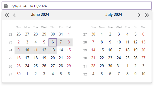
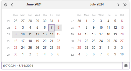
Set the First Day of the Week
The first day of a week in the Date Range Picker’s calendar depends on the current culture settings. Use the FirstDayOfWeek property to specify a different day.
<DxDateRangePicker StartDate="DateTime.Today"
                   EndDate="DateTime.Today.AddDays(7)"
                   FirstDayOfWeek="DayOfWeek.Monday">
</DxDateRangePicker>
To specify a rule that determines the first week of the year, use the WeekNumberRule property.
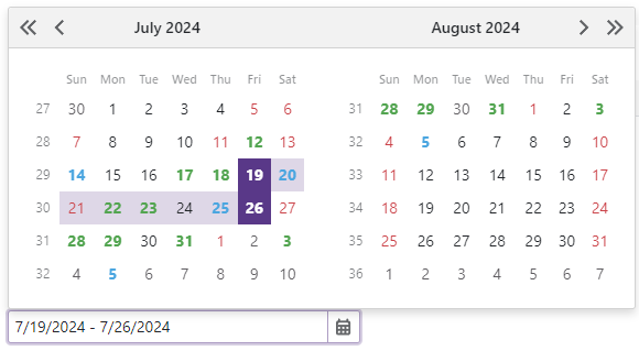
Highlight Special Dates
You can use the DayCellTemplate property to highlight individual dates in the Date Range Picker’s calendar. The template’s context parameter allows you to access the current date-time object and its settings.
The following code applies different styles to different dates:
<DxDateRangePicker @bind-StartDate="@DateTimeStart"
                   @bind-EndDate="@DateTimeEnd">
    <DayCellTemplate>
        <a class="@GetCssClassNames(context)">@context.Day.ToString()</a>
    </DayCellTemplate>
</DxDateRangePicker>

@code {
    DateTime DateTimeStart { get; set; } = DateTime.Today;
    DateTime DateTimeEnd { get; set; } = DateTime.Today.AddDays(7);
    CalendarData Data { get; set; } = new CalendarData();
    string GetCssClassNames(DateTime date) {
        if(Data.PersonalDays.Exists(d => DaysEqual(d, date)))
            return "fw-bold text-success";
        if(Data.Holidays.Exists(d => DaysEqual(d, date)))
            return "text-danger";
        if(Data.BirthDates.Exists(d => DaysEqual(d, date)))
            return "fw-bold text-info";
        return string.Empty;
    }
    bool DaysEqual(DateTime date1, DateTime date2) {
        return (date1.Year == date2.Year && date1.DayOfYear == date2.DayOfYear);
    }
}
Appearance Customization
Use the SizeMode property to specify Date Range Picker size. The following code applies different size modes to Date Range Picker components:
<DxDateRangePicker StartDate="DateTime.Today"
                   EndDate="DateTime.Today.AddDays(7)"
                   SizeMode="SizeMode.Small"></DxDateRangePicker>

<DxDateRangePicker StartDate="DateTime.Today"
                   EndDate="DateTime.Today.AddDays(7)"
                   SizeMode="SizeMode.Medium"></DxDateRangePicker>

<DxDateRangePicker StartDate="DateTime.Today"
                   EndDate="DateTime.Today.AddDays(7)"
                   SizeMode="SizeMode.Large"></DxDateRangePicker>

To customize Date Range Picker input, use the InputCssClass property. The following code snippet applies the custom style to the text within the input:
<style>
    .my-style {
        font-weight: 800;
    }
</style>

<DxDateRangePicker StartDate="DateTime.Today"
                   EndDate="DateTime.Today.AddDays(7)"
                   InputCssClass="my-style"/>

For more information, refer to the following help topics:
Hide Built-In Drop-Down Button
Set the ShowDropDownButton to false to hide the built-in button that invokes a drop-down calendar. If you need a custom drop-down button, you can add a new command button.
Add Command Buttons
You can add custom command buttons to the Date Range Picker component. Refer to Command Buttons for more information.
The following code hides the built-in drop-down button, adds a new drop-down button, and specifies its position:
<DxDateRangePicker StartDate="DateTime.Today"
                   EndDate="DateTime.Today.AddDays(7)"
                   ShowDropDownButton=false>
    <Buttons>
        <DxDateEditDropDownButton Position="EditorButtonPosition.Left"/>
    </Buttons>
</DxDateRangePicker>
Read-Only State
The Blazor Date Range Picker supports a read-only state. Set the ReadOnly property to true to activate this option.
<DxDateRangePicker StartDate="DateTime.Today"
                   EndDate="DateTime.Today.AddDays(7)"
                   ReadOnly="true"/>
Drop-Down Window Direction
Use the DropDownDirection property to specify the direction in which the drop-down calendar is displayed relative to the input element. The default value is Down. The following code changes the direction to Up:
<DxDateRangePicker StartDate="DateTime.Today"
                   EndDate="DateTime.Today.AddDays(7)"
                   DropDownDirection="DropDownDirection.Up" />
Note
If the editor is close to a browser window’s edge and there is not enough space to display the drop-down window in the specified direction, the drop-down window is displayed in the opposite direction.
Keyboard Navigation
The DevExpress Blazor Date Range Picker supports keyboard navigation. Users can navigate to the editor’s input element and within the drop-down calendar.
Note
Keyboard support allows users to interact with application content in cases they cannot use a mouse or they rely on assistive technologies (like screen readers or switch devices). Refer to the Accessibility help topic for information on other accessibility areas that we address.
Shortcut Keys for Input Element
The following shortcut keys are available when the editor’s input element is focused:
| Shortcut Keys | Description |
|---|---|
| Tab | Moves focus to the next focusable element on a page. Note that the drop-down button, custom buttons, and the Clear button are excluded from the page tab sequence. |
| Shift + Tab | Moves focus to the previous focusable element on a page. |
| Alt + Down Arrow | Opens the drop-down calendar. |
Shortcut Keys for Drop-Down Calendar
The following shortcut keys are available when the drop-down calendar is open:
| Shortcut Keys | Description |
|---|---|
| Tab | Moves focus between root navigation elements. |
| Shift + Tab | Moves focus backwards between root navigation elements. |
| Left Arrow | Moves focus to the previous cell. |
| Right Arrow | Moves focus to the next cell. |
| Up Arrow | Moves focus one cell up. |
| Down Arrow | Moves focus one cell down. |
| Ctrl + Up Arrow | Navigates to a view with a wider date range: from month view to year view, from year view to decade view, and so on. |
| Ctrl + Down Arrow | Navigates to a more detailed view: from decade view to year view, from year view to month view, and so on. |
| Page Up | Navigates from the current month/year/decade/century to the previous month/year/decade/century. |
| Page Down | Navigates from the current month/year/decade/century to the next month/year/decade/century. |
| Home | Moves focus to the first day of the current week. |
| End | Moves focus to the last day of the current week. |
| Enter or Space | Allows you to select a date range. Focus the start date and press Enter or Space to select it. Then use Arrows, Home, End, Page Up, or Page Down to navigate to the end date and press Enter or Space to select it. After that, the component closes the drop-down calendar, updates StartDate and EndDate parameter values, and focuses the input element. |
| Shift | Allows you to select a date range. Focus the first date, press Shift and navigate to the end date (use Arrows, Home, End, Page Up, or Page Down ). When the Shift key is released, the component closes the drop-down calendar, updates StartDate and EndDate parameter values, and focuses the input element. |
| Esc or Alt + Up Arrow | Closes the drop-down calendar and moves focus to the input element. |
Root Element Navigation

Input Validation
You can add a standalone Date Range Picker or the Form Layout component to Blazor’s standard EditForm. This form validates user input based on data annotation attributes defined in a model and indicates errors.
For more information, refer to the following help topic: Validate Input.
HTML Attributes and Events
You can use HTML attributes and events to configure the Date Range Picker.
<DxDateRangePicker StartDate="DateTime.Today"
                   EndDate="DateTime.Today.AddDays(7)"
                   id="daterangepicker"
                   name="daterangeppicker"
                   autocomplete="on"
                   @oninput="MyFunction">
</DxDateRangePicker>

@code {
    void MyFunction(){
        //...
    }
}