DxSankey Class
A component that depicts value flow between two entity sets.
Namespace: DevExpress.Blazor
Assembly: DevExpress.Blazor.v25.2.dll
NuGet Package: DevExpress.Blazor
Declaration
public class DxSankey :
    ClientComponentJSInterop,
    IModelProvider<SankeyLinkSettingsModel>,
    IModelProvider<SankeyNodeSettingsModel>,
    IModelProvider<SankeyLabelSettingsModel>,
    IModelProvider<TitleSettingsModel>,
    IModelProvider<MarginSettingsModel>,
    IModelProvider<TooltipSettingsModel>,
    IModelProvider<ExportSettingsModel>
Remarks
The DevExpress Sankey for Blazor (<DxSankey>) visualizes data as weighted relationships (links) between nodes displayed on opposite sides.

Add a Sankey to a Project
Follow the steps below to add a Sankey component to an application:
- Use a DevExpress Project Template to create a new Blazor Server or Blazor WebAssembly application. If you use a Microsoft project template or already have a Blazor project, configure your project to incorporate DevExpress Blazor components.
- Enable interactivity on a Razor page.
- Add the following markup to a
.razorfile:<DxSankey>…</DxSankey>. - Bind the component to data.
- Customize node and links, and configure other options (see sections below).
API Reference
Refer to the following list for the component API reference: DxSankey Members.
Static Render Mode Specifics
Blazor Sankey does not support static render mode. Enable interactivity to use the component in your application. Refer to the following topic for more details: Enable Interactive Render Mode.
Bind to Data
Use the DxSankey.Data property to bind the <DxSankey> component to an IEnumerable<T> data source. To create nodes and links, specify the component’s SourceFieldName, TargetFieldName, and WeightFieldName properties.
<DxSankey Data="@Data"
          Width="100%"
          Height="440px"
          SourceFieldName="Source"
          TargetFieldName="Target"
          WeightFieldName="Weight">
    <DxSankeyNodeSettings Width="8" Spacing="30" />
    <DxSankeyLinkSettings ColorMode="SankeyLinkColorMode.Gradient" />
    <DxTitleSettings Text="Commodity Turnover" />
</DxSankey>

@code {
    IEnumerable<SankeyDataPoint> Data = Enumerable.Empty<SankeyDataPoint>();
    protected override void OnInitialized() {
        Data = GenerateData();
    }
}
Nodes, Links, and Labels
The <Sankey> component displays data source values as labeled nodes that have weights. Source and target nodes are connected with links that illustrate the weight flow between nodes.

This section describes how to access and customize Sankey nodes, links, and labels.
Nodes
Add a DxSankeyNodeSettings object to the Sankey component markup to customize nodes. The following properties are available:
- Width
- Changes the node width.
- Spacing
- Specifies the vertical distance between two nodes.
- Color | Opacity
- Customize node color settings.
You can specify the color scheme for Sankey nodes. Use the DxSankey.Palette property. When the number of nodes exceeds the number of palette colors, you can use the PaletteExtensionMode property to specify palette extension mode.
<DxSankey Data="@Data"
          SourceFieldName="Source"
          TargetFieldName="Target"
          WeightFieldName="Weight"
          Palette="@(new string[]{"red", "blue"})"
          PaletteExtensionMode="PaletteExtensionMode.Blend">
    @* ... *@
</DxSankey>
Note
The DxSankeyNodeSettings.Color property has priority over DxSankey.Palette.
The DxSankeyNodeSettings component also allows you to add DxSankeyHoverStyleSettings and DxBorderSettings objects to its markup to configure hover style and border settings.
The following code snippet customizes DxSankey nodes:

<DxSankey Data="@Data"
          SourceFieldName="Source"
          TargetFieldName="Target"
          WeightFieldName="Weight">
    <DxSankeyNodeSettings Color="#888"
                          Width="8"
                          Spacing="20">
        <DxSankeyHoverStyleSettings Color="#5f368d" />
        <DxBorderSettings Visible="true" Color="#888"/>
    </DxSankeyNodeSettings>
    <DxTitleSettings Text="Commodity Turnover" />
</DxSankey>
Links
Add a DxSankeyLinkSettings object to the Sankey component markup to customize links. You can specify the following properties:
- Color
- Specifies the link color.
- ColorMode
- Specifies the color mode for DxSankey links.
- Opacity
- Specifies link opacity.
The DxSankey component uses the DxSankeyLinkSettings.Color property to determine the link color.
<DxSankey Data="@Data"
          SourceFieldName="Source"
          TargetFieldName="Target"
          WeightFieldName="Weight">
    <DxSankeyLinkSettings Color="#5f368d" />
    @* ... *@
</DxSankey>
The DxSankeyLinkSettings.ColorMode property defines the way the Sankey component colors links (whether to use node colors). When you set the ColorMode property to Source, Target, or Gradient, it has priority over DxSankeyLinkSettings.Color.
The following code snippet customizes Sankey links:

<DxSankey Data="@Data"
          SourceFieldName="Source"
          TargetFieldName="Target"
          WeightFieldName="Weight">
    <DxSankeyLinkSettings ColorMode="SankeyLinkColorMode.Gradient">
        <DxSankeyHoverStyleSettings Color="#5f368d" Opacity="0.6">
            <DxHatchSettings Direction="HatchDirection.Right"
                             LineSpacing="6"
                             Width="2"
                             Opacity="0.3"/>
            <DxBorderSettings Visible="true" Color="black" />
        </DxSankeyHoverStyleSettings>
    </DxSankeyLinkSettings>
    @* ... *@
</DxSankey>
Labels
Add a DxSankeyLabelSettings object to the Sankey component markup to customize node labels. You can specify the following properties:
- Visible
- Specifies whether node labels are visible.
- HorizontalOffset | VerticalOffset
- Specify the label position.
- Overlap
- Specifies how the component displays overlapped labels.
- UseNodeColors
- Specifies whether to apply the node color to the node label’s text.
The DxSankeyLabelSettings component also allows you to add DxFontSettings, DxBorderSettings, and DxShadowSettings objects to its markup to configure font, border, and shadow settings.
Note
The DxSankey component uses the DxFontSettings.Color property to determine the label text color. You can set the DxSankeyLabelSettings.UseNodeColors property to true to apply node colors to corresponding node label captions.
To hide Sankey labels, set the DxSankeyLabelSettings.Visible to false.
The following code snippet customizes DxSankey node labels:

<DxSankey Data="@Data"
          Width="100%"
          Height="440px"
          SourceFieldName="Source"
          TargetFieldName="Target"
          WeightFieldName="Weight">
    <DxSankeyNodeSettings Width="8" Spacing="30" />
    <DxSankeyLabelSettings HorizontalOffset="20">
        <DxFontSettings Size="18" Color="white"/>
        <DxBorderSettings Visible="true" Color="black"/>
        <DxShadowSettings Blur="3" Color="black" VerticalOffset="5" />
    </DxSankeyLabelSettings>
    <DxSankeyLinkSettings ColorMode="SankeyLinkColorMode.Gradient" />
    <DxTitleSettings Text="Commodity Turnover" />
</DxSankey>
Layout
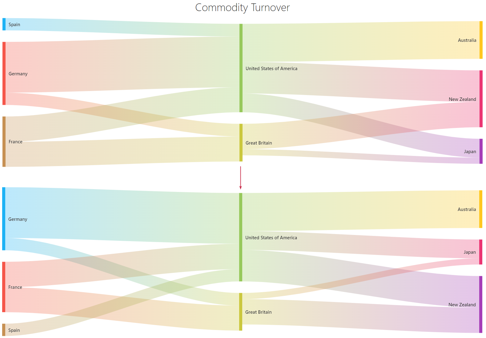
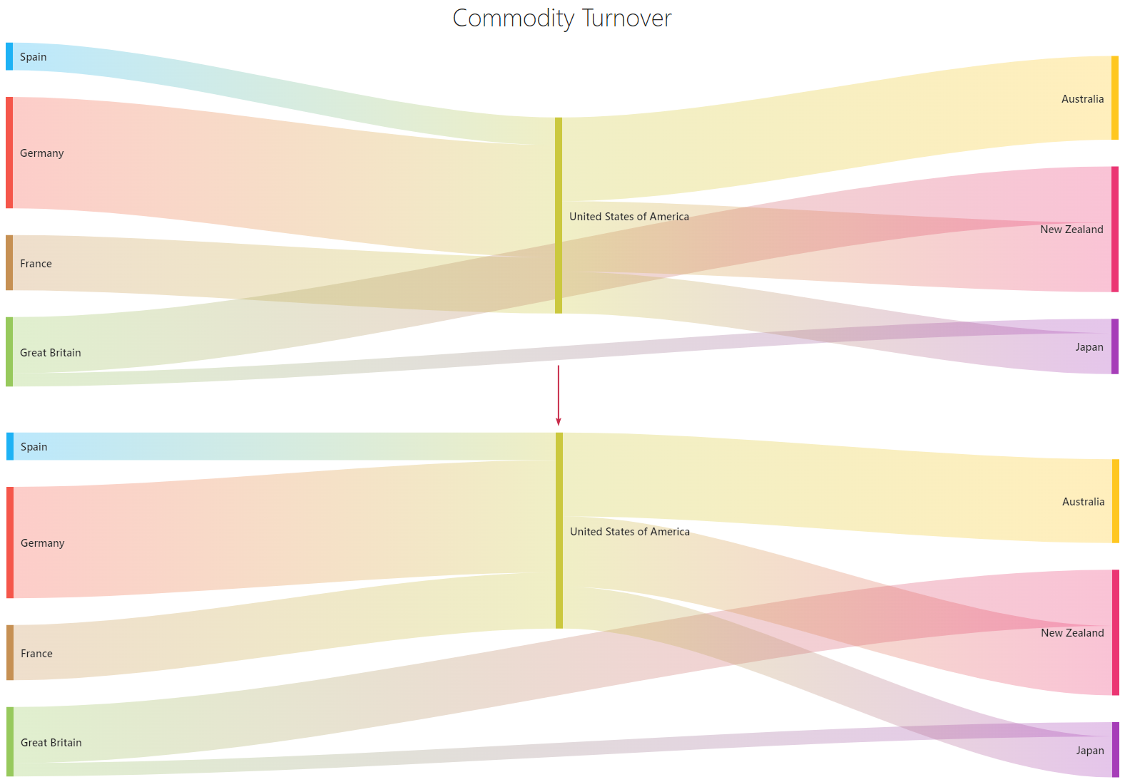
The <DxSankey> component displays nodes in the order they are declared in the data source. You can use the DxSankey.SortOrder property to change the default node arrangement:

<DxSankey Data="@Data"
          Width="100%"
          Height="440px"
          SortOrder="@SortOrder"
          SourceFieldName="Source"
          TargetFieldName="Target"
          WeightFieldName="Weight">
   @* ... *@
</DxSankey>

@code {
    // ...

    Dictionary<string, int> SortOrder = new Dictionary<string, int>() {
        { "Spain", 3 },
        { "France", 2 },
        { "New Zealand", 3 }
    };
}
The <DxSankey> component also allows you to change the vertical alignment of node columns through the DxSankey.VerticalAlignment property. This property accepts an array of VerticalAlignment values. Based on the array length, the component aligns all columns simultaneously or each column individually.

<DxSankey Data="@Data"
          SourceFieldName="Source"
          TargetFieldName="Target"
          WeightFieldName="Weight"
          VerticalAlignment="@AlignmentOptions">
    <DxSankeyNodeSettings Width="8" Spacing="30" />
    <DxSankeyLinkSettings ColorMode="SankeyLinkColorMode.Gradient" />
    <DxTitleSettings Text="Commodity Turnover" />
</DxSankey>

@code {
    // ...

    VerticalAlignment[] AlignmentOptions = new VerticalAlignment[] {
        VerticalAlignment.Bottom,
        VerticalAlignment.Top,
        VerticalAlignment.Bottom };
}
Title and Subtitle
The <DxSankey> component can display a title and subtitle. Add the following objects to the Sankey markup to configure title and subtitle settings:
- DxTitleSettings
- Contains title settings.
- DxSubtitleSettings
- Contains subtitle settings.
The following code snippet displays and customizes the Sankey component’s title and subtitle:

<DxSankey Data="@Data"
          SourceFieldName="Source"
          TargetFieldName="Target"
          WeightFieldName="Weight">
    <DxSankeyNodeSettings Width="8" Spacing="30" />
    <DxSankeyLinkSettings ColorMode="SankeyLinkColorMode.Gradient" />
    <DxTitleSettings Text="Commodity Turnover"
                     HorizontalAlignment="HorizontalAlignment.Left">
        <DxFontSettings Size="20" Family="cursive" Weight="700" />
        <DxSubtitleSettings Text="2023">
            <DxFontSettings Size="16" Family="cursive" Weight="300" />
        </DxSubtitleSettings>
    </DxTitleSettings>
</DxSankey>
Refer to DxTitleSettings and DxSubtitleSettings class descriptions for more information.
Tooltips
The <DxSankey> component displays tooltips when a user hovers a mouse pointer over nodes or links. To create tooltips, follow the steps below:
- Add a DxTooltipSettings object to the Sankey markup.
- Set the DxTooltipSettings.Enabled property to
true. - Optional. Configure tooltip settings. You can specify root-level properties (for example, Color or CornerRadius ) or add and configure nested objects.
The following code snippet creates and configures tooltips in the Sankey component:

<DxSankey Data="@Data"
          SourceFieldName="Source"
          TargetFieldName="Target"
          WeightFieldName="Weight">
    <DxTooltipSettings Enabled="true" CornerRadius="5">
        <DxFontSettings Size="16" Color="gray" Family="system-ui"/>
        <DxShadowSettings Blur="8" Color="purple" />
    </DxTooltipSettings>
    @* ... *@
</DxSankey>
Refer to the DxTooltipSettings class description for more information.
User Interaction Options
The <DxSankey> component supports user interaction with nodes and links. This section describes available options. To disable user interaction with the Sankey component, set the DxSankey.Enabled property to false.
Hover
When a user hovers the mouse pointer over a Sankey node or link, the corresponding element changes its appearance. You can set the DxSankey.ChangeStyleOnHover property to false to disable this effect.
Add a DxSankeyHoverStyleSettings object to the DxSankeyNodeSettings or DxSankeyLinkSettings markup to access and configure hover style settings for nodes or links.
You can configure hover style settings as follows:
- Specify Color and Opacity properties at the DxSankeyHoverStyleSettings component level to customize color settings.
- Add a DxHatchSettings object to DxSankeyHoverStyleSettings markup to define a hatch pattern.
- Add a DxBorderSettings object to DxSankeyHoverStyleSettings markup to show and configure borders.
The following code snippet customizes hover style settings for Sankey links:

<DxSankey Data="@Data"
          SourceFieldName="Source"
          TargetFieldName="Target"
          WeightFieldName="Weight">
    <DxSankeyLinkSettings ColorMode="SankeyLinkColorMode.Gradient">
        <DxSankeyHoverStyleSettings Color="#5f368d" Opacity="0.6">
            <DxHatchSettings Direction="HatchDirection.Right"
                             LineSpacing="6"
                             Width="2"
                             Opacity="0.3"/>
            <DxBorderSettings Visible="true" Color="black" />
        </DxSankeyHoverStyleSettings>
    </DxSankeyLinkSettings>
    @* ... *@
</DxSankey>
Click
The <DxSankey> component allows users to click nodes and links. You can handle the DxSankey.NodeClick or DxSankey.LinkClick event to respond to user clicks.
The following code snippet handles the LinkClick event and displays information about the clicked link and associated nodes:
<DxSankey Data="@Data"
          Width="100%"
          Height="440px"
          LinkClick="@OnLinkClick"
          SourceFieldName="Source"
          TargetFieldName="Target"
          WeightFieldName="Weight">
    <DxSankeyNodeSettings Width="8" Spacing="30" />
    <DxSankeyLinkSettings ColorMode="SankeyLinkColorMode.Gradient" />
    <DxTitleSettings Text="Commodity Turnover" />
</DxSankey>

@Message

@code {
    IEnumerable<SankeyDataPoint> Data = Enumerable.Empty<SankeyDataPoint>();
    protected override void OnInitialized() {
        Data = GenerateData();
    }

    string Message { get; set; }
    void OnLinkClick(SankeyLinkClickEventArgs args) {
        var connection = args.Connection;
        Message = "The source node: " + connection.SourceNode + ". " +
                  "The target node: " + connection.TargetNode + ". " +
                  "The link weight: " + connection.Weight + ".";
    }
}

Export and Printing
The <DxSankey> component supports export and print operations both in code and UI.
Call the following methods to export and print Sankey data in code:
- PrintAsync()
- Invokes the browser’s Print dialog.
- GetSvgMarkupAsync()
- Obtains the component’s SVG markup.
- ExportToAsync(String, DataExportFormat)
- Exports Sankey data to a file in the specified format.
The client-side export and printing functionality includes the Export hamburger menu with export and print commands. To display the menu, add a DxExportSettings object to the Sankey markup and set its DxExportSettings.Enabled property to true.
The following code snippet customizes the Sankey’s Export hamburger menu and specifies the name of the exported file:

<DxSankey Data="@Data"
          SourceFieldName="Source"
          TargetFieldName="Target"
          WeightFieldName="Weight">
    @* ... *@
    <DxExportSettings Enabled="true"
                      FileName="My file"
                      Formats="@exportFormats"/>
</DxSankey>

@code {
    // ...

    DataExportFormat[] exportFormats = new DataExportFormat[] {
        DataExportFormat.Png,
        DataExportFormat.Pdf }
}
After the Sankey component is exported, it raises the Exported event.
Size
Use DxSankey.Height and DxSankey.Width properties to specify the size of the DxSankey component. When the container size changes at runtime, the component is redrawn. To disable this behavior, set the DxSankey.RedrawOnResize property to false.
You can also use a DxMarginSettings object to add margins between the widget and container borders.

<DxSankey Data="@Data"
          Width="100%"
          Height="400px"
          SourceFieldName="Source"
          TargetFieldName="Target"
          WeightFieldName="Weight">
    @* ... *@
    <DxMarginSettings Top="20" Right="30" Bottom="20" Left="30" />
</DxSankey>
Troubleshooting
If a Blazor application throws unexpected exceptions, refer to the following help topic: Troubleshooting.