DxProgressBar Class
A progress bar component.
Namespace: DevExpress.Blazor
Assembly: DevExpress.Blazor.v25.2.dll
NuGet Package: DevExpress.Blazor
Declaration
public class DxProgressBar :
    DxComponentBase
Remarks
The DevExpress Progress Bar for Blazor (<DxProgressBar>) allows you to inform users about the status of ongoing processes.

Add a Progress Bar to a Project
Follow the steps below to add a Progress Bar component to an application:
- Use a DevExpress Project Template to create a new Blazor Server or Blazor WebAssembly application. If you use a Microsoft project template or already have a Blazor project, configure your project to incorporate DevExpress Blazor components.
- Add the
<DxProgressBar>…</DxProgressBar>markup to a.razorfile. - Write code to update the Progress Bar value or enable the indeterminate state.
- Optional. Specify the progress bar type: horizontal, vertical, or circular.
API Reference
Refer to the following list for the component API reference: DxProgressBar Members.
Static Render Mode Specifics
Blazor Progress Bar does not support static render mode. Enable interactivity to use the component in your application. Refer to the following topic for more details: Enable Interactive Render Mode.
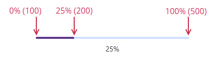
Value
The Value property specifies the current progress bar value. MinValue and MaxValue properties limit the range of accepted values.
The progress is measured in percentages and calculated by the following formula:(Value - MinValue) / (MaxValue - MinValue) * 100.
<DxProgressBar MinValue="100" MaxValue="500" Value="200" />
If the current progress is unknown, you can display an indeterminate progress bar.
Progress Status
Use the Status property to specify the progress status. The status affects bar appearance, the icon, and the default label.
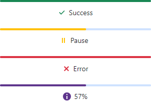
If the Status property is not specified, the component automatically sets the Success status when Value matches MaxValue. You can set the SetSuccessStatusOnComplete property to false to disable this behavior.
Label
The progress bar label displays information about progress status. The label shows the progress in percentages, and the corresponding text for the Success, Pause, and Error status values.
Use the Label property to customize the progress bar label.
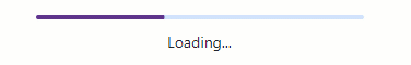
<DxProgressBar Label="Loading..." ... />

You can use the LabelPosition property to specify the position of the label relative to the progress bar. To hide the label, set the ShowLabel property to false.
Indeterminate State
When progress cannot be estimated or it is not necessary to indicate the progress numerically, set the Indeterminate property to true to display a moving bar.
<DxProgressBar Label="Loading..." Indeterminate="true" />
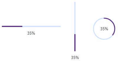
Vertical and Circular Progress Bar
The DxProgressBar component renders a linear horizontal progress bar. Use the Type property to change the bar type to vertical or circular.
<DxProgressBar Type="ProgressBarType.Horizontal" Value="35" />
<DxProgressBar Type="ProgressBarType.Vertical" Value="35" />
<DxProgressBar Type="ProgressBarType.Circular" Value="35" />