Color Editor Elements
- 2 minutes to read
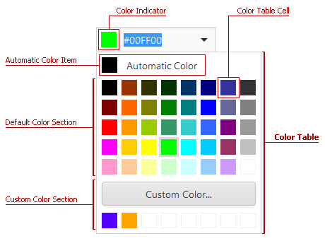
This topic describes the visible elements of the ASPxColorEdit.

The following visual elements are available:
Color Indicator
The color indicator displays the selected color within the editor’s edit box.

The table below lists the main members that affect element appearance and functionality.
| Characteristics | Members |
|---|---|
| Style | ASPxColorEdit.ColorIndicatorStyle |
| Width | ASPxColorEdit.ColorIndicatorWidth |
| Height | ASPxColorEdit.ColorIndicatorHeight |
Color Table
The color table consists of the default color section, which is always visible, and a custom color section. To display the custom color section, set the ASPxColorEdit.EnableCustomColors property to true. If a user clicks the Custom Color… button, it invokes the color picker.
The table below lists the main members that affect the element’s appearance and functionality:
| Characteristics | Members |
|---|---|
| Style | ASPxColorEdit.ColorTableStyle |
| Column Count | ASPxColorEdit.ColumnCount |
| Default Colors | ASPxColorEdit.Items |
| Custom Color Section Visibility | ASPxColorEdit.EnableCustomColors |
| Custom Color Button Text | ASPxColorEdit.CustomColorButtonText |
Color Table Cell
The color table cell displays an individual color within the color table.

The table below lists the main members that affect the element’s appearance and functionality:
| Characteristics | Members |
|---|---|
| Style | ASPxColorEdit.ColorTableCellStyle |
Automatic Color Item
The automatic color item allows users to select a predefined default color.

The table below lists the main members that affect element appearance and functionality.
| Characteristics | Members |
|---|---|
| Availability | ASPxColorEdit.EnableAutomaticColorItem |
| Color | ASPxColorEdit.AutomaticColor |
| Caption | ASPxColorEdit.AutomaticColorItemCaption |
| Value | ASPxColorEdit.AutomaticColorItemValue |
| Style | ASPxColorEdit.ColorTableCellStyle |
Color Picker
Click the Custom Color… button in the color table to display the color picker.

The table below lists the main members that affect element appearance and functionality.
| Characteristics | Members |
|---|---|
| Availability | ASPxColorEdit.EnableCustomColors |
| OK Button Text | ASPxColorEdit.OkButtonText |
| Cancel Button Text | ASPxColorEdit.CancelButtonText |
| Style | ASPxColorEdit.ColorPickerStyle |