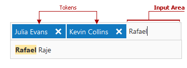
Token Box Elements
- 2 minutes to read
This topic describes the visible elements of the ASPxTokenBox.

The following visual elements are available.
Drop-Down Window
You can display a Drop-Down Window when the token box is focused. The window contains items that users can use to add corresponding tokens.

The table below lists the main members that affect element appearance and functionality.
| Characteristics | Members |
|---|---|
| Visibility | ASPxTokenBox.ShowDropDownOnFocus |
| Filter Mode | ASPxAutoCompleteBoxBase.IncrementalFilteringMode |
| Style | ASPxAutoCompleteBoxBase.ListBoxStyle |
Input Area
An Input Area allows users to input tokens.

You can use the ASPxTokenBox.TokenBoxInputStyle property to customize Input Area style settings.
If no token is specified and the editor is not focused, the Input Area can display prompt text, which is specified by the ASPxAutoCompleteBoxBase.NullText property. The prompt text disappears when the editor receives focus.
<dx:ASPxTokenBox ID="MyTokenBox" runat="server" NullText="Select contacts...">
     ...
</dx:ASPxTokenBox>
The image below shows the result.

Item
The ASPxTokenBox control displays Items in the Drop Down Window where users can add corresponding tokens. Users can type text in the Input Area to filter Items.

The table below lists the main members that affect element appearance and functionality.
| Characteristics | Members |
|---|---|
| Item Collection | ASPxAutoCompleteBoxBase.Items |
| Filter Mode | ASPxAutoCompleteBoxBase.IncrementalFilteringMode |
| Style | ASPxAutoCompleteBoxBase.ItemStyle |
Token
A Token is a text element in the ASPxTokenBox editor. The Token consists of the Text and Remove Button elements.

The table below lists the main members that affect element appearance and functionality.
| Characteristics | Members |
|---|---|
| Token Style | ASPxTokenBox.TokenStyle, ASPxTokenBox.TokenHoverStyle |
| Token Text Style | ASPxTokenBox.TokenTextStyle |
| Token Remove Button Style | ASPxTokenBox.TokenRemoveButtonStyle, ASPxTokenBox.TokenRemoveButtonHoverStyle |