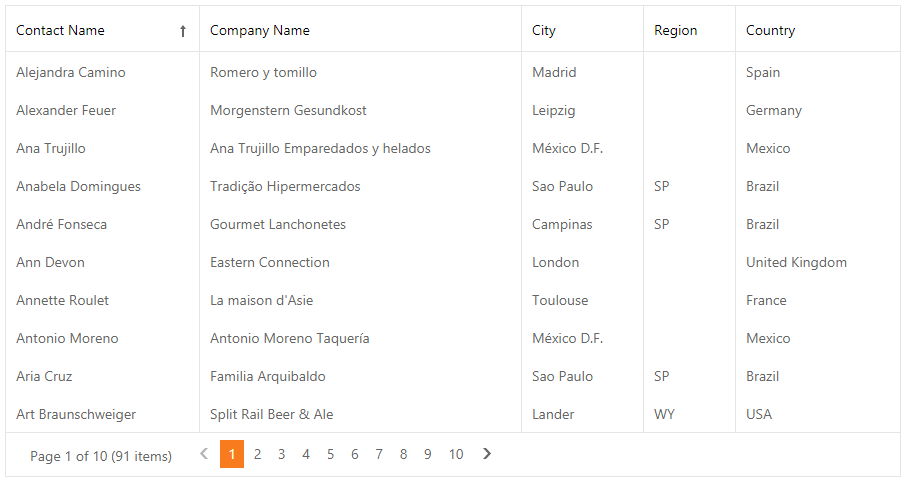
Grid View
- 8 minutes to read
The GridView control allows you to display data from a data source in a grid. The grid displays data source fields and records as columns and rows in a table.
ASPxGridView is the GridView Control on the server side, and ASPxClientGridView is its client-side equivalent.
Features
Data Binding
The control works only in bound mode. You can bind the grid to any standard data source type: SqlDataSource, ObjectDataSource, XmlDataSource, AccessDataSource, and SiteMapDataSource.
Use the KeyFieldName property to set a data source’s key field name. DataSourceID and DataSource specify the data source’s ID and data source object.
Database Server Mode
The grid supports database server mode. In this mode, the grid loads only required items to the server memory and implements data-aware operations (for example, filtering) at the database level.
Unbound Columns
The grid control supports unbound columns that are not bound to any data source field. Use the CustomUnboundColumnData event or specify the UnboundExpression property to populate an unbound column with data.
Data Editing
Edit Modes
The grid includes the following built-in edit modes that allow users to edit grid data (Mode):
- Edit Form (See demo)
- Edit Form and Display Row
- Popup Edit Form (See demo)
- In-Line Edit Mode
- Batch - (See demo)
Edit Form Template
You can use any controls to create a custom layout for the edit form.
Edit Form Layout
The EditFormLayoutProperties property allows you to customize the edit form layout.
Column Management
The grid control displays data in a table format. Data sources contain data as fields and records. The grid control displays data fields as columns and records as data rows.
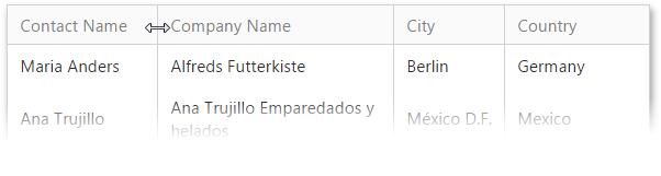
Resize Columns
You can resize a column header to modify the column’s width (SettingsResizing).
Move Columns
The grid control supports drag-and-drop functionality that allows you to move a column to a different position. You can use the AllowDragDrop property to allow users to move all grid columns or a column’s Settings.AllowDragDrop property to enable drag and drop for an individual column.
Header and Data Cell Bands
The grid control enables you to organize columns in logical groups (bands) and display them in multiple rows. Header bands (GridViewBandColumn) organize grid columns into logical groups and display hierarchical multi-row headers.
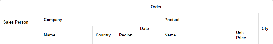
Data cell bands (Columns) allow you to display a data record hierarchically. Specify the CellRowSpan and CellRowSpan properties to arrange a column header and data cells in a data cell band layout.
Fixed Columns
The grid allows you to fix columns on the left side and display these columns onscreen when the columns’ total width exceeds the grid width. To fix a column, enable horizontal scroll (HorizontalScrollBarMode) and set the column’s FixedStyle property to Left.
Truncate Cell Text
The grid can truncate cell values and display an ellipsis (‘…’) if they don’t fit the cell width (AllowEllipsisInText).
Data Management
Sort Data
You can sort grid data by an unlimited number of columns. Use a column’s AllowSort property or the grid’s AllowSort option to allow users to sort the specified column or all columns in the grid.
Filter Data
You can use the following UI elements to filter grid data:
Auto-Filter Row (See demo)
Built-in Search Panel (See demo)
Column Header Filter Dropdowns (See demo)
Filter Control (See demo)
Group Data
The grid enables users to use drag-and-drop operations (ShowGroupPanel) or APIs to group data against an unlimited number of data columns. Use a column’s AllowGroup property or the grid’s AllowGroup option to allow end users to group the specified column or all columns in the grid.
The GroupInterval property enables you to change how data rows are grouped, especially for columns that contain date/time values.
The grid allows you to group data by multiple columns at once and combine them into a single group (MergeGroupsMode).
Data Summary
The grid allows you to display a brief description about groups of rows or individual data columns (summaries) in the footer (ShowFooter). The following summary types are available:
Total Summary - Add the ASPxSummaryItem object(s) to the TotalSummary collection.
Group Summary - Add the ASPxSummaryItem object(s) to the GroupSummary collection.
Custom Summary - Set the SummaryType property to SummaryItemType.Custom and handle the ASPxGridBase.CustomSummaryCalculate event to calculate the custom summary.
Master-Detail Grid
The grid supports master-detail data. You can link a master table to multiple detail tables. Each detail table can be the master of another table.
Validation
You can validate data in grid data rows and display error icons/messages for invalid fields.
Validate Rows - RowValidating, DoRowValidation()
Validate Edit Cells - ValidationSettings
Custom Validation - EnableCustomValidation
Export
The grid allows you to export data in the following formats: PDF, XLS, XLSX, RTF, CSV, DOCX.
Merged Cells
The grid can automatically merge adjacent cells with the same values (ASPxGridViewBehaviorSettings.AllowCellMerge, GridViewDataColumnSettings.AllowCellMerge).
Selection
You can use the UI elements (AllowSelectByRowClick, ShowSelectCheckbox, ShowSelectButton, SelectAllCheckboxMode) or APIs on the client and server side to select grid data.
Built-In Pager
The grid includes a built-in pager (SettingsPager) that enables users to navigate through data. The pager consists of navigation buttons: “next”, “last”, “previous”, “first”, and “All”.
Set the Mode property to EndlessPaging to enable endless paging mode, which enables you to load grid rows on demand when a user scrolls the grid.
Scroll Data
Use the HorizontalScrollBarMode and VerticalScrollBarMode properties to enable the horizontal and vertical scroll bars.
The grid supports virtual paging mode (VerticalScrollBarStyle), which allows users to use the vertical scroll bar to navigate through grid pages.
Keyboard Navigation
Built-in keyboard support allows you to use the keyboard to navigate the grid (KeyboardSupport).
Row Management
Alternate Row
You can highlight alternate (odd) grid rows with a different style (Enabled).
Preview Row
A preview row displays large memo fields or custom data across all grid columns (ShowPreview, PreviewFieldName).
Grid Lines
The grid allows you to display horizontal and/or vertical grid lines (GridLines).
Focused Row
You can focus a row in the grid. Note that you can select multiple records simultaneously, but you can focus only one record at a time.
Learn more | See demo | Learn more
Customization Tools
Toolbar
The toolbar enables you to group grid commands. The grid stores toolbars (GridViewToolbar) in its Toolbars collection. You can add or remove toolbars, change their availability and position, and populate them with toolbar items (GridViewToolbarItem).
Customization Dialog
The customization dialog enables users to sort, group, filter, and hide/show columns in the grid on mobile devices.
Context Menu
The grid includes the following context menu types (Enabled):
- Row (EnableRowMenu)
- Column header (EnableColumnMenu)
- Footer (EnableFooterMenu)
- Group footer (EnableGroupFooterMenu)
- Group panel (EnableGroupPanelMenu)
Column Chooser
The column chooser allows users to drag column headers to show/hide columns in the grid (EnableCustomizationWindow).
Adaptivity
The grid allows you to build adaptive or responsive page layouts. The control can automatically resize or hide its elements when a user resizes the browser window (SettingsAdaptivity).
Appearance Customization
Templates
The grid supports templates and allows you to customize its UI elements’ appearance and layout.
Conditional Formatting
You can apply format rules (GridFormatConditionBase object descendants) to the grid (FormatConditions) to customize the appearance of the grid’s data.
Miscellaneous
Cookie Support
The grid supports cookies that allow your site’s visitors to personalize pages. If cookies are enabled, the browser saves grid options that can be restored in future sessions.
Save and Restore Layout
You can save the grid’s layout to a database and then restore it.
Accessibility Support
The grid is designed to comply with Section 508 Standards and W3C’s latest accessibility recommendations such as WCAG (2.0) and WAI-ARIA (1.0). The control implements the AccessibilityCompliant property that allows more accessible markup to be generated for the control.