Adaptivity
- 3 minutes to read
The ASPxGridView control allows you to build adaptive or responsive page layouts. The control can automatically resize or hide its elements when the browser window is resized.
Responsive Layout
Set the ASPxGridViewAdaptivitySettings.AdaptivityMode property to HideDataCells to enable responsive mode.
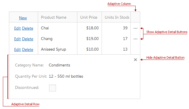
In this mode, the grid automatically hides columns one by one and displays an ellipsis button (which shows adaptive detail) in a separate column (the adaptive column). You can click the ellipsis button to expand the adaptive detail row, which contains the data of hidden columns.

Property | Description |
|---|---|
Specifies the order in which the grid hides columns. | |
Specifies the adaptive column’s position. | |
Specifies the number of columns in the adaptive detail row. | |
ASPxGridViewAdaptivitySettings.AllowOnlyOneAdaptiveDetailExpanded | Specifies whether the expanded row is collapsed when you expand another adaptive row. |
Online Demo
Adaptive Layout
Set the ASPxGridViewAdaptivitySettings.AdaptivityMode property to HideDataCellsWindowLimit to enable the adaptive layout.
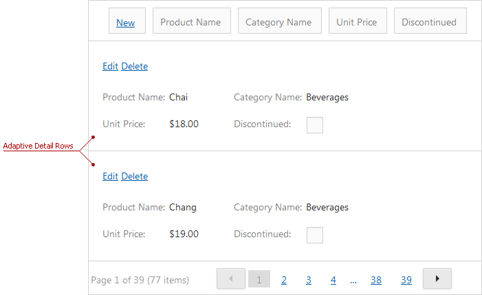
In this mode, the grid arranges its content into one column when the browser window’s inner width is less than the ASPxGridViewAdaptivitySettings.HideDataCellsAtWindowInnerWidth property value.
Note
In adaptive mode, you should specify the control’s width in percentage.

Property | Description |
|---|---|
Specifies the number of columns displayed in a detail row. | |
ASPxGridViewAdaptivitySettings.AdaptiveDetailLayoutProperties | Allows you to provide a custom adaptive detail row layout. |
Online Demos
Adaptive Popups
Enable adaptive mode for popup windows to display them as modal windows that cover the entire screen.
Use a popup dialog’s SettingsAdaptivity property to access the adaptivity settings.
Adaptive Toolbars
Set the Enabled property to true to make a grid’s toolbar adaptive. The ASPxGridView can display its toolbar items as follows when they do not fit the browser window’s width.
- Displays only icons. Hover the mouse pointer over a toolbar item to display its caption as a tooltip.
![]()
Property | Description |
|---|---|
Specifies whether the toolbar hides its items’ text and displays only icons when the browser window width is changed. | |
Specifies the maximum browser window inner width when the toolbar hides item text and displays only icons. |
<dx:ASPxGridView runat="server" ID="Grid" ...>
    <Toolbars>
        <dx:GridViewToolbar>
            <SettingsAdaptivity Enabled="true" EnableCollapseRootItemsToIcons="true"
            CollapseRootItemsToIconsAtWindowInnerWidth="400" />
            <Items>
            ...
            </Items>
        </dx:GridViewToolbar>
    </Toolbars>
    <Columns>
    ...
    </Columns>
</dx:ASPxGridView>
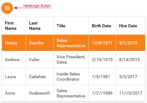
- Moves toolbar items to the side menu and hides them under the hamburger button. Click this button to show the toolbar items.

Property | Description |
|---|---|
Specifies whether the grid moves toolbar items to the side menu when the browser window’s width changes. | |
Specifies the browser window’s maximum inner width when the toolbar moves its items to the side menu. |
<dx:ASPxGridView runat="server" ID="Grid" ...>
    <Toolbars>
        <dx:GridViewToolbar>
            <SettingsAdaptivity Enabled="true" EnableCollapseToSideMenu="true"
            CollapseToSideMenuAtWindowInnerWidth="400" />
            <Items>
            ...
            </Items>
        </dx:GridViewToolbar>
    </Toolbars>
    <Columns>
    ...
    </Columns>
</dx:ASPxGridView>
Online Demo
Limitations
HideDataCells mode (Responsive Layout) is in effect if the ColumnResizeMode property is set to Disabled (the default setting).
The grid’s adaptive mode is in effect if the HorizontalScrollBarMode property is disabled.
The grid does not support the cell merge feature in adaptive mode.
The grid does not support Bands in responsive mode.
The ASPxGridView.FormatConditions property is not in effect in adaptive and responsive modes.
The grid does not support adaptive mode when it uses the DataRow template.