ProgressPanel Class
Represents a control showing an await message to a user.
Namespace: DevExpress.XtraWaitForm
Assembly: DevExpress.XtraEditors.v19.1.dll
Declaration
[ToolboxBitmap(typeof(ToolboxIconsRootNS), "ProgressPanel")]
public class ProgressPanel :
    BaseStyleControl,
    ITransparentBackgroundManager,
ISupportLookAndFeelRemarks
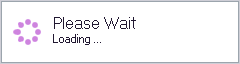
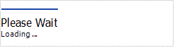
The ProgressPanel is a control intended to show an await message to a user. It contains a wait indicator, a message caption and description.
Tip
If you need to display an await message in a separate window, use the WaitForm control.
The following properties affect the layout and appearance of the control’s caption, description and image:
- ProgressPanel.Caption and ProgressPanel.Description — specify the message caption and description, respectively (changing these properties does not automatically resize the control horizontally, you need to resize it manually). You can also localize the default caption (‘Please Wait’) and description (‘Loading…’) using the StringId.ProgressPanelDefaultCaption and StringId.ProgressPanelDefaultDescription values;
- ProgressPanel.ShowCaption and ProgressPanel.ShowDescription — allow you to hide the message caption and description;
- ProgressPanel.AppearanceCaption and ProgressPanel.AppearanceDescription — allow you to customize the appearance (font settings and the foreground color) of the message caption and description;
- ProgressPanel.CaptionToDescriptionDistance — specifies the vertical distance between the caption and description;
- ProgressPanel.AnimationToTextDistance — specifies the horizontal distance between the wait indicator and the message caption and description;
- ProgressPanel.ImageHorzOffset — specifies the horizontal distance between the control’s left edge and the wait indicator;
- ProgressPanel.ContentAlignment — specifies the alignment of the caption, description and wait indicator relative to the control;
- Visible — use this inherited property to specify the control visibility.
The ProgressPanel.WaitAnimationType property specifies the wait indicator type:
Default (depends on a skin)
Line
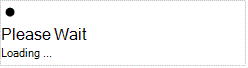
Ring
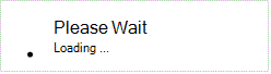
Bar
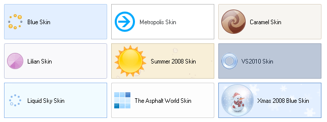
In the Default mode, the wait indicator is an animated image determined by the currently applied skin. See the Look And Feel and Skinning article to learn how to apply a skin to forms and controls.
In the Line, Ring and Bar modes, the wait indicator behavior and appearance can be specified using the following options:
- ProgressPanel.AnimationSpeed and ProgressPanel.AnimationAcceleration — specifies the speed and acceleration of wait indicators;
- ProgressPanel.AnimationElementCount — specifies the number of wait indicator visual elements;
- ProgressPanel.RingAnimationDiameter — specifies the diameter, in pixels, of the ring wait indicator;
- ProgressPanel.LineAnimationElementType and ProgressPanel.LineAnimationElementHeight — specifies the shape and height of the line indicator visual elements;
- ProgressPanel.BarAnimationElementLength, ProgressPanel.BarAnimationElementThickness and ProgressPanel.BarAnimationMotionType — specifies the length, thickness and motion type of the bar indicator.