AccordionControlElement Class
An element within AccordionControl.
Namespace: DevExpress.XtraBars.Navigation
Assembly: DevExpress.XtraBars.v19.1.dll
Declaration
Related API Members
The following members return AccordionControlElement objects:
Remarks
You can add elements to the AccordionControl using the control’s context menu and smart tags.
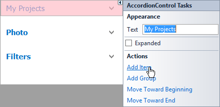
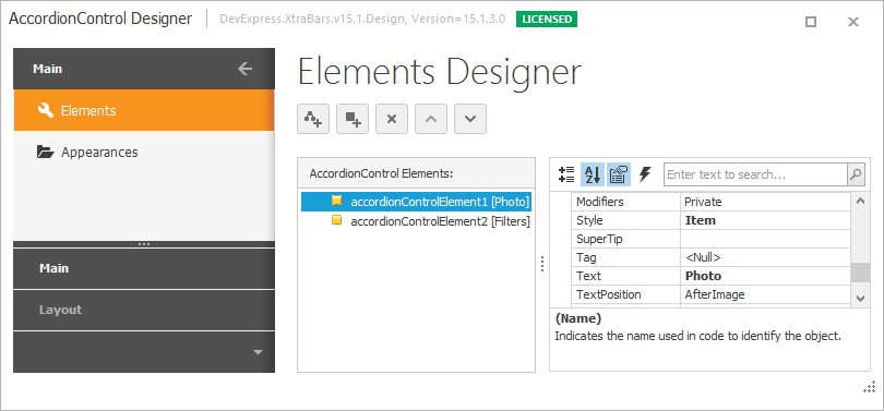
Additionally, the AccordionControl’s Designer provides means to manipulate the control elements.
To access root elements in code, use the AccordionControl.Elements collection.
Depending on the AccordionControlElement.Style property value, an element is considered either a group or an item.
Items
Items (AccordionControlElement objects of the Item style) serve two purposes:
Items can act as buttons. You can handle the AccordionControlElementBase.Click or AccordionControl.ElementClick event to respond to item clicking.
Items can display custom controls in an expandable area below an item header. To do this, provide a content container to the item using the AccordionControlElementBase.ContentContainer property or the AccordionControl.GetContentContainer event.
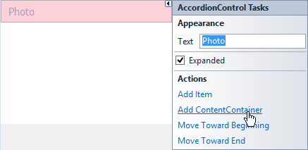
To add a content container to an item at design time, use the “Add ContentContainer” link in the item’s smart tag.
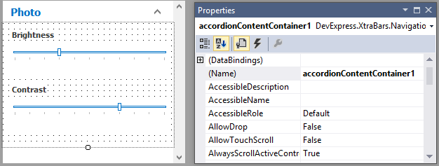
The added container can be vertically resized and customized at design time. You can drop custom controls onto the container.
By default, items are not drawn as selected when clicked. You can set the AccordionControl.AllowItemSelection property to true to change this behavior.
Tip
An accordion content container’s Padding property initially equals 0. Set it to -1 to force the container to use paddings according to the currently applied skin.
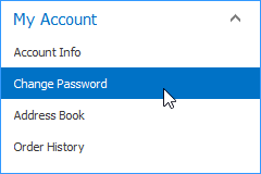
Groups
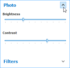
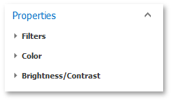
Groups (AccordionControlElement objects of the Group style) are expandable objects. Use them to create hierarchy levels. A group’s elements can be items and other groups. Thus, you can create a navigation hierarchy consisting of multiple levels. The following image shows the Properties group. It has three immediate children.
A group’s elements can be accessed using the AccordionControlElement.Elements collection. For elements of the Item style, this property is ignored.
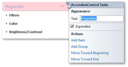
At design time, you can add elements to a group using its smart tag.
Unlike items, groups cannot be associated with content containers. Thus, the AccordionControlElementBase.ContentContainer property and the AccordionControl.GetContentContainer event are not in effect for groups.
Item and Group Common Settings
Elements, both items and groups, have headers that display an image (AccordionControlElementBase.Image or AccordionControlElementBase.ImageIndex) and text (AccordionControlElementBase.Text). Use the AccordionControlElementBase.TextPosition property to specify whether the image is located before or after text.
AccordionControl elements can display custom controls in their header areas. To add such a control, assign it to the element’s AccordionControlElementBase.HeaderControl property.
The AccordionControlElementBase.HeaderVisible property allows you to hide an element’s header. In this case, only the element’s contents are displayed.
You can display context buttons in item and group headers. Use the AccordionControl.ItemContextButtons and AccordionControl.GroupContextButtons properties and optionally the AccordionControl.ContextButtonCustomize event to accomplish this task.
The AccordionControl.ExpandElementMode property is in effect for groups and the items that have content containers associated with them. This property specifies whether single or multiple elements can be expanded simultaneously.
Example
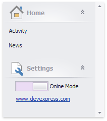
This example demonstrates how to create a sample AccordionControl at runtime.
Note
A complete sample project is available at https://github.com/DevExpress-Examples/create-accordioncontrol-in-code-t500006
using DevExpress.XtraBars.Navigation;
using DevExpress.XtraEditors;
using System;
using System.Collections.Generic;
using System.ComponentModel;
using System.Data;
using System.Diagnostics;
using System.Drawing;
using System.Linq;
using System.Text;
using System.Threading.Tasks;
using System.Windows.Forms;

namespace AccordionControl_ex {
    public partial class Form1 : Form {
        public Form1() {
            InitializeComponent();
        }

        AccordionControl acControl;

        private void Form1_Load(object sender, EventArgs e) {
            acControl = new AccordionControl();
            acControl.Dock = DockStyle.Left;
            acControl.Parent = this;
            acControl.Width = 200;
            InitAccordionControl();
        }

        private void InitAccordionControl() {
            acControl.BeginUpdate();
            AccordionControlElement acRootGroupHome = new AccordionControlElement();
            AccordionControlElement acItemActivity = new AccordionControlElement();
            AccordionControlElement acItemNews = new AccordionControlElement();
            AccordionControlElement acRootItemSettings = new AccordionControlElement();

            acControl.ElementClick += new ElementClickEventHandler(this.accordionControl1_ElementClick);

            //
            // Root Group 'Home'
            //
            acRootGroupHome.Elements.AddRange(new AccordionControlElement[] {
            acItemActivity,
            acItemNews});
            acRootGroupHome.Expanded = true;
            acRootGroupHome.ImageOptions.ImageUri.Uri = "Home;Office2013";
            acRootGroupHome.Name = "acRootGroupHome";
            acRootGroupHome.Text = "Home";
            //
            // Child Item 'Activity'
            //
            acItemActivity.Name = "acItemActivity";
            acItemActivity.Style = ElementStyle.Item;
            acItemActivity.Tag = "idActivity";
            acItemActivity.Text = "Activity";
            //
            // Child Item 'News'
            //
            acItemNews.Name = "acItemNews";
            acItemNews.Style = ElementStyle.Item;
            acItemNews.Tag = "idNews";
            acItemNews.Text = "News";
            //
            // Root Item 'Settings' with ContentContainer
            //
            acRootItemSettings.ImageOptions.ImageUri.Uri = "Customization;Office2013";
            acRootItemSettings.Name = "acRootItemSettings";
            acRootItemSettings.Style = ElementStyle.Item;
            acRootItemSettings.Text = "Settings";
            //
            // itemSettingsControlContainer
            //
            AccordionContentContainer itemSettingsControlContainer = new AccordionContentContainer();
            HyperlinkLabelControl hyperlinkLabelControl1 = new HyperlinkLabelControl();
            ToggleSwitch toggleSwitch1 = new ToggleSwitch();
            acControl.Controls.Add(itemSettingsControlContainer);
            acRootItemSettings.ContentContainer = itemSettingsControlContainer;
            itemSettingsControlContainer.Controls.Add(hyperlinkLabelControl1);
            itemSettingsControlContainer.Controls.Add(toggleSwitch1);
            itemSettingsControlContainer.Appearance.BackColor = System.Drawing.SystemColors.Control;
            itemSettingsControlContainer.Appearance.Options.UseBackColor = true;
            itemSettingsControlContainer.Height = 60;
            //
            // hyperlinkLabelControl1
            //
            hyperlinkLabelControl1.Location = new System.Drawing.Point(26, 33);
            hyperlinkLabelControl1.Size = new System.Drawing.Size(107, 13);
            hyperlinkLabelControl1.Text = "www.devexpress.com";
            hyperlinkLabelControl1.HyperlinkClick += new DevExpress.Utils.HyperlinkClickEventHandler(this.hyperlinkLabelControl1_HyperlinkClick);
            //
            // toggleSwitch1
            //
            toggleSwitch1.EditValue = true;
            toggleSwitch1.Location = new System.Drawing.Point(24, 3);
            toggleSwitch1.Properties.AllowFocused = false;
            toggleSwitch1.Properties.AutoWidth = true;
            toggleSwitch1.Properties.OffText = "Offline Mode";
            toggleSwitch1.Properties.OnText = "Onlne Mode";
            toggleSwitch1.Size = new System.Drawing.Size(134, 24);
            toggleSwitch1.Toggled += new System.EventHandler(this.toggleSwitch1_Toggled);

            acControl.Elements.AddRange(new DevExpress.XtraBars.Navigation.AccordionControlElement[] {
                acRootGroupHome,
                acRootItemSettings});

            acRootItemSettings.Expanded = true;

            acControl.EndUpdate();
        }

        private void accordionControl1_ElementClick(object sender, DevExpress.XtraBars.Navigation.ElementClickEventArgs e) {
            if (e.Element.Style == DevExpress.XtraBars.Navigation.ElementStyle.Group) return;
            if (e.Element.Tag == null) return;
            string itemID = e.Element.Tag.ToString();
            if (itemID == "idNews") {
                //...
            }
            listBoxControl1.Items.Add(itemID + " clicked");
        }

        private void toggleSwitch1_Toggled(object sender, EventArgs e) {
            //...
        }

        private void hyperlinkLabelControl1_HyperlinkClick(object sender, DevExpress.Utils.HyperlinkClickEventArgs e) {
            Process.Start(e.Text);
        }


    }
}