State and State Image Indicators
- 6 minutes to read
State and state image indicators are elements used to label different gauge states. These can be regarded as a specific type of Value Indicators, isolated from Scales from the end-user’s point of view. Both of these indicators can be used for only analog gauges (Circular Gauges and Linear Gauges).
State Indicators
State indicators display simple vector images of multiple available predefined shapes. To add a state indicator to your analog gauge, invoke the gauge’s smart-tag and click the ‘Add State Indicator’ menu item, as shown below. Depending on the gauge’s type, an object of either the ArcScaleStateIndicatorComponent or LinearScaleStateIndicatorComponent class will be created and placed into the gauge’s Indicators collection.

As with other gauge visual elements, you can click a state indicator at design-time to modify its properties or invoke its designer (see the following figure).

To arrange the indicator to the desired position, use the StateIndicator.Center, StateIndicator.Size and BaseLeafPrimitive.ZOrder properties. After the state indicator is positioned, you can set the image displayed by it. To do so, add a new item to the indicator’s StateIndicator.States collection. This will add a ScaleIndicatorState element that can display a predefined image when a related gauge scale’s value reaches the specific value. This image will be displayed as long as the scale value stays within the target interval. This behavior is implemented by using the following properties:
- StateImageIndicatorComponent.IndicatorScale - a scale associated with this indicator;
- ScaleIndicatorState.ShapeType - gets or sets one of multiple predefined vector images to be displayed by this ScaleIndicatorState;
- BaseIndicatorState.StartValue - a value of the associated scale starting from which the ScaleIndicatorState will display the specific image;
- BaseIndicatorState.IntervalLength - the associated scale’s value interval that starts from the StartValue. The indicator will display the ShapeType image for as long as the scale value stays within this interval.
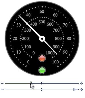
The following animation illustrates an example: a gauge with two scale arcs that has two identical state indicators associated with these scales: the lower indicator relates to the outer scale (ranges from 0 to 100), the upper indicator - to the inner scale (ranges from 0 to 1000). Scale values are modified by using the range bars below the gauge. You will notice that the lower indicator changes its color from green to yellow and then to red when the outer gauge needle surpasses the values of 50 and 80 respectively. Value thresholds for the inner scale in turn, are set to 700 and 900.
The code snipped below illustrates how to do the same programmatically.
circularGauge2.BeginUpdate();
//The indicator for the outer scale
ArcScaleStateIndicatorComponent indicator1 = new ArcScaleStateIndicatorComponent();
indicator1.IndicatorScale = arcScaleComponent3;
indicator1.Center = new DevExpress.XtraGauges.Core.Base.PointF2D(125F, 225F);
indicator1.Size = new System.Drawing.SizeF(25F, 25F);
indicator1.Name = "indicator1";
//Adding three shapes for each of the outer scale's ranges
indicator1.States.Add(new ScaleIndicatorState(StateIndicatorShapeType.ElectricLight4) { StartValue = 0F, IntervalLength = 50F });
indicator1.States.Add(new ScaleIndicatorState(StateIndicatorShapeType.ElectricLight3) { StartValue = 50F, IntervalLength = 30F });
indicator1.States.Add(new ScaleIndicatorState(StateIndicatorShapeType.ElectricLight2) { StartValue = 80F, IntervalLength = 20F });

//The indicator for the inner scale
ArcScaleStateIndicatorComponent indicator2 = new ArcScaleStateIndicatorComponent();
indicator2.IndicatorScale = arcScaleComponent5;
indicator2.Center = new DevExpress.XtraGauges.Core.Base.PointF2D(125F, 190F);
indicator2.Size = new System.Drawing.SizeF(25F, 25F);
indicator2.Name = "indicator2";
//Adding three shapes for each of the inner scale's ranges
indicator2.States.Add(new ScaleIndicatorState(StateIndicatorShapeType.ElectricLight4) { StartValue = 0F, IntervalLength = 700F });
indicator2.States.Add(new ScaleIndicatorState(StateIndicatorShapeType.ElectricLight3) { StartValue = 700F, IntervalLength = 200F });
indicator2.States.Add(new ScaleIndicatorState(StateIndicatorShapeType.ElectricLight2) { StartValue = 900F, IntervalLength = 100F });

//Adding both indicators to the gauge
circularGauge2.Indicators.AddRange(new ArcScaleStateIndicatorComponent[] { indicator1, indicator2});
circularGauge2.EndUpdate();
State Image Indicators
State image indicators are represented by the StateImageIndicatorComponent class and are used when pre-defined shapes of simple state indicators are insufficient for your task. These elements combine features of both simple static images and state indicators, giving you the unlimited resource to mark your gauge states in the desired way.
As with any other gauge element, a state image indicator can be added either via the corresponding link within the gauge’s smart-tag, or by using the Gauge Designer (see the figure below).

To display a static image, assign this image to the indicator’s Image property. Otherwise, if you wish to display multiple images, each for the specific related indicator state (which is the reason to use state image indicators in the first place), put your images into an image collection (e.g., the standard ImageList or the DevExpress ImageCollection object) and assign this collection to the indicator’s StateImageIndicatorComponent.StateImages property. There are two options to toggle state images:
automatically when the related scale’s value reaches the specific threshold. To do so, you need to bind the state image indicator to a scale by using the StateImageIndicatorComponent.IndicatorScale property. Next, specify the StateImageIndicatorComponent.ImageStateCollection (see the following image). This step is identical to creating states for state indicators, as mentioned above. You will need to set the starting value for each state (the StartValue property) and value interval to which this state belongs (the IntervalLength property). In the figure below, the selected State2 state is active when the value ranges from 50 to 80.

- manually by using the StateImageIndicatorComponent.StateIndex property. This property either explicitly sets the active state from the StateImageIndicatorComponent.ImageStateCollection, or (if the state collection is empty) picks an image that has this specific index within the StateImageIndicatorComponent.StateImages collection.
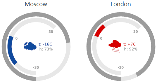
Use the first option when you need to mark different scale values by displaying different images. The second approach is useful when your state image indicator has no clear connection to scale values. For example, in the animation below, both radial gauges have two range bars - one for the temperature, the other - for humidity. State image indicators in the gauges’ middle display icons of different weather types (sunny, cloudy, rain or snow), which does not strictly depend on either temperature or humidity.
State image indicators, as well as labels, static images and range bars can be colorized using Color Schemes.