Breadcrumb Edit Control
- 7 minutes to read
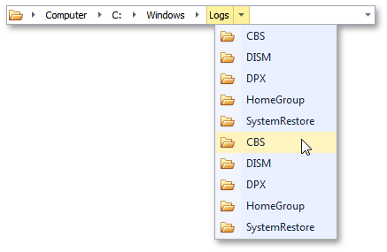
The Breadcrumb Edit Control (represented by the BreadCrumbEdit class object in code) emulates a navigation bar, similar to the one displayed in Microsoft Explorer starting from Windows 7 (see the following figure).

This control allows you to build a node hierarchy, where each node is related to one or many child nodes. At runtime the control displays your current position within this tree.
Integration With TreeList
You can pair a BreadCrumbEdit and TreeList control to implement a breadcrumb navigation through the TreeList hierarchy. In pairing mode, the BreadCrumbEdit automatically syncs its hierarchy and selection with the TreeList. See Breadcrumb Navigation to learn more.
Concepts and Visual Elements
This section describes Breadcrumb Edit Control’s cornerstones, crucial for understanding the editor’s mechanics.
Nodes
The fundamental Breadcrumb Edit Control’s element is a node - an object of the BreadCrumbNode class that can store other nodes within its BreadCrumbNode.ChildNodes collection. Each node has a caption, value (the BreadCrumbNode.Caption and BreadCrumbNode.Value properties respectively) and image (the BreadCrumbNode.ImageIndex property). Node images are displayed only within the drop-down lists (see below). You can also insert an image before the very first node by specifying the RepositoryItemBreadCrumbEdit.RootGlyph property (see the figure below). Clicking this root glyph raises the RepositoryItemBreadCrumbEdit.RootGlyphClick event.

Paths
The current position within the node tree is called a path and stored within the BreadCrumbEdit.Path property. A path string consists of node values, separated by a separator character, stored within the RepositoryItemBreadCrumbEdit.PathSeparator property.
At runtime the path is presented as a sequence of click-able node elements, arranged one by one in a single row. These elements display node captions and allow end-users to navigate back to these nodes on clicking. If a node has child nodes within, it displays a small arrow that invokes a drop-down menu on clicking. End-users can click this button to browse node children and navigate to them (see the following figure). If the drop-down list contains a currently selected node, its caption will be highlighted using a bold font style.

Each node has its own path accessed via the BreadCrumbNode.Path property - this is the sequence of breadcrumb nodes you need to pass before you reach this current node.
Persistent nodes
Persistent nodes are nodes, whose BreadCrumbNode.Persistent properties are set to true. These nodes serve as a prefix, standing above the primary node tree and expose the following unique features:
- always visible wherever an end-user navigates;
- excluded from the nodes hierarchy, which means values for these nodes are not included in path strings;
- provide only one nesting level for child nodes (you can add other nodes to the BreadCrumbNode.ChildNodes collection of a persistent node, but these child nodes should not contain any children themselves);
- when an end-user selects a child node from the persistent node’s drop-down list, it does not navigate you to this child node (the RepositoryItemBreadCrumbEdit.PathChanged event is never raised);
- node values for persistent nodes’ children can store path strings. In this case clicking such a node will navigate you to the desired node without the nessecity to handle the RepositoryItemBreadCrumbEdit.NodeClick event and manually set the required path (see the example below).
These specifics make persistent nodes more similar to regular drop-down buttons rather than breadcrumb nodes. Their main purpose is to store shortcuts to the most important and/or frequently used nodes or execute any custom actions. For instance, the animation below illustrates an example where a persistent node contains three child nodes, each perform navigation to a specific regular node.

This example was built by setting the required paths to breadcrumb node’s child node values.
breadCrumbNode2.Caption = "Expand the 'A' nodes branch"; breadCrumbNode2.Value = "Root\\Node A\\Node A.2\\Node A.2.2"; breadCrumbNode3.Caption = "Expand the 'B' nodes branch"; breadCrumbNode3.Value = "Root\\Node B\\Node B.2"; breadCrumbNode4.Caption = "Expand the \'C\' nodes branch"; breadCrumbNode4.Value = "Root\\Node C\\Node C.3";Dynamically populated nodes
These are the nodes that raise the RepositoryItemBreadCrumbEdit.QueryChildNodes event when the editor needs to navigate to this node for the first time. This event allows you to populate such nodes dynamically (see the example below). To do so, set the BreadCrumbNode.PopulateOnDemand property for required nodes to true.
Validation
If a Breadcrumb Edit Control has to navigate to a node that does not yet exist (e.g., you have passed an unknown node values sequence to the editor’s path), the path validation occurs. This mechanism gives you an opportunity to check this path and either cancel the navigation or create new nodes with the required values. To do so, handle the RepositoryItemBreadCrumbEdit.ValidatePath event and set its e.ValidationResult parameter to the required value. If you choose to create new nodes, they will raise the RepositoryItemBreadCrumbEdit.NewNodeAdding and RepositoryItemBreadCrumbEdit.QueryChildNodes events, which allows you to populate these new nodes dynamically (see the example below).
Breadcrumb Modes
The Breadcrumb Edit Control can operate in two modes - Select and Edit. See the Breadcrumb Modes document for more details.
History
Whenever an end-user succesfully navigates to a node in Edit mode, the path to this node is written to a breadcrumb history. At runtime users can click the editor’s drop-down button to view these stored paths and select one to navigate to it. The following figure illustrates an example.

To access the breadcrumb history in code, use the RepositoryItemBreadCrumbEdit.History property. This property provides access to the BreadCrumbHistory collection, which stores the BreadCrumbHistoryItem class objects. Each history item has the BreadCrumbHistoryItem.Path property in which the item keeps the path to the related node. The Breadcrumb Edit Control provides multiple methods to navigate through history items.
- BreadCrumbEdit.GoBack - navigates one BreadCrumbHistoryItem back from the current path.
- BreadCrumbEdit.GoForward - navigates one BreadCrumbHistoryItem forward from the current path, discarding the previously performed back navigation.
- BreadCrumbEdit.GoUp - navigates to the parent node from the currently selected node. This method relates to common BreadCrumbEdit navigation rather than navigation history.
End-users can navigate through nodes by means different from typing paths in Edit mode, for instance:
- by using mouse in Select mode;
- by modifying the editor’s path from code;
- by using shortcuts stored within a persistent node, etc.
Though the regular breadcrumb history, accessed through the RepositoryItemBreadCrumbEdit.History property, does not store any records of such navigation, you can get a complete history by calling the BreadCrumbEdit.GetNavigationHistory method. This method returns the separate BreadCrumbHistory collection that tracks every user’s move within the editor.
Editor Buttons
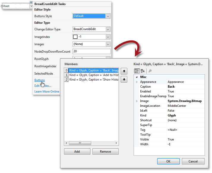
By default, the Breadcrumb Edit Control has one button that invokes a drop-down menu with history records. You can remove this predefined button and/or add your own custom buttons. To do this at design-time, use the corresponding link on the editor’s smart-tag. The button editor that will appear allow you to create, re-arrange, remove buttons and modify their properties using the built-in property grid.

To do this in code, modify the RepositoryItemButtonEdit.Buttons property, accessed through the editor’s BreadCrumbEdit.Properties category. Buttons are represented by the EditorButton class objects. Follow the corresponding link in the ‘Examples’ section of this document to see an example.
Examples
This section contains links to task-based help regarding the Breadcrumb Edit Control.
How to: Create Breadcrumb Nodes at Design Time
A simple tutorial that demonstrates how to use the Breadcrumb Node Editor to populate the Breadcrumb Edit Control at design time.
How to: Create Breadcrumb Nodes at Runtime
Learn how to programmatically populate the Breadcrumb Edit Control with nodes.
How To: Add Custom Buttons to the Breadcrumb Edit Control
An example dedicated to custom Breadcrumb Edit Control’s buttons.
How To: Create a File Explorer
An advanced tutorial that illustrates how to emulate the Microsoft Explorer using the Breadcrumb Edit Control.