Adorner Guides
- 4 minutes to read
Guides are Adorner UI Manager elements that highlight an area within a parent form and display an optional description for this area.
Guides are objects of the Guide class. Key elements include:
- Target element
- The area to highlight (the AdornerElement.TargetElement property).
- Flyout panel
- The control with the description for the highlighted area (the AdornerUIManager.QueryGuideFlyoutControl event).
End-User Capabilities
A user can perform the following actions:
- Click an area with a guide to display the guide for this area.
- Press Esc to hide all guides.
Note
When guides are shown, a user cannot interact with the form’s UI elements. The adorner layer intercepts all mouse events.
Create a Guide
Design Time
- Drop an Adorner UI Manager on the form.
- Click the Edit Elements link in the Adorner UI Manager’s smart tag and create a guide in the Collection Editor dialog.
- Assign the element you want to highlight to the AdornerElement.TargetElement property.
In Code
Create a Guide class instance, assign the element you want to highlight to the AdornerElement.TargetElement property, and add the guide to the AdornerUIManager.Elements collection:
public Form1() {
    InitializeComponent();
    Guide guide1 = new Guide();
    guide1.TargetElement = ribbonPageGroup2;
    adorneruiManager1.Elements.Add(guide1);
}
Populate Flyout Panels
Enable a guide’s Properties.AllowFlyoutPanel property to display a flyout panel for this guide.
Handle the Adorner UI Manager’s QueryGuideFlyoutControl event to populate flyout panels. Use the following event parameters:
- e.SelectedElement
- Identifies the area for which the guide appears.
- e.Control
- Specifies the control to display within the corresponding guide’s flyout panel.
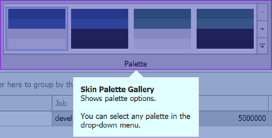
The following code snippet displays a label with an HTML-formatted text string as a guide flyout panel:
void adornerUIManager1_QueryGuideFlyoutControl(object sender, QueryGuideFlyoutControlEventArgs e) {
    if (e.SelectedElement.TargetElement == ribbonPageGroup2) e.Control = new LabelControl() {
        AllowHtmlString = true,
        Width = 350,
        AutoSizeMode = LabelAutoSizeMode.Vertical,
        Padding = new Padding(20),
        Text = "<b>Skin Palette Gallery</b><br>" +
            "Shows palette options.<br><br>" +
            "You can select any palette in the drop-down menu."
    };
}
The following image shows the result:
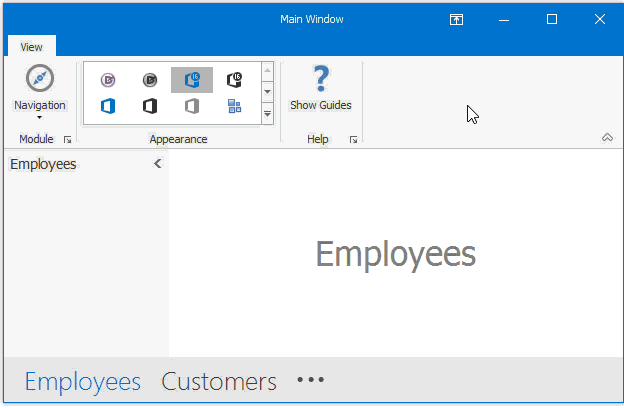
Flyout panels can display more complex content. In the following image, the flyout panel displays three buttons and a WindowsUI Button Panel.

Flyout panels adjust their size automatically to fit their content. To set a flyout display position, use the GuideDefaultProperties.FlyoutLocation property.
Manipulate Guides
Use the following API to show, hide, or select guides:
API | Task |
|---|---|
Enable this property to show guides. Guides are displayed in the order of their | |
Display the next guide. | |
Display the previous guide. | |
Display a specific guide. |
Appearance Settings
You can customize any guide element or the adorner layer:
Setting | Element to customize |
|---|---|
An individual guide (borders and the highlighted area). | |
All guides. | |
All flyout panels. | |
| The adorner layer. |
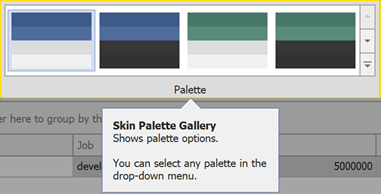
Important
Use four-number ARGB values to assign semi-transparent colors.
The following code snippet specifies custom colors for a guide, flyout panels, and the adorner layer:
// Customize an individual guide
guide1.Appearances.Selected.BorderColor = Color.BlueViolet;
guide1.Appearances.Selected.BackColor = Color.FromArgb(100, 0, 0, 150);
// Customize the adorner layer
adorneruiManager1.GuideAppearances.Layer.BackColor = Color.FromArgb(100, 0, 50, 150);
// Customize flyout panels
adorneruiManager1.GuideProperties.FlyoutBackColor = Color.LightCyan;
adorneruiManager1.GuideProperties.FlyoutBorderColor = Color.Violet;
The following image shows the result: