Free Layout Mode
- 4 minutes to read
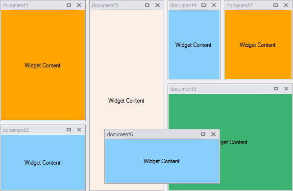
The Free Layout Mode imposes no restrictions on how to organize your widgets and allows you to build any desired layout. Also, this is the only layout mode that fully supports floating widgets.

New documents added in Free Layout mode are arranged side-by-side in a single column or row depending on the WidgetView.Orientation property. Using the ‘Layout’ tab of the component’s designer, you can drag these widgets to build any document layout you want. To do the same in code, call a Document.DockTo method overload that takes another widget document and the Orientation enumeration value as parameters. Additionally, by specifying the third boolean parameter, you can choose whether to place your widget before or after the target document. The code sample below illustrates how to dock one widget below another.
Drag Styles
The ItemDragStyle property, accessed through the View’s WidgetView.FreeLayoutProperties section, changes the way this View operates when in Free Layout Mode.
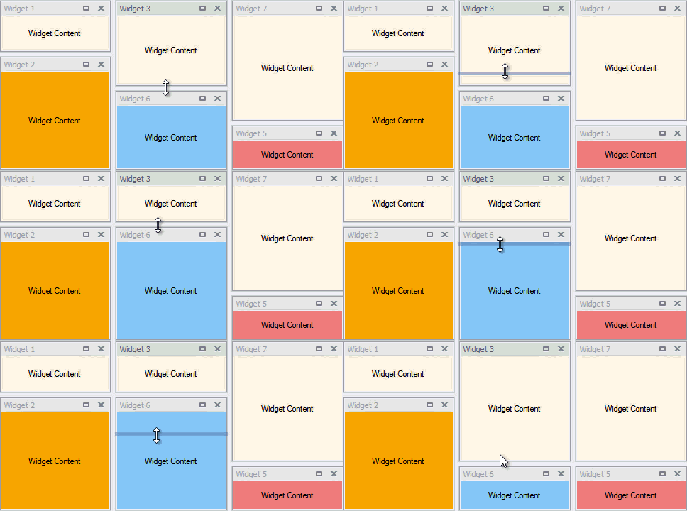
Setting the ItemDragStyle property to the DockingHints value turns on traditional docking-styled dragging: end-users can use docking hints to dock widgets to the desired position. A user can also drop the widget and leave it floating. Alternatively, when this property equals LivePreview, the View does not allow you to float its child documents by dragging them. The dragging itself no longer displays docking hints. Instead, the View utilizes a live preview to highlight the widget’s future position. The gallery to the left illustrates the difference. |
Sticky Splitters
Modifying the boolean EnableStickySplitters property (the WidgetView.FreeLayoutProperties group) enables or disables sticky splitters. When you drag a sticky splitter at runtime, it will automatically snap to match the level of other splitters with the same orientation. This feature allows you to easily align multiple splitters in a line for a clean and neat layout look. The animation below illustrates this feature.

Without this feature enabled, users will have to manually move splitters pixel-by-pixel if they want to adjust them on the same level.
Fixed and Relative Sizes
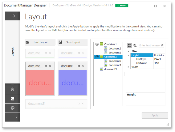
When you dock one widget to another in Free Layout mode, both widgets are placed to a docking container. Normally, you do not need to modify these containers as they dynamically adapt to the layout you build. However, you can manually specify width and height values for your containers and documents they own. To do so, invoke the Document Manager’s designer and switch to the “Layout” tab. Not only does this tab allow you to re-arrange widgets by dragging them, but also shows the current layout hierarchy of the widgets and docking container (see the figure below).

When you select either a document or a container, the property grid displays their width and height properties. These properties accept objects of the Length type. A Length is a structure that holds two values.
- Length.UnitType - the unit of measure type. This property can equal either Pixel or Star.
- Length.UnitValue - a size value. Depending on the UnitType value, this number is interpreted as either an absolute value in pixels, or as a relative value compared to other star-typed Length objects.
Assigning Length structures of different types and values to widgets and docking containers, you can specify in detail how your layout will act when the form resizes at runtime.
The View will always prioritize a valid layout over your fixed size settings. For example, you can add two docking containers with the fixed widths of 100 and 200 pixels respectively. If an end-user resizes such a form to 600 pixels, a View will resize containers proportionally to 200 and 400 pixels rather than keep your custom size settings as is and display a gap between containers.
Also, keep in mind that since docking containers are created automatically depending on the layout you build, they are also automatically destroyed when not needed. Thus, your size settings can be lost after certain layout modifications.

