Widget View
- 3 minutes to read
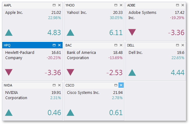
The Widget View of the Document Manager allows you to create dashboard-like applications. The figure below illustrates an example.
In code Widget Views are represented by the WidgetView class objects. As any other Document Manager View, Widget View works with documents (the Document class objects). The way documents are arranged depends on the current layout mode (see below). The Widget View supports four layout modes - Stack Layout, Table Layout, Flow Layout and Free Layout.
Getting Started
Creating and populating the Widget View at design time
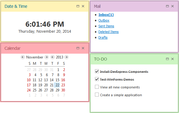
This video demonstrates how to populate the Widget View with documents, arranged into multiple Stack Groups.
Creating and populating the Widget View in code
This example illustrates the way to populate the Widget View in code and arrange your widgets into Stack Groups.
Layout Modes
The Widget View can function in multiple layout modes that affect the way documents are organized. Use the WidgetView.LayoutMode property to select the currently applied layout mode.
-
In this default layout mode, documents are placed into either vertically or horizontally arranged groups.
-
This layout mode allows you to build a grid of columns and rows and place documents into one or multiple cells of this grid.
-
Documents in this layout mode are not held in any containers and simply follow each other in the given direction. Supports wrapping documents into multiple columns or rows.
-
This layout mode allows you to build any desired layout of widget documents.
Colorized Widgets
The Document.AppearanceCaption and Document.AppearanceActiveCaption properties provide access to a set of properties that specify this widget’s appearance. The BackColor property available through these properties allow you to set a custom color to any widget. This color will be used to paint the widget caption area and its borders, as the following figure illustrates.
Note that caption forecolors are automatically updated to fit the custom background color. The figure above illustrates this feature - for some widgets the color of their captions remains almost unchanged (purple widget), while other widgets (pink and green widgets) colorize their captions more intensively. This process uses a complex algorithm to mix the default forecolor with a custom backcolor to achieve the most visually appropriate result.
Runtime Capabilities
At runtime, end-users can do the following.
Resize documents if the IDocumentDefaultProperties.AllowResize property does not equal false. Widget View documents can only be resized in the same dimension as the View orientation. Widgets in Table Layout Mode cannot be resized.

Maximize Documents by clicking the Maximize button. The button’s visibility is specified by the IDocumentDefaultProperties.AllowMaximize property. Maximized Documents fill the entire View space. To restore the Document size, click the Restore button.
Show the animation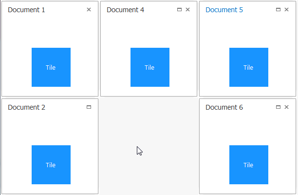
You can also specify the Document.MaximizedControl property. In this case, a control (User Control A) will be displayed in its normal (“preview”) state, but when a document with this control is maximized, it displays another control (User Control B). The animation below illustrates this functionality.
Show the animation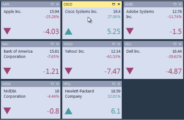
Close documents using the Close button (use the IBaseDocumentDefaultProperties.AllowClose property to enable or disable document closing).

Animation effects can be applied to all state change operations (Maximize, Minimize and Restore). To turn these effects on or off, use the WidgetView.AllowDocumentStateChangeAnimation property.