Views
- 3 minutes to read
The DocumentManager View is the component’s main element that owns all Documents and manages their appearance and behavior.
View Hierarchy
Each Application UI Manager View is represented by a separate class.
- Tabbed View - the TabbedView class.
- Native MDI View - the NativeMdiView class.
- Widget View - the WidgetView class.
- Windows UI View - the WindowsUIView class.
All Views derive from the BaseView class, which provides common View settings.
Adding and Applying Views
When you place an Application UI Manager on a form, is has the Tabbed View applied. Invoke the component smart tag and click “Convert to…” to create and apply another View. Note that if you already have Documents added to your View, they will be lost upon the conversion.
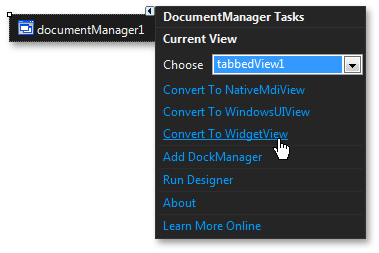
To add Views in code, create instances of required View classes and add them into the DocumentManager.ViewCollection collection. Then, assign a View to the DocumentManager.View property to make this View currently active.
View Types
Below is a brief description and feature summary for each available View.
Tabbed View
Main article: Tabbed View
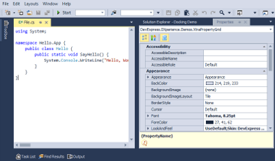
- Documents owned by a Tabbed View are by default displayed as tabs.
- End-users can re-arrange tabs and pin them in place.
- End-users can drag tabs to make them floating. Floating Documents can be docked back to the client area.
- Floating Documents can also dock to dynamically created floating containers.
- The View can split its client area into multiple resize-able regions that host Documents. In Free Layout Mode, you can break down the client area both vertically and horizontally at the same time.
- The Document Selector invoked by Ctrl+Tab or Ctrl+Shift+Tab keys allows end-users to navigate through Documents and preview their content.
Native MDI View
Main article: Native MDI View
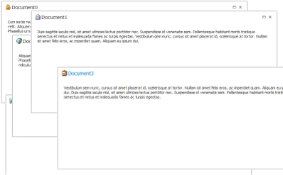
- All Documents are displayed as floating windows.
- End-users can maximize, minimize, drag and close Documents.
- The Document Selector invoked by Ctrl+Tab or Ctrl+Shift+Tab keys allows end-users to navigate through Documents and preview their content.
Widget View
Main article: Widget View
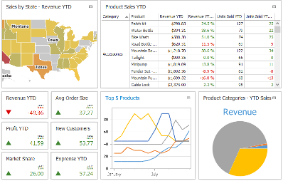
- Each Document is a rectangle-shaped panel (a widget). The View displays multiple widgets at the same time.
- Multiple widget layout modes.
- End-users can maximize individual widgets. A widget can display different content in regular and maximized states.
- Drag-and-drop support.
- Extended appearance features (widget colorization, wobble drag animations, live resize preview, etc.).
WindowsUI View
Main article: WindowsUI View
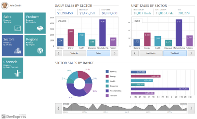
- One View to build entire Windows Modern-inspired applications.
- Various content containers for single and multiple Documents, plus a start-up container for tiles.
- Each Document can have a corresponding animated ‘live’ tile.
- Embedded top and bottom Navigation Bars that host buttons.
- An ability to create multiple modules (application screens) and provide advanced application hierarchy.
- Flat Windows Modern-inspired appearance of all View UI elements.
View Controllers
Every View provides the Controller property. This property stores an object that exposes public API to manage in code the View itself and its child documents. For example, using the NativeMdiView.Controller property, you can retrieve an INativeMdiViewController object and call its INativeMdiViewController.Cascade method to cascade all currently visible child MDI forms.