Header Buttons
- 7 minutes to read
- Default Panel Buttons
- Modify Default Button Images
- Add Custom Header Buttons To Dock Panels
- Custom Button Types
- Arranging Default and Custom Header Buttons
- Buttons in Content Container Headers
- Example
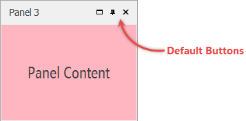
Default Panel Buttons
Default panel buttons are “Maximize”, “Auto-Hide” and “Close”.
You can hide unwanted default buttons for specific panels. To do so, use required properties from the DockPanel.Options section. To do this for all panels at once, utilize properties from the DockManager.DockingOptions group instead.
Close Button
- Available for both docked and floating panels.
- On this button click, a panel is placed into the DockManager.HiddenPanels collection. You can utilize this collection to restore a hidden panel by modifying its DockPanel.Visibility property.
If you want the close button to dispose of closed panels rather than move them to the
HiddenPanelscollection, handle the ClosedPanel event and destroy panels manually.
- The DockManager.ClosingPanel event occurs when end-users click this button.
- For tab containers, this button can hide either the currently active tab or the entire container. To select the desired behavior, utilize the DockingOptions.CloseActiveTabOnly property.
- Utilize the BaseDockOptions.ShowCloseButton property to hide the “Close” buttons for all panels or individual panels only.
Maximize Button
- Available for floating panels and child panels of split containers.
- Maximized floating panels occupy the entire screen. In split containers, maximized panels fill these containers almost entirely.
- Utilize the BaseDockOptions.ShowMaximizeButton property to hide maximize buttons for all panels or individual panels only.
Auto-Hide Button
- Not available for floating panels and panels docked to floating tab and split containers.
- Hidden panels are hosted within auto-hide containers.
- Utilize the BaseDockOptions.ShowAutoHideButton property to hide maximize buttons for all panels or individual panels only.
Modify Default Button Images
All DevExpress controls and their elements use images and image settings from skins. To modify DockPanel button images, run the WinForms Skin Editor and create a custom skin.
- In Skin Editor, go to the “Bars” collection and expand the “Dock Panel Button Glyphs” item.
- Select the required item state (for example, Normal) and load a new glyph. You can also colorize an existing image. To do this, double-click any glyph panel to open the Edit SVG Palette dialog, select the required glyph and set its new color.
- Save your custom skin, export it as a .dll assembly, and add this library to your Visual Studio project. See this help topic for more information: Export and Apply Custom Skins.
Add Custom Header Buttons To Dock Panels
To add custom header buttons at design time, click the ellipsis button next to the DockPanel.CustomHeaderButtons property to invoke the Collection Editor dialog. In this dialog, click the “Add” button to create header buttons for a panel.
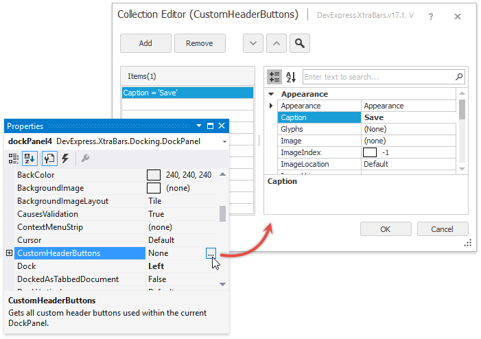
The property grid to the right of the Collection Editor allows you to modify button properties.
To add custom buttons in code, populate the DockPanel.CustomHeaderButtons collection with the CustomHeaderButton class instances.
Custom Button Types
There are three types of custom header buttons.
Push Buttons
- A regular push button created by default. Performs a specific action upon clicking.
- The IButtonProperties.Style property equals ButtonStyle.PushButton.
- The IButtonProperties.GroupIndex property equals -1.
- Fires the DockPanel.CustomButtonClick event when clicked at runtime.
Check Buttons
- A button that toggles through checked and unchecked states upon clicking.
- The IButtonProperties.Style property equals ButtonStyle.CheckButton.
- The IButtonProperties.GroupIndex property equals -1.
- The IButtonProperties.Checked property specifies the current button state (checked or unchecked).
- When a check button switches its state, it fires the IBaseButton.CheckedChanged event. Additionally, either the DockPanel.CustomButtonChecked or DockPanel.CustomButtonUnchecked event occurs.
- Check buttons do not trigger the CustomButtonClick event.
Radio Buttons
- Multiple check buttons united into a group, where only one button can be checked (pressed) at a time.
- The IButtonProperties.Style property equals ButtonStyle.CheckButton.
- The IButtonProperties.GroupIndex property is set to the same integer value like other radio buttons of the same group.
- Similarly to a single check button, radio buttons raisethe IBaseButton.CheckedChanged and DockPanel.CustomButtonChecked events. However, the DockPanel.CustomButtonUnchecked event never fires for radio buttons.
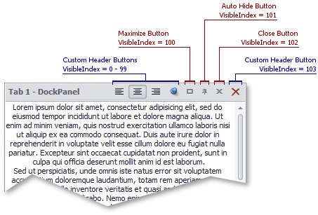
Arranging Default and Custom Header Buttons
Both default and custom header buttons are arranged depending on the VisibleIndex property value. The less a button visible index is, the closer this button will be to the panel caption. For default buttons, this value is fixed.
- “Maximize” - visible index is 100.
- “Auto-Hide” - visible index is 101.
- “Close” - visible index is 102.
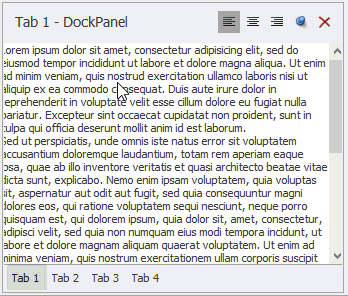
The following figure illustrates an example.
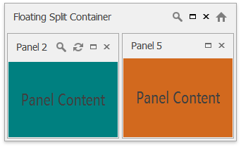
Buttons in Content Container Headers
Split and tab panel containers are objects of the DockPanel class and thus, they support header buttons. Header buttons for split containers are visible only when these containers float.
private void DockManager1_RegisterDockPanel(object sender, DockPanelEventArgs e) {
    if (e.Panel.Count != 0 && e.Panel.FloatForm != null) {
        e.Panel.ActiveChildChanged += Panel_ActiveChildChanged;
        e.Panel.Text = "Floating Split Container";
        e.Panel.CustomHeaderButtons.Add(new CustomHeaderButton(
            "Button 1", "Find;Size16x16;Grayscaled", HorizontalImageLocation.Default,
            DevExpress.XtraBars.Docking2010.ButtonStyle.PushButton, "Button 1",
            false, 50, -1));
        e.Panel.CustomHeaderButtons.Add(new CustomHeaderButton(
            "Button 2", "Home;Size16x16;Grayscaled", HorizontalImageLocation.Default,
            DevExpress.XtraBars.Docking2010.ButtonStyle.PushButton, "Button 2",
            false, 250, -1));
    }
}
For tab containers, their own headers merge with a header of a currently active tab. This means a tab container displays both standard and custom header buttons of its active tabs, plus custom buttons added to this container directly.
Auto-hide containers have no headers and cannot display any buttons.
Example
In this example, a tab container with four panels within has five custom buttons added to its header.
- The “Close” push button hides the currently active tab.
- The “Auto-Hide” check button hides and restores the tab container.
- Three “Align …” check buttons united in a single group apply different text alignment settings to memo edit controls, hosted within dock panels.
using System;
using System.Collections.Generic;
using System.ComponentModel;
using System.Data;
using System.Drawing;
using System.Linq;
using System.Text;
using System.Windows.Forms;
using DevExpress.XtraBars.Docking;
using DevExpress.XtraBars.Docking2010;
using DevExpress.Utils;
using DevExpress.XtraEditors;

namespace CustomHeaderButtonsExample {
    public partial class Form1 : Form {
        public Form1() {
            InitializeComponent();
            panelContainer1.CustomButtonUnchecked += new DevExpress.XtraBars.Docking2010.ButtonEventHandler(panelContainer1_CustomButtonUnchecked);
            panelContainer1.CustomButtonChecked += new DevExpress.XtraBars.Docking2010.ButtonEventHandler(panelContainer1_CustomButtonChecked);
            panelContainer1.CustomButtonClick += new DevExpress.XtraBars.Docking2010.ButtonEventHandler(panelContainer1_CustomButtonClick);
        }


        void panelContainer1_CustomButtonUnchecked(object sender, DevExpress.XtraBars.Docking2010.ButtonEventArgs e) {
            panelContainer1.Visibility = DockVisibility.Visible;
        }

        void panelContainer1_CustomButtonClick(object sender, DevExpress.XtraBars.Docking2010.ButtonEventArgs e) {
            panelContainer1.ActiveChild.Close();
        }

        void panelContainer1_CustomButtonChecked(object sender, DevExpress.XtraBars.Docking2010.ButtonEventArgs e) {
            if (e.Button == panelContainer1.CustomHeaderButtons[4]) (panelContainer1.ActiveChild.ControlContainer.Controls[0] as MemoEdit).Properties.Appearance.TextOptions.HAlignment = HorzAlignment.Near;
            if (e.Button == panelContainer1.CustomHeaderButtons[3]) (panelContainer1.ActiveChild.ControlContainer.Controls[0] as MemoEdit).Properties.Appearance.TextOptions.HAlignment = HorzAlignment.Center;
            if (e.Button == panelContainer1.CustomHeaderButtons[2]) (panelContainer1.ActiveChild.ControlContainer.Controls[0] as MemoEdit).Properties.Appearance.TextOptions.HAlignment = HorzAlignment.Far;
            if (e.Button == panelContainer1.CustomHeaderButtons[1]) panelContainer1.Visibility = DockVisibility.AutoHide;
        }
    }
}