Splash Screen Manager
- 2 minutes to read
The SplashScreenManager component allows you to create and display splash forms and images. The main features include:
- Manually show and hide splash screens.
- Automatically display and hide splash screens on the main form’s startup.
- Customize splash screens at design-time.
- Show splash forms in a separate thread.
- Splash screens can display interactive UI elements.
Note
Not all splash forms support all of these features. See below for more information.
Skin Splash Screen
A skin-aware splash screen.
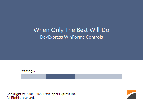
- The color and font settings are skin dependent.
- You can customize and show this splash screen in code.
See Skin Splash Screen.
Fluent Splash Screen
A Windows 10-inspired splash screen.
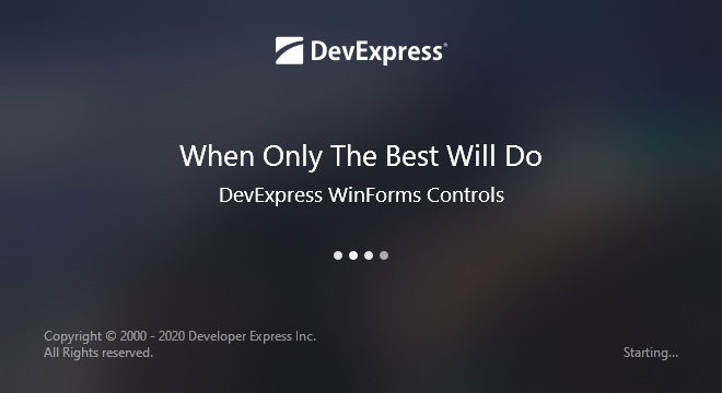
- Features an Acrylic material effect — a partially transparent texture.
- You can create and customize this splash screen in code.
See Fluent Splash Screen.
Default Splash Screen

- Non-skin dependent appearance.
- Supports design-time customization.
- Can be automatically shown and closed at main form startup.
See Splash Screen.
Splash Image
Displays any image as a splash screen.
- Image transparency is supported, so splash images may be of an irregular form and may contain shadows.
- Supports design-time customization.
- Can be automatically shown and closed at main form startup.
See Splash Image.
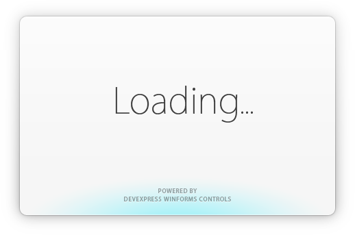
Overlay Form
A semi-transparent splash screen that overlays its parent control or form.

- Overlaps the parent form/control.
- Prevents users from accessing the parent form/control while the Overlay Form is visible.
- The wait indicator type and colors depend on the control’s skin.
See Overlay Form.
Wait Form
A skin-aware form designed to indicate progress of time-consuming operations.

- Contains an animated image and two labels.
- Can be used to indicate the progress of operations during your application run.
See Wait Form.
Examples
- How to: Dynamically Update Wait Form’s Caption or Description
- How to: Dynamically Update Custom Controls Added to Splash Forms
- How to: Show an Image as a Splash Screen and Draw Custom Information Over this Image
- How to: Display a Custom Button on an Overlay Form
- How to: Display a Loading Panel During a Time-Consuming Operation
- How to: Dynamically Change Wait Form Labels
- How to: Cancel a Time-Consuming Operation (Wait Form)
- How to: Display a Splash Image with Custom Information
- How to: Interact with the Splash Screen by Sending Commands
- WinForms Overlay Form - Display a Custom Button