Customize an Application Appearance
- 2 minutes to read
You can change the appearance of an application built with DevExpress WPF controls and standard WPF controls in any of the following ways:
Switch an Application Theme
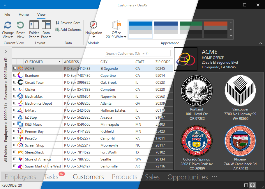
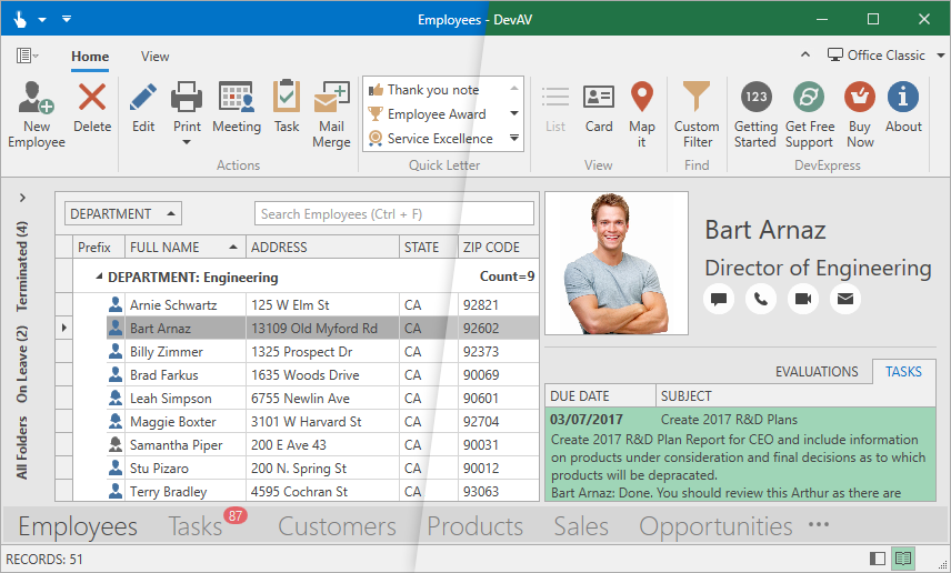
The DevExpress WPF Subscription ships with over thirty custom designed application themes. Themes change the appearance (colors, padding values, margins, and more) of DevExpress WPF controls and standard WPF controls. Refer to the following topic for information on how to switch an application theme: WPF Application Themes.

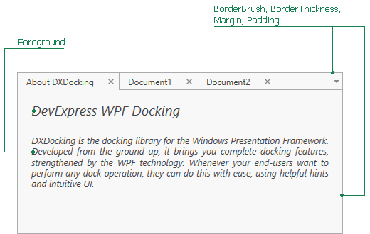
Use a Control’s Built-in Appearance Customization Properties

Refer to the following topics for information on available appearance customization properties:
- GridControl
- Ribbon, Bars and Menu
- Data Editors
- Dock Layout Manager
- Property Grid
- Gantt Control
- Scheduler
- Pivot Grid
- Navigation Bar
- Diagram Control
Modify Theme Palettes
The following DevExpress WPF themes include palettes:
| Theme Family | Themes |
|---|---|
| Windows 11 | Dark, Light |
| Windows 10 | Dark, Light |
| Office 2019 | Black, Colorful, Dark Gray, White, HighContrast |
| Visual Studio 2019 | Blue, Dark, Light |
| Office 2016 SE | Black, Colorful, Dark Gray, White |
| Visual Studio 2017 | Blue, Dark, Light |
Palettes allow you to integrate colors (for example, corporate colors) into your application and customize colors used in these themes.

Follow the steps below to apply a custom palette to an application:
- Create a custom palette in code.
- Generate a new theme that includes this palette.
- Apply the theme to an application.
Use the WPF Theme Designer
You can also create custom theme palettes in the WPF Theme Designer tool in any of the following ways:
Create a custom palette and generate a new theme assembly that includes this palette.
Create a custom palette and export it as a class to a .cs file.
Modify Theme Resources (Advanced Approach)
If a visual element has no associated appearance property or palette color, you can modify this element’s theme resources in your application.