Shapes in the DiagramControl are colored according to the applied theme. To create a custom theme, add a resource dictionary with a DevExpress.Diagram.Core.Themes.Theme element to your application.
Each theme should contain a color palette. To specify a color palette, add the DevExpress.Diagram.Core.Themes.ColorPalette element into the DevExpress.Diagram.Core.Themes.Theme.
To specify how colors are used in a theme, set the Theme.Effects property. This property accepts the DevExpress.Diagram.Core.Themes.EffectCollection object that defines colors shown in the following gallery:
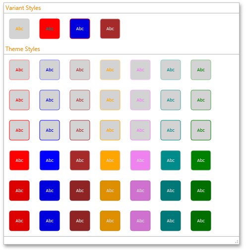
DevExpress.Diagram.Core.Themes.EffectCollection has the following properties:
- ThemeEffects - Specifies colors in the “Theme Styles” group.
- VariantEffects - Specifies colors in the “Variant Styles” group. When a shape is created its default color scheme is taken from this group.
- ConnectorEffects - Specifies connector colors.
To register a custom theme, use the ThemeRegistrator.RegisterThemes method.
<Window
        xmlns="http://schemas.microsoft.com/winfx/2006/xaml/presentation"
        xmlns:x="http://schemas.microsoft.com/winfx/2006/xaml"
        xmlns:dx="http://schemas.devexpress.com/winfx/2008/xaml/core"
        xmlns:dxdiag="http://schemas.devexpress.com/winfx/2008/xaml/diagram"
        dx:ThemeManager.ThemeName="MetropolisLight"
        x:Class="CustomShapeThemes.MainWindow"
        Title="MainWindow" Height="700" Width="1100">
    <Grid>

        <dxdiag:DiagramDesignerControl SelectedStencils="BasicShapes, BasicFlowchartShapes" Name="diagramControl"/>

    </Grid>
</Window>
using DevExpress.Diagram.Core;

using System;
using System.Collections.Generic;
using System.Linq;
using System.Text;
using System.Threading.Tasks;
using System.Windows;
using System.Windows.Controls;
using System.Windows.Data;
using System.Windows.Documents;
using System.Windows.Input;
using System.Windows.Media;
using System.Windows.Media.Imaging;
using System.Windows.Navigation;
using System.Windows.Shapes;

namespace CustomShapeThemes
{
    /// <summary>
    /// Interaction logic for MainWindow.xaml
    /// </summary>
    public partial class MainWindow : Window
    {
        public MainWindow()
        {
            InitializeComponent();
            InitCustomShapeTheme();
        }

        void InitCustomShapeTheme()
        {
            ResourceDictionary customShapeThemeDictionary = new ResourceDictionary() { Source = new Uri("CustomShapeTheme.xaml", UriKind.Relative) };
            ThemeRegistrator.RegisterThemes(customShapeThemeDictionary, (name) => name);
            diagramControl.Theme = ThemeRegistrator.GetTheme("MyTheme");
        }
    }
}
<p:ResourceDictionary xmlns="http://schemas.devexpress.com/winfx/2008/xaml/diagram"
                    xmlns:x="http://schemas.microsoft.com/winfx/2006/xaml"
                    xmlns:p="http://schemas.microsoft.com/winfx/2006/xaml/presentation">
    <Theme x:Key="{ThemeKey MyTheme}" FontSize="10" FontFamily="Calibri">
        <ColorPalette Dark="Green" Light="LightGray" Accent1="Red" Accent2="Blue" Accent3="Brown" Accent4="Orange" Accent5="Violet" Accent6="DarkCyan" />
        <Theme.Effects>
            <EffectCollection>
                <EffectCollection.ThemeEffects>
                    <Effect Background="Light" Foreground="Accent" Stroke="ChangeBrightness(Accent, 0.5)" />
                    <Effect Background="Light" Foreground="Accent" Stroke="ChangeBrightness(Accent, 0.25)" />
                    <Effect Background="Light" Foreground="Accent" Stroke="Accent" />
                    <Effect Background="Accent" Foreground="Light" Stroke="Color('#FFC8C8C8')" />
                    <Effect Background="ChangeBrightness(Accent, -0.13)" Foreground="Light" Stroke="ChangeBrightness(Accent, -0.25)" />
                    <Effect Background="ChangeBrightness(Accent, -0.13)" Foreground="Light" Stroke="ChangeBrightness(Accent, -0.25)" />
                </EffectCollection.ThemeEffects>
                <EffectCollection.VariantEffects>
                    <Effect Background="Light" Foreground="Accent4" Stroke="Color('#FFC8C8C8')" />
                    <Effect Background="Accent1" Foreground="Accent6" Stroke="Accent1" />
                    <Effect Background="ChangeBrightness(Accent2, -0.13)" Foreground="Light" Stroke="ChangeBrightness(Accent1, -0.2)" />
                    <Effect Background="Accent3" Foreground="Light" Stroke="Color('#FFC8C8C8')" />
                </EffectCollection.VariantEffects>
                <EffectCollection.ConnectorEffects>
                    <Effect Background="Light" Foreground="Accent" Stroke="Accent" />
                    <Effect Background="Light" Foreground="Accent" Stroke="Accent" StrokeDashArray="4,4" />
                    <Effect Background="Light" Foreground="Accent" Stroke="Accent" StrokeThickness="2" />
                </EffectCollection.ConnectorEffects>
            </EffectCollection>
        </Theme.Effects>
    </Theme>
</p:ResourceDictionary>
Imports DevExpress.Diagram.Core

Imports System
Imports System.Collections.Generic
Imports System.Linq
Imports System.Text
Imports System.Threading.Tasks
Imports System.Windows
Imports System.Windows.Controls
Imports System.Windows.Data
Imports System.Windows.Documents
Imports System.Windows.Input
Imports System.Windows.Media
Imports System.Windows.Media.Imaging
Imports System.Windows.Navigation
Imports System.Windows.Shapes

Namespace CustomShapeThemes
    ''' <summary>
    ''' Interaction logic for MainWindow.xaml
    ''' </summary>
    Partial Public Class MainWindow
        Inherits Window

        Public Sub New()
            InitializeComponent()
            InitCustomShapeTheme()
        End Sub

        Private Sub InitCustomShapeTheme()
            Dim customShapeThemeDictionary As New ResourceDictionary() With {.Source = New Uri("CustomShapeTheme.xaml", UriKind.Relative)}
            ThemeRegistrator.RegisterThemes(customShapeThemeDictionary, Function(name) name)
            diagramControl.Theme = ThemeRegistrator.GetTheme("MyTheme")
        End Sub
    End Class
End Namespace