TdxOfficeSearchBoxProperties Class
Stores Office Search Box settings.
Declaration
TdxOfficeSearchBoxProperties = class(
    TcxCustomTextEditProperties
)
Remarks
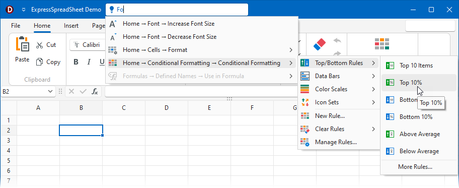
The Office Search Box editor is an auxiliary UI element inspired by the Tell Me text box found in Microsoft Office® applications. The Office Search Box simplifies command search in a complex Ribbon or Toolbar UI.

Main API Members
The list below outlines key members of the TdxOfficeSearchBoxProperties class. These members allow you to configure Office Search Box editors.
Appearance Settings
- Glyph
- Specifies an editor glyph.
- Nullstring | UseNullString
- Allow you to display custom text in the Office Search Box when it is empty (has the Null edit value).
- UseStrokeColorForGlyphPalette
- Specifies if the editor uses text color to draw vector glyph outlines or fill vector glyph shapes.
User Interaction Options
- Automation
- Provides access to [UI Automation] and accessibility settings.
- AutoSelect
- Specifies if the editor automatically selects content when input focus moves to the editor.
- ClearKey | ClickKey
- Allow you to associate keystrokes with basic user actions.
UI Command Search API Members
- BarManager | Ribbon
- Specify the parent Bar Manager component and the Ribbon control used as the source of appearance settings.
- GetPaths
- Returns all UI paths to the target command in the current search source.
- MaxResultCount
- Limits the number of displayed search results.
- OnDropDownMenuItemAdded
- Allows you to execute custom code in response to search result population.
- OnDropDownMenuItemAdding | OnDropDownMenuPopulate
- Allow you to customize the search result list.
- RecursiveSearch
- Specifies if search results can include nested UI elements.
- SearchSource
- Specifies the source component (the TdxBarManager component or a TdxRibbon control) for UI command search.
- ShowResultPaths
- Specifies if search results display default (shortest) paths to corresponding Ribbon or Toolbar UI items.
General-Purpose API Members
- Assign
- Copies settings between Office Search Box editors.
- BeginUpdate | EndUpdate
- Allow you to avoid excessive redraw operations during batch editor setting changes.
Code Example: Display an Office Search Box in a Ribbon Form Caption
The following code example creates a TdxOfficeSearchBox editor, associates it with an existing TdxRibbon control, and embeds the created editor into the Ribbon Form caption:
uses
  dxRibbonForm,  // Declares the TdxRibbonForm class
  dxOfficeSearchBox; // Declares the TdxOfficeSearchBox class
// ...
procedure TMyForm.FormCreate(Sender: TObject);
var
  ABar: TdxBar;
  ABarItem: TcxBarEditItem;
  ASearchBoxProperties: TdxOfficeSearchBoxProperties;
  AIconFolder: string;
begin
  DisableAero := True; // Allows the DevExpress Skin Engine to draw non-client form areas
  AIconFolder := 'C:\Program Files (x86)\DevExpress\VCL\ExpressLibrary\Sources\Icon Library\';
  dxRibbon1.Style := rsOffice365;  // Selects the Office 365 style with support for form caption toolbars
  ABar := dxBarManager1.Bars.Add;  // Creates a toolbar as a container for the Office Search Box
  ABar.Visible := True;  // Displays the created toolbar container
  ABarItem := ABar.ItemLinks.AddItem(TcxBarEditItem).Item as TcxBarEditItem;
  ABarItem.PropertiesClass := TdxOfficeSearchBoxProperties;
  ASearchBoxProperties := ABarItem.Properties as TdxOfficeSearchBoxProperties;
  ASearchBoxProperties.BeginUpdate;  // Initiates the following batch change
  try
    ASearchBoxProperties.SearchSource := dxRibbon1;  // Associates the Office Search Box with the Ribbon UI
    ASearchBoxProperties.Nullstring := 'Tell me what you want to do...';
    ASearchBoxProperties.UseNullString := True;  // Displays the defined null string in the empty editor
    ASearchBoxProperties.Glyph.LoadFromFile(AIconFolder + 'SVG Images\Icon Builder\Business_Idea.svg');
    ASearchBoxProperties.Glyph.SourceWidth := 16;  // Explicitly specifies the required glyph width
    ASearchBoxProperties.Glyph.SourceHeight := 16;  // Explicitly specifies the required glyph height
    ASearchBoxProperties.ShowResultPaths := True;  // Displays navigation paths to found UI commands
  finally
    ASearchBoxProperties.EndUpdate;  // Calls EndUpdate regardless of the batch operation's success
  end;
  dxRibbon1.CaptionAreaSearchToolbar.Toolbar := ABar;  // Displays the toolbar container in the caption area
  dxRibbon1.CaptionAreaSearchToolbar.Alignment := TdxRibbonCaptionAreaSearchToolbarAlignment.Left;
end;

Direct TdxOfficeSearchBoxProperties Class References
The following public API members reference a TdxOfficeSearchBoxProperties object:
- TdxOfficeSearchBox.ActiveProperties
- Provides access to active office search box settings.
- TdxOfficeSearchBox.Properties
- Provides access to search box properties.
Inheritance
TObject
TPersistent
TInterfacedPersistent
TcxInterfacedPersistent
TcxCustomEditProperties
TcxCustomTextEditProperties
TdxOfficeSearchBoxProperties
See Also