ASPxListBox Class
A list box control.
Namespace: DevExpress.Web
Assembly: DevExpress.Web.v19.2.dll
Declaration
public class ASPxListBox :
    ASPxListEdit,
    IListBoxColumnsOwner,
    IMultiSelectListEdit,
    IControlDesigner,
    IListEditPropertyDescriptorsOwner,
IListEditServerModeOwnerRemarks
The ASPxListBox allows you to display a list of items which can be selected by end-users.
Create a List Box
Design Time
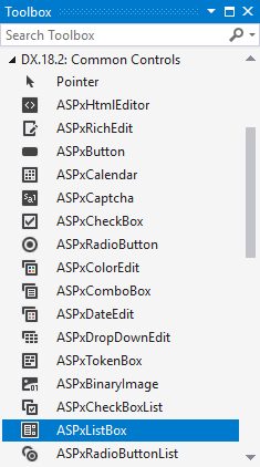
The ASPxListBox control is available on the DX.19.2: Common Controls toolbox tab in the Microsoft Visual Studio IDE.
Drag the control onto a form and customize control settings, or paste the control markup in the page’s source code.
<dx:ASPxListBox ID="ASPxListBox1" runat="server" Width="100">
    <Items>
        <dx:ListEditItem Text="Item 1" Value="Item 1" />
        <dx:ListEditItem Text="Item 2" Value="Item 2" />
        <dx:ListEditItem Text="Item 3" Value="Item 3" />
    </Items>
</dx:ASPxListBox>
Run Time
protected void Page_Load(object sender, EventArgs e)
{
    ASPxListBox listBox = new ASPxListBox();
    listBox.ID = "ASPxListBox1";
    form1.Controls.Add(listBox);
    listBox.Items.Add(new ListEditItem("Item 1"));
    listBox.Items.Add(new ListEditItem("Item 2"));
    listBox.Items.Add(new ListEditItem("Item 3"));
}
Client-Side API
The ASPxListBox‘s client-side API is implemented with JavaScript language and exposed by the ASPxClientListBox object.
Availability | Available by default. |
Class name | |
Access name | |
Events |
<dx:ASPxListBox ID="ASPxListBox1" runat="server" Theme="Office365" ClientInstanceName="listBox">
    <Items>
        <dx:ListEditItem Text="Item1" Value="10" />
        <dx:ListEditItem Text="Item2" Value="20" />
        <dx:ListEditItem Text="Item3" Value="30" />
    </Items>
</dx:ASPxListBox>
<br />
<dx:ASPxButton ID="ASPxButton1" runat="server" AutoPostBack="False" Text="Get Item's Info" Theme="Office365">
    <ClientSideEvents Click="function(s, e) {
        var item = listBox.GetSelectedItem();
        memo.SetText('Text: ' + item.text + '\n' + 'Value: ' + item.value + '\n' + 'Selected: ' + item.selected + '\n' + 'Index: ' + item.index );
    }" />
</dx:ASPxButton>
<br /><br />
<dx:ASPxMemo ClientInstanceName="memo" ID="ASPxMemo1" runat="server" Height="71px" Width="170px"></dx:ASPxMemo>
Features
Common Concept
You can populate the ASPxListBox manually or bind it to a data source. The editor stores its items in the ASPxListEdit.Items collection. You can specify the caption text (ListEditItem.Text), associated value (ListEditItem.Value) and display image (ListEditItem.ImageUrl) for an individual item.
Note
Each item in the ASPxListEdit.Items collection should be unique. There should not be two or more list items with the same value (ListEditItem.Value).
Data Binding
Use the ASPxListEdit.DataSourceID (ASPxEditBase.DataSource) and ASPxEditBase.DataMember properties to bind a list box to a data source.
The following properties allow you to specify an item characteristics (text, value and image) that are obtained from specific data fields:
- The ASPxListEdit.TextField property.
- The ASPxListEdit.ValueField property.
- The ASPxListEdit.ImageUrlField property.
Note
An item’s value (ASPxListEdit.ValueField](xref:DevExpress.Web.ASPxListEdit.ValueField)) should be unique.
<dx:ASPxListBox ID="ASPxListBox1" runat="server" Height="160px" Theme="Office365" DataSourceID="SqlDataSource1" >
    <Columns>
        <dx:ListBoxColumn FieldName="OrderID" Width="60" />
        <dx:ListBoxColumn FieldName="ShipCity" Width="130" />
        <dx:ListBoxColumn FieldName="ShipCountry" Width="130" />
    </Columns>
</dx:ASPxListBox>

<asp:SqlDataSource ID="SqlDataSource1" runat="server" ConnectionString="Provider=Microsoft.Jet.OLEDB.4.0;Data Source=F:\Docs\DB\nwind.mdb"
  ProviderName="System.Data.OleDb" SelectCommand="SELECT [OrderID], [ShipCity], [ShipCountry] FROM [Orders]">
</asp:SqlDataSource>
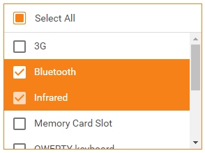
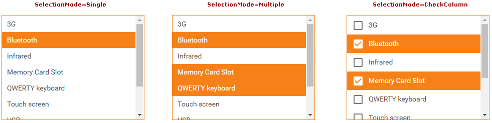
Multiple Selection
The ASPxListBox allows you to select multiple list items at the same time (SelectionMode). The following selection modes are available:
<dx:ASPxListBox ID="ASPxListBox1" runat="server" Width="100" SelectionMode="CheckColumn">
    <Items>
        <dx:ListEditItem Text="Item 1" Value="Item 1" />
        <dx:ListEditItem Text="Item 2" Value="Item 2" />
        <dx:ListEditItem Text="Item 3" Value="Item 3" />
    </Items>
</dx:ASPxListBox>
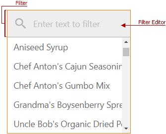
Filtering
End-users can enter text in the filter editor above the list to filter list box items. Set the ShowSearchUI property to true to set the search editor visible.
<dx:ASPxListBox ID="ASPxListBox1" runat="server" ValueType="System.String"
TextField="ProductName" ValueField="ProductName" Width="200px" Height="200px"
Theme="Office365" DataSourceID="SqlDataSource1">
    <FilteringSettings ShowSearchUI="true" />
</dx:ASPxListBox>
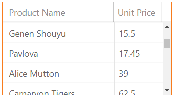
Multi-Column Mode
The list box allows you to display its data (from a data source) in several columns. Use the ASPxListBox.Columns property to access the control’s columns collection.
<dx:ASPxListBox ID="ASPxListBox1" runat="server" Height="150px" Theme="Office365"
DataSourceID="SqlDataSource1">
    <Columns>
        <dx:ListBoxColumn FieldName="ProductName" Width="160" />
        <dx:ListBoxColumn FieldName="UnitPrice" Width="60" />
    </Columns>
</dx:ASPxListBox>
Item Appearance Customization
Use the ASPxListBox.ItemStyle property to define the common item style. The ASPxListBox.ItemImage property allows you to specify the common image settings.
Use the ItemTextCellPrepared event (for cells) and the ItemRowPrepared event (for rows) to customize list box items’ appearance.
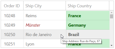
<style type="text/css">
    .city {
        color: #9C0006;
        font-style: italic;
    }
    .country {
        color: #006100;
        background-color: #C6EFCE;
        font-weight: bold;
    }
</style>
<dx:ASPxListBox ID="ASPxListBox1" runat="server" Height="160px" Theme="Office365" DataSourceID="SqlDataSource1"
  OnItemRowPrepared="ASPxListBox1_ItemRowPrepared" OnItemTextCellPrepared="ASPxListBox1_ItemTextCellPrepared" >
    <Columns>
        <dx:ListBoxColumn FieldName="OrderID" Width="60" />
        <dx:ListBoxColumn FieldName="ShipCity" Width="130" />
        <dx:ListBoxColumn FieldName="ShipCountry" Width="130" />
    </Columns>
</dx:ASPxListBox>
protected void ASPxListBox1_ItemRowPrepared(object sender, ListBoxItemRowPreparedEventArgs e)
{
    e.Row.ToolTip = "Ship Address: " + e.Item.GetFieldValue("ShipAddress").ToString();
}

protected void ASPxListBox1_ItemTextCellPrepared(object sender, ListBoxItemTextCellPreparedEventArgs e)
{
    if (e.Column.FieldName == "ShipCity")
    {
        if (e.Item.GetFieldValue("ShipCity").ToString().Contains("er") == true)
        {
            e.TextCell.CssClass += " city";
        }
    }
    if (e.Column.FieldName == "ShipCountry")
        e.TextCell.CssClass += " country";
}
Built-in Validation
You can validate the list box data both on the client and server side.
Online Demos
Online Examples
ASPxListBox - How to implement a hyperlink in items of a specific column
How to drag and drop items from/to ASPxListBox using jQuery UI
How to drag-and-drop elements from ASPxTreeList to ASPxListBox
Moving items between two ASPxListBoxes (server-side approach)