EditButton Class
Represents a button for a button editor control.
Namespace: DevExpress.Web
Assembly: DevExpress.Web.v19.2.dll
Declaration
Related API Members
The following members return EditButton objects:
Remarks
The EditButton class implements the functionality of an individual button displayed within button editors of different types (such as the ASPxButtonEdit, ASPxDateEdit, ASPxComboBox). Instances of the EditButton class are maintained within the EditButtonCollection collection which can be accessed via the ASPxButtonEditBase.Buttons property of a button editor.
Use the properties of the EditButton class to specify an individual edit button’s characteristics. You can define the EditButton.Text, EditButton.Image and EditButton.ImagePosition properties to specify the button’s caption text, displayed image and the image’s position within the button. The button’s width and position within a button editor can be specified via the EditButton.Width and EditButton.Position properties. The EditButton.Visible and EditButton.Enabled properties control the button’s visibility and availability to end-users.
<dx:ASPxButtonEdit ID="ASPxButtonEdit2" runat="server">
    <ClientSideEvents ButtonClick="OnButtonClick" />
    <Buttons>
        <dx:EditButton Text="AA">
        </dx:EditButton>
        <dx:EditButton Text="BB">
        </dx:EditButton>
    </Buttons>
</dx:ASPxButtonEdit>
function OnButtonClick(s, e) {
    var buttonElement = s.GetButton(e.buttonIndex);
    alert("Button " + buttonElement.innerText + " is clicked");
}
Example
This example demonstrates how to customize the collection of an editor’s edit buttons and how to change the DropDownButton position.
The default drop-down button’s position can be changed via the EditButton.Position property. Using this property, you can display the button at the left or at the right control side. To display the drop-down button at the custom position (between other edit buttons), hide the default button using the EditButton.Visible property. After that, you can create a custom drop-down button in the required place.
Note
To work properly, a control should have only one drop-down button: a default one or custom one (with a hidden default drop-down button).
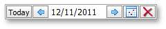
The code sample below demonstrates how to create a custom EditButtonCollection within the ASPxDateEdit control. The image below shows the result.
<dx:ASPxDateEdit ID="ASPxDateEdit1" runat="server" Width="220px" ClientInstanceName="dateedit">
     <ClientSideEvents ButtonClick="onButtonClick" />
     <DropDownButton Visible="False">
     </DropDownButton>
     <Buttons>
          <dx:EditButton Text="Today" Position="Left" ToolTip="Today">
          </dx:EditButton>
          <dx:EditButton Position="Left" ToolTip="Previous day">
               <Image Url="~/Left.png">
               </Image>
          </dx:EditButton>
          <dx:EditButton ToolTip="Next day">
               <Image Url="~/Right.png">
               </Image>
          </dx:EditButton>
          <dx:DropDownButton ToolTip="Show calendar">
               <Image Url="~/Calendar.png">
               </Image>
          </dx:DropDownButton>
          <dx:EditButton ToolTip="Clear">
               <Image Url="~/Clear.png">
               </Image>
          </dx:EditButton>
     </Buttons>
</dx:ASPxDateEdit>
function onButtonClick (s, e) {
     var date = dateedit.GetDate();
     switch (e.buttonIndex) {
          case 0:
               var today = new Date();
               dateedit.SetDate(today);
               break;
          case 1:
               date.setDate(date.getDate() - 1);
               dateedit.SetDate(date);
               break;
          case 2:
               date.setDate(date.getDate() + 1);
               dateedit.SetDate(date);
               break;
          case 4:
               dateedit.SetValue(null);
     };
}