ASPxRibbon Class
A ribbon control.
Namespace: DevExpress.Web
Assembly: DevExpress.Web.v19.2.dll
Declaration
public class ASPxRibbon :
    ASPxHierarchicalDataWebControl,
    IParentSkinOwner,
    ISkinOwner,
    IPropertiesOwner,
    IControlDesigner,
IRequiresLoadPostDataControlRelated API Members
The following members return ASPxRibbon objects:
Remarks
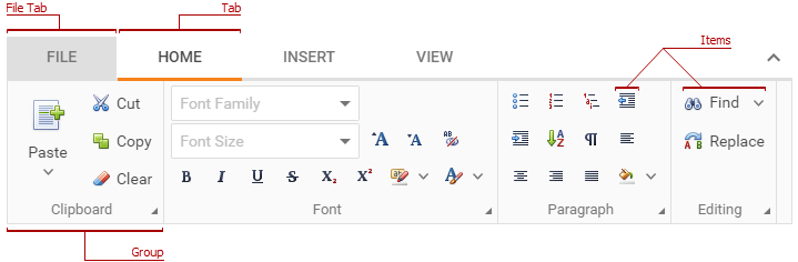
The ASPxRibbon is a tabbed toolbar that allows you to place command items on several tabs.

Create a Ribbon
Design Time
The ASPxRibbon control is available on the DX.19.2: Navigation & Layout toolbox tab in the Microsoft Visual Studio IDE.

Drag the control onto a form and customize control settings, or paste the control markup in the page’s source code.
<dx:ASPxRibbon ID="ASPxRibbon1" runat="server">
    <Tabs>
        <dx:RibbonTab Name="Home" Text="Home" />
        <dx:RibbonTab Name="Insert" Text="Insert" />
    </Tabs>
</dx:ASPxRibbon>
Run Time
using DevExpress.Web;
...
protected void Page_Load(object sender, EventArgs e) {
    ASPxRibbon ribbon = new ASPxRibbon();
    ribbon.ID = "ASPxRibbon1";

    RibbonTab tab1 = new RibbonTab("Home");
    RibbonTab tab2 = new RibbonTab("Insert");
    ribbon.Tabs.Add(tab1);
    ribbon.Tabs.Add(tab2);

    // Adds the created control to the page
     Page.Form.Controls.Add(ribbon1);
}
Client-Side API
The ASPxRibbon‘s client-side API is implemented with JavaScript language and exposed by the ASPxClientRibbon object.
Availability | Available by default. |
Class name | |
Access name | |
Events |
<dx:ASPxRibbon ID="ASPxRibbon1" runat="server" ClientInstanceName="ribbon">
    //...
</dx:ASPxRibbon>
function buttonClick(){
    // Makes a tab with the specified index active.
    ribbon.SetActiveTabIndex(2);
}
Common Concept
The ribbon stores a set of tabs (RibbonTab) in the Tabs collection. You can specify an individual tab’s header text (Text), name (Name) and the visibility (Visible).
<dx:ASPxRibbon ID="ASPxRibbon1" ...>
    <Tabs>
        <dx:RibbonTab Name="Home" Text="Home" />
        <dx:RibbonTab Name="Insert" Text="Insert" Visible="False" />
    </Tabs>
</dx:ASPxRibbon>
To hide all tab headers, set the ASPxRibbon.ShowTabs property to false.
<dx:ASPxRibbon ID="ASPxRibbon1" ShowTabs="False" >
</dx:ASPxRibbon>
The “File” tab is the first tab in the ribbon’s header. Its visibility depends on the ASPxRibbon.ShowFileTab property value. Note that the ribbon does not store the “File” tab in the tab collection (RibbonTabCollection).
<dx:ASPxRibbon ID="ASPxRibbon1" runat="server" ShowFileTab="False" >
</dx:ASPxRibbon>
A tab (RibbonTab) contains groups (RibbonGroup) with items (RibbonItemBase). You can use the RibbonTab.Groups and RibbonGroup.Items properties to access groups and group items in a tab.
Use the RibbonGroup.Text property to specify a group’s label. To hide all group labels in the ribbon, set the ASPxRibbon.ShowGroupLabels property to false.
<dx:ASPxRibbon ID="ASPxRibbon1" ShowGroupLabels="False" ...>
    <Tabs>
        <dx:RibbonTab Name="Home" Text="Home">
            <Groups>
                <dx:RibbonGroup Name="Clipboard" Text="Clipboard">
                    <Items>
                        <dx:RibbonButtonItem Name="Cut" Text="Cut" />
                        <dx:RibbonButtonItem Name="Copy" Text="Copy" />
                    </Items>
                </dx:RibbonGroup>
            </Groups>
        </dx:RibbonTab>
    </Tabs>
</dx:ASPxRibbon>
Features
Data Binding
Use the ASPxHierarchicalDataWebControl.DataSourceID or ASPxDataWebControlBase.DataSource property to bind the ribbon to a data source.
<dx:ASPxRibbon ID="Ribbon" runat="server" DataSourceID="RibbonDataSource" />
Mappings specify which field in a data source corresponds to an object’s property.
Object | Mappings |
|---|---|
Tab | |
Group | |
Item |
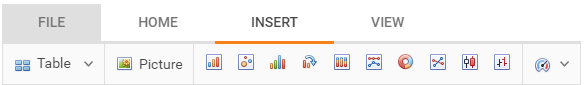
Item Types
The ribbon allows you to use different editors as items (button, text box, combo box and others).
<dx:ASPxRibbon ID="ASPxRibbon1" ShowGroupLabels="False" ...>
    <Tabs>
        <dx:RibbonTab Name="Home" Text="Home">
            <Groups>
                <dx:RibbonGroup Name="Clipboard" Text="Clipboard">
                    <Items>
                        <dx:RibbonButtonItem Name="Cut" Text="Cut" />
                        <dx:RibbonComboBoxItem Name="Font Family">
                            // ...
                        </dx:RibbonComboBoxItem>
                    </Items>
                </dx:RibbonGroup>
            </Groups>
        </dx:RibbonTab>
    </Tabs>
</dx:ASPxRibbon>
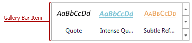
Gallery Items
The ribbon provides a gallery bar (RibbonGalleryBarItem) and drop-down gallery (RibbonGalleryDropDownItem) items to display image lists in the ribbon.
<dx:ASPxRibbon ID="ASPxRibbon1" ShowGroupLabels="False" ...>
    <Tabs>
        <dx:RibbonTab Text="Home">
            <Groups>
                <dx:RibbonGroup Text="Font">
                    <Items>
                        <!-- Gallery Bar -->
                        <dx:RibbonGalleryBarItem >
                            <Groups>
                                <dx:RibbonGalleryGroup>
                                    <Items>
                                        ...
                                    </Items>
                                </dx:RibbonGalleryGroup>
                            </Groups>
                        </dx:RibbonGalleryBarItem>

                        <!-- Drop-Down Gallery -->
                        <dx:RibbonGalleryDropDownItem >
                            <Groups>
                                <dx:RibbonGalleryGroup>
                                    <Items>
                                        ...
                                    </Items>
                                </dx:RibbonGalleryGroup>
                            </Groups>
                        </dx:RibbonGalleryDropDownItem>
                    </Items>
                </dx:RibbonGroup>
            </Groups>
        </dx:RibbonTab>
    </Tabs>
</dx:ASPxRibbon>
Context Tabs
The ribbon supports context tabs (RibbonContextTabCategory) and stores them in the ContextTabCategories collection.
<dx:ASPxRibbon ID="ASPxRibbon1" ShowGroupLabels="False" ...>
    <Tabs>
        ...
    </Tabs>
    <ContextTabCategories>
        <dx:RibbonContextTabCategory Name="Table tools" ...>
            <Tabs>
                <dx:RibbonTab Text="Design" />
                ...
            </Tabs>
        </dx:RibbonContextTabCategory>
    </ContextTabCategories>
</dx:ASPxRibbon>
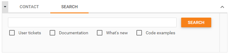
Templates
You can provide custom content for the ribbon’s elements: file tab (FileTabTemplate) and item (Template).
<dx:ASPxRibbon ID="Ribbon" >
    <Tabs>
        <dx:RibbonTab Text="Search">
            <Groups>
                <dx:RibbonGroup Text="">
                    <Items>
                        <dx:RibbonTemplateItem Size="Large">
                            <Template>
                                <table><tr>
                                    <td>
                                        <dx:ASPxTextBox ID="SearchTextBox" />
                                    </td>
                                    <td>
                                        <dx:ASPxButton ID="SearchButton" />
                                    </td>
                                </tr></table>
                                <dx:ASPxCheckBoxList runat="server" >
                                    <Items>
                                        <dx:ListEditItem Text="User tickets" />
                                        <dx:ListEditItem Text="Documentation" />
                                        <dx:ListEditItem Text="What's new" />
                                        <dx:ListEditItem Text="Code examples" />
                                    </Items>
                                </dx:ASPxCheckBoxList>
                            </Template>
                        </dx:RibbonTemplateItem>
                    </Items>
                </dx:RibbonGroup>
            </Groups>
        </dx:RibbonTab>
    </Tabs>
</dx:ASPxRibbon>
One-Line Mode
The ribbon can display all items within an active tab in one line (OneLineMode), which makes the ribbon look more compact.
<dx:ASPxRibbon ID="ASPxRibbon1" OneLineMode="true" ...>
</dx:ASPxRibbon>