ASPxLoadingPanel Class
An ASPxLoadingPanel control.
Namespace: DevExpress.Web
Assembly: DevExpress.Web.v19.2.dll
Declaration
Remarks
The ASPxLoadingPanel is a panel with text and image. An end user can display and hide it when it is required (for example, while a callback is being processed on the server side).

Create a Loading Panel
Design Time
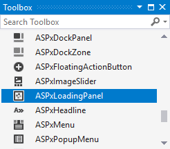
The ASPxLoadingPanel control is available on the DX.19.2: Navigation & Layout toolbox tab in the Microsoft Visual Studio IDE.

Drag the control onto a form and customize control settings, or paste the control markup in the page’s source code.
<dx:ASPxLoadingPanel ID="ASPxLoadingPanel1" runat="server" Text="Loading...">
</dx:ASPxLoadingPanel>
Run Time
using DevExpress.Web;
...
protected void Page_Load(object sender, EventArgs e) {
    ASPxLoadingPanel panel = new ASPxLoadingPanel();
    panel.ID = "ASPxLoadingPanel1";
    form1.Controls.Add(panel);
    panel.Text = "Loading...";
}
Client-Side API
The ASPxLoadingPanel‘s client-side API is implemented with JavaScript language and exposed by the ASPxClientLoadingPanel object.
Availability | Available by default. |
Class name | |
Access name | |
Events |
Features
Container Element
You can display the loading panel over the entire page or a specified HTML element (ContainerElementID).
<dx:ASPxLoadingPanel ID="ASPxLoadingPanel1" runat="server"
  ClientInstanceName="lPanel" ContainerElementID="myDiv" Modal="True" ...>
</dx:ASPxLoadingPanel>

<div style="width:500px; height:300px; border: 1px solid red;" id="myDiv">
TEST
</div>
<dx:ASPxButton ID="ASPxButton1" runat="server" Text="ASPxButton"
    AutoPostBack="False">
    <ClientSideEvents Click="function(s, e) {
          lPanel.Show();
    }" />
</dx:ASPxButton>
Modal Mode
You can display the loading panel in modal mode (ASPxLoadingPanel.Modal). In this mode, the loadting panel retains the input focus while active. The user cannot switch the focus to the page until the loading panel is not hidden by the code. In modal mode, the loading panel covers the entire page behind it (or just the element specified via the ASPxLoadingPanel.ContainerElementID property) with a specific Loading DIV element.
<dx:ASPxLoadingPanel ID="ASPxLoadingPanel1" runat="server"
  ClientInstanceName="lPanel" ContainerElementID="myDiv" Modal="True" ...>
</dx:ASPxLoadingPanel>

<div style="width:500px; height:300px; border: 1px solid red;" id="myDiv">
TEST
</div>
<dx:ASPxButton ID="ASPxButton1" runat="server" Text="ASPxButton"
    AutoPostBack="False">
    <ClientSideEvents Click="function(s, e) {
          lPanel.Show();
    }" />
</dx:ASPxButton>
Appearance Customization
The control’s appearance can be customized via specific style properties, or by assigning a CSS class.
Templates
You can provide custom content for the loading panel (ASPxLoadingPanel.Template).