ASPxCheckBoxList Class
A control to display a list of check boxes.
Namespace: DevExpress.Web
Assembly: DevExpress.Web.v19.2.dll
Declaration
Remarks
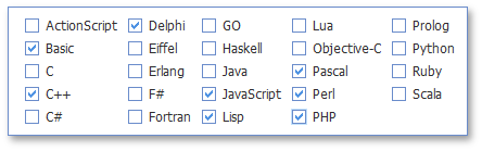
The ASPxCheckBoxList is a control that displays a list of check boxes which can be selected by end-users.
The ASPxCheckBoxList editor’s item list can be generated dynamically through data binding or populated manually. In order to bind the ASPxCheckBoxList to a data source, the ASPxListEdit.DataSourceID (ASPxListEdit.DataSource) and ASPxEditBase.DataMember properties can be used. When retrieving items from the data source, item characteristics such as the text, value, and image are obtained from specific data fields defined via the ASPxListEdit.TextField, ASPxListEdit.ValueField and ASPxListEdit.ImageUrlField properties.
List items are contained within the editor’s ASPxListEdit.Items collection. You can define the caption text (ListEditItem.Text), associated value (ListEditItem.Value), and display image (ListEditItem.ImageUrl) for an individual item. Note, for the ASPxCheckBoxList editor to function properly, values of all list items in the ASPxListEdit.Items collection should be unique. There should not be two or more list items with the same value of the ListEditItem.Value property. The control’s ASPxCheckBoxList.Value property specifies a value of a selected item (if only one item is selected) or a value of the first selected item (if multiple items are selected).
You can get an array of selected items using the ASPxCheckBoxList.SelectedItems property, or you can access arrays of indices (ASPxCheckBoxList.SelectedIndices) or values (ASPxCheckBoxList.SelectedValues) of selected items. Methods provided by the ASPxCheckBoxList allow you to select (ASPxCheckBoxList.SelectAll) or unselect (ASPxCheckBoxList.UnselectAll) all items within the control.
You can display the ASPxCheckBoxList‘s data in several columns (ASPxCheckListBase.RepeatColumns), set a direction of items within the control (ASPxCheckListBase.RepeatDirection), and specify whether items are aligned as a table (ASPxCheckListBase.RepeatLayout).
To customize the control appearance style, use the ASPxCheckBoxList.CheckBoxStyle and ASPxCheckBoxList.CheckBoxFocusedStyle properties. You can change the default check box images using the ASPxCheckBoxList.CheckedImage and ASPxCheckBoxList.UncheckedImage properties.
Note
The client-side equivalent of this editor control is the ASPxClientCheckBoxList object. The editor’s client-side API is enabled if the ASPxEditBase.EnableClientSideAPI property is set to true, or the ASPxEditBase.ClientInstanceName property is specified, or any client event is handled. Available client events can be accessed via the ASPxCheckListBase.ClientSideEvents property.