ASPxHint Class
A hint control.
Namespace: DevExpress.Web
Assembly: DevExpress.Web.v19.2.dll
Declaration
Remarks
The ASPxHint control allows you to display a hint message for a UI element on a web page. A hint is displayed within a box with an arrow targeting the specified UI element in response to user interaction.
Create a Hint Control
Design Time
The ASPxHint control is available on the DX.19.2: Navigation & Layout toolbox tab in the Microsoft Visual Studio IDE.

Drag the control onto a form and customize control settings, or paste the control markup in the page’s source code.
<dx:ASPxHint ID="ASPxHint1" runat="server" TargetSelector=".left" Position="left" Content="Sample Text" />
Run Time
<div class="country" style="width: 50px">
    <asp:Button ID="Button1" runat="server" Text="Button" />
</div>
using DevExpress.Web;

protected void Page_Load(object sender, EventArgs e)
{
    ASPxHint hint = new ASPxHint();
    hint.ID = "ASPxHint1";
    form1.Controls.Add(hint);
    hint.TargetSelector = ".country";
    hint.Position = HintPosition.Top;
    hint.Content = "Sample Text";
}
Client-Side API
The ASPxHint‘s client-side API is implemented with JavaScript language and exposed by the ASPxClientHint object.
Availability | Available by default. |
Class name | |
Access name | |
Events |
<dx:ASPxHint ID="ASPxHint1" runat="server"></dx:ASPxHint>
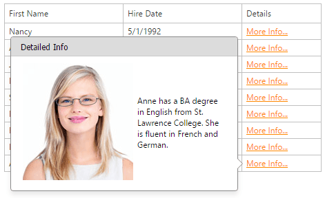
ASPxClientHint.Register('[data-visibleindex]', {
    onShowing: function(s, e) {
        var index = getElementAttr(e.targetElement);
        var key = Grid.GetRowKey(index);
        Grid.GetRowValues(index, 'Notes', function(content) {
            e.contentElement.innerHTML = '<div class="hintContent">' +
              '<img src="LoadContentOnDemand.aspx?photo=' + key + '" />' +
              '<div>' + content + '</div>' + '</div>';
            ASPxClientHint.UpdatePosition(e.hintElement);
            });
        return 'loading...';
    },
        position: 'left',
        triggerAction: 'click',
        className: 'paddings'
    });
    function getElementAttr(element) {
        return element.dataset ? element.dataset['visibleindex'] : element.getAttribute('data-visibleindex');
    }
Features
Customizable Content
You can specify custom content for a hint either on the server or client side programmatically.
<dx:ASPxHint ID="ASPxHint1" Selector=".myImage" Title="My Title" Content="My Content" runat="server"></dx:ASPxHint>
Hint Position
The hint can be displayed on any side (left, right, top, bottom) of the target element.
<dx:ASPxHint ID="ASPxHint1" runat="server" TargetSelector=".left" Position="left" Content="Sample Text" />
Trigger Action
The hint allows you to specify which action triggers a hint (hover, click, focus, programmatic).
<dx:ASPxHint ID="ASPxHint1" TargetSelector=".myImage" TriggerAction="HoverAndFocus" runat="server"></dx:ASPxHint>
<dx:ASPxImage ID="ASPxImage1" ImageUrl="~/Content/myImage.png" CssClass="myImage" runat="server"></dx:ASPxImage>
Concept and Getting Started
Online Demos
- ASPxHint - Overview
- ASPxHint - Features
- ASPxHint - Load Content on Demand
- ASPxHint - Hint for Text Ellipsis
- ASPxHint - Choosing a Seat