ASPxGridView Class
A grid control.
Namespace: DevExpress.Web
Assembly: DevExpress.Web.v19.2.dll
Declaration
Remarks
The ASPxGridView is a data bound control that displays data from a data source in grid format. The grid displays data source fields and records as columns and rows in a table.
Create a Grid View
Design Time
The ASPxGridView control is available on the DX.19.2: Data & Analytics toolbox tab in the Microsoft Visual Studio IDE.

Drag the control onto a form and customize control settings, or paste the control markup in the page’s source code.
<dx:ASPxGridView ID="ASPxGridView1" runat="server" AutoGenerateColumns="False" DataSourceID="SqlDataSource1"
    KeyFieldName="ProductID" Theme="MaterialCompact">
    <Columns>
        <dx:GridViewDataTextColumn FieldName="ProductID" ReadOnly="True" VisibleIndex="0">
            <EditFormSettings Visible="False" />
        </dx:GridViewDataTextColumn>
        <dx:GridViewDataTextColumn FieldName="ProductName" VisibleIndex="1">
        </dx:GridViewDataTextColumn>
        <dx:GridViewDataTextColumn FieldName="UnitPrice" VisibleIndex="2">
        </dx:GridViewDataTextColumn>
    </Columns>
</dx:ASPxGridView>
<asp:SqlDataSource ID="SqlDataSource1" runat="server" ConnectionString="Provider=Microsoft.Jet.OLEDB.4.0;Data Source=|DataDirectory|\nwind.mdb;
    Persist Security Info=True" ProviderName="System.Data.OleDb"
    SelectCommand="SELECT [ProductID], [ProductName], [UnitPrice], [UnitsInStock] FROM [Products]">
</asp:SqlDataSource>
Run Time
<asp:SqlDataSource ID="SqlDataSource1" runat="server" ConnectionString="Provider=Microsoft.Jet.OLEDB.4.0;Data Source=|DataDirectory|\nwind.mdb;
    Persist Security Info=True" ProviderName="System.Data.OleDb"
    SelectCommand="SELECT [ProductID], [ProductName], [UnitPrice], [UnitsInStock] FROM [Products]">
</asp:SqlDataSource>
using DevExpress.Web;
...
protected void Page_Load(object sender, EventArgs e)  {
    ASPxGridView grid1 = new ASPxGridView();
    grid1.ID = "grid1";
    Page.Form.Controls.Add(grid1);
    grid1.AutoGenerateColumns = false;
    grid1.DataSourceID = "SqlDataSource1";
    grid1.KeyFieldName = "ProductID";
    grid1.Columns.AddRange(new GridViewDataColumn[]{
        new GridViewDataColumn { FieldName="ProductID", ReadOnly = true, VisibleIndex = 0},
        new GridViewDataColumn() { FieldName = "ProductName", VisibleIndex = 1 },
        new GridViewDataColumn() { FieldName = "UnitPrice", VisibleIndex = 2 },
    });
}
KB Article: How to create controls dynamically
Client-Side API
Availability | Available by default. |
Class name | |
Access name | |
Events |
Features
Data Binding
The ASPxGridView works only in bound mode. You can bind the grid to any standard data source type: SqlDataSource, ObjectDataSource, XmlDataSource, AccessDataSource, and SiteMapDataSource.
Use the KeyFieldName property to set a data source’s key field name. The DataSourceID and DataSource specify the data source’s ID and the data source object, respectively.
ASPxGridView.DataSourceID:
<dx:ASPxGridView ID="ASPxGridView1" runat="server" AutoGenerateColumns="False"
DataSourceID="SqlDataSource1" KeyFieldName="ProductID" >
</dx:ASPxGridView>
<asp:SqlDataSource ID="SqlDataSource1" runat="server"
    ConnectionString="Provider=Microsoft.Jet.OLEDB.4.0;Data Source=|DataDirectory|\nwind.mdb;Persist Security Info=True"
    ProviderName="System.Data.OleDb"
    SelectCommand="SELECT [ProductID], [ProductName], [UnitPrice], [UnitsInStock] FROM [Products]">
</asp:SqlDataSource>
ASPxGridView.DataSource:
SqlDataSource dataSource1 = new SqlDataSource(@"Provider=Microsoft.Jet.OLEDB.4.0;
    Data Source=|DataDirectory|\nwind.mdb;Persist Security Info=True",
    "SELECT [CategoryName] FROM [Categories] WHERE ([CategoryID] = @param)");
dataSource1.SelectParameters.Add("@param", selectedItemID);
dataSource1.ProviderName = "System.Data.OleDb";
dataSource1.ID = "DataSource1";
...
gridView.DataSource = dataSource1;
gridView.KeyFieldName = "CategoryID";
gridView.DataBind();
...
Database Server Mode
The grid supports database server mode. In this mode, the grid loads only required items to the server memory and implements data-aware operations (for example, filtering) at the database level.
Unbound Columns
The grid control supports unbound columns that are not bound to any data source field. Use the CustomUnboundColumnData event or specify the UnboundExpression property to populate an unbound column with data.
GridViewDataColumn.UnboundExpression:
<dx:ASPxGridView ID="Grid" runat="server" DataSourceID="ProductsDataSource" KeyFieldName="OrderID" >
    <Columns>
        <dx:GridViewDataSpinEditColumn FieldName="UnitPrice" />
        <dx:GridViewDataSpinEditColumn FieldName="Quantity" />
        <dx:GridViewDataSpinEditColumn FieldName="Discount" />
        <dx:GridViewDataTextColumn FieldName="Total" UnboundType="Decimal"
            UnboundExpression="UnitPrice*Quantity*(1-Discount)" />
    </Columns>
</dx:ASPxGridView>
ASPxGridView.CustomUnboundColumnData event:
<dx:ASPxGridView ID="Grid" runat="server" DataSourceID="ProductsDataSource" KeyFieldName="OrderID" OnCustomUnboundColumnData="Grid_CustomUnboundColumnData" >
    <Columns>
        <dx:GridViewDataSpinEditColumn FieldName="UnitPrice" />
        <dx:GridViewDataSpinEditColumn FieldName="Quantity" />
        <dx:GridViewDataSpinEditColumn FieldName="Discount" />
        <dx:GridViewDataTextColumn FieldName="Total" UnboundType="Decimal" />
    </Columns>
</dx:ASPxGridView>
protected void Grid_CustomUnboundColumnData(object sender,
    ASPxGridViewColumnDataEventArgs e) {
    if (e.Column.FieldName == "Total") {
        decimal unitPrice = Convert.ToDecimal(e.GetListSourceFieldValue("UnitPrice"));
        int quantity = Convert.ToInt32(e.GetListSourceFieldValue("Quantity"));
        decimal discount = Convert.ToDecimal(e.GetListSourceFieldValue("Discount"));
        e.Value = unitPrice * quantity * (1 - discount);
    }
}
Columns Management
The grid control displays data in a table format. Data sources provide data as fields and records. The grid control displays data fields as columns and records - as data rows.
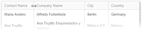
Resize Columns
You can resize a column header to modify the column’s width (SettingsResizing).
<dx:ASPxGridView ID="grid" runat="server" ...>
    ...
    <SettingsResizing ColumnResizeMode="Control" Visualization="Postponed" />
</dx:ASPxGridView>
Move Columns
The grid control supports drag-and-drop functionality that allows you to move a column to the desired position. You can use the AllowDragDrop property to allow end users to move all grid columns or a column’s Settings.AllowDragDrop property to enable drag and drop for an individual column.
<dx:ASPxGridView ID="ASPxGridView1" runat="server" ...>
    ...
    <SettingsBehavior AllowDragDrop="false" />
    <Columns>
        <dx:GridViewDataTextColumn FieldName="ProductName" VisibleIndex="0" />
        <dx:GridViewDataTextColumn FieldName="QuantityPerUnit" VisibleIndex="1">
            <Settings AllowDragDrop="True" />
        </dx:GridViewDataTextColumn>
        ...
    </Columns>
</dx:ASPxGridView>
Use the ColumnMoveMode property to move columns and bands between hierarchy levels.
<dx:ASPxGridView ID="ASPxGridView1" runat="server" ...>
    <SettingsBehavior ColumnMoveMode="ThroughHierarchy" />
    ...
</dx:ASPxGridView>
Header and Data Cell Bands
The grid control allows you to organize columns in logical groups (bands) and display them in multiple rows.
Header bands (GridViewBandColumn) organize grid columns into logical groups and display hierarchical multi-row headers.
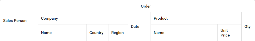
<dx:ASPxGridView ID="Grid" runat="server"... >
    <Columns>
        <dx:GridViewBandColumn Caption="Order">
            <Columns>
                <dx:GridViewBandColumn Caption="Company">
                    <Columns>
                        <dx:GridViewDataTextColumn FieldName="CompanyName" Caption="Name" />
                        ...
                    </Columns>
                </dx:GridViewBandColumn>
            ...
            </Columns>
        </dx:GridViewBandColumn>
    </Columns>
</dx:ASPxGridView>
Data cell bands (Columns) allow you to display a data record hierarchically. Specify the CellRowSpan and CellRowSpan properties to arrange a column header and data cells in a data cell band layout.

<dx:ASPxGridView ID="Grid" runat="server" ...>
    <Columns>
        <dx:GridViewDataColumn FieldName="Address">
            <Columns>
                <dx:GridViewDataColumn FieldName="Features">
                    <Columns>
                        <dx:GridViewDataColumn FieldName="Beds" />
                        ...
                    </Columns>
                </dx:GridViewDataColumn>
                ...
            </Columns>
        </dx:GridViewDataColumn>
    </Columns>
</dx:ASPxGridView>
Fixed Columns
The grid allows you to fix columns on the left side and display these columns onscreen when the columns’ total width exceeds the grid width. Enable the horizontal scrolling (HorizontalScrollBarMode) and set a column’s FixedStyle property to Left to fix the column.
<dx:ASPxGridView ID="Grid" runat="server" ...>
    <Columns>
        <dx:GridViewDataColumn FieldName="ContactName" Width="150" FixedStyle="Left" />
        <dx:GridViewDataColumn FieldName="CompanyName" Width="180" FixedStyle="Left" />
        <dx:GridViewDataColumn FieldName="City" Width="130" />
        <dx:GridViewDataColumn FieldName="Region" Width="80" />
        ...
    </Columns>
    <Settings HorizontalScrollBarMode="Visible" />
    <Styles>
        <FixedColumn BackColor="LightYellow" />
    </Styles>
</dx:ASPxGridView>
Truncate Cell Text
The grid can truncate cell (‘…’) values if they don’t fit the cells width ( AllowEllipsisInText).
<dx:ASPxGridView runat="server" Width="100%" ID="ASPxGridView1" ClientInstanceName="sampleGrid" ...>
    <SettingsBehavior AllowEllipsisInText="true"/>
    ...
</dx:ASPxGridView>
Data Editing
Edit Modes
The grid provides the following built-in edit modes that allow end-users to edit grid data (Mode):
- Edit Form (See demo | Learn more)
- Edit Form and Display Row
- Popup Edit Form (See demo)
- In-Line Edit Mode
- Batch - (See demo | Learn more)
<dx:ASPxGridView ID="grid" runat="server" >
    <Columns>
        ...
    </Columns>
    <SettingsEditing Mode="Batch" />
</dx:ASPxGridView>
Edit Form Template
You can use any controls to create a custom layout for the edit form.
<dx:ASPxGridView ID="grid" runat="server"...>
    ...
    <Templates>
        <EditForm>
            <dx:ASPxTextBox ID="txtTitle" ...>
            </dx:ASPxTextBox>
            <br />
            <dx:ASPxGridViewTemplateReplacement ID="UpdateButton" ReplacementType="EditFormUpdateButton"
                    runat="server"></dx:ASPxGridViewTemplateReplacement>
            <dx:ASPxGridViewTemplateReplacement ID="CancelButton" ReplacementType="EditFormCancelButton"
                    runat="server"></dx:ASPxGridViewTemplateReplacement>
        </EditForm>
    </Templates>
</dx:ASPxGridView>
Edit Form Layout
The EditFormLayoutProperties property allows you to customize the edit form layout.
<dx:ASPxGridView ID="grid" runat="server" ...>
    <Columns>
        ...
    </Columns>
    <EditFormLayoutProperties ColCount="2">
        <Items>
            <dx:GridViewLayoutGroup ColCount="2" GroupBoxDecoration="None">
                <Items>
                    ...
                    <dx:GridViewColumnLayoutItem ColumnName="Position" Width="100%" />
                    <dx:GridViewColumnLayoutItem Caption="Notes" Width="100%" VerticalAlign="Top">
                        <Template>
                            <dx:ASPxMemo ID="notesMemo" runat="server" Width="100%" Height="253" Text='<%# Bind("Notes") %>' />
                        </Template>
                    </dx:GridViewColumnLayoutItem>
                </Items>
            </dx:GridViewLayoutGroup>
            <dx:EditModeCommandLayoutItem Width="100%" HorizontalAlign="Right" />
        </Items>
    </EditFormLayoutProperties>
</dx:ASPxGridView>
Data Management
Sort Data
You can sort the grid data by an unlimited number of columns. Use a column’s AllowSort property or the grid’s AllowSort option to allow end users to sort the specified column or all columns in the grid.
<dx:ASPxGridView ID="grid">
    <SettingsBehavior AllowSort="true">
    <Columns>
        <dx:GridViewDataColumn FieldName="ContactName" SortIndex="2" SortOrder="Ascending" >
            <Settings AllowSort="false" SortMode="DisplayText" />
        </dx:GridViewDataColumn>
        ...
    </Columns>
</dx:ASPxGridView>
Filter Data
You can use the following UI elements to filter grid data:
Auto-Filter Row (See demo | Learn more)
<dx:ASPxGridView ID="Grid" >
    ...
    <Settings ShowFilterRow="true" ShowFilterRowMenu="true" />
    <SettingsBehavior FilterRowMode="OnClick" />
</dx:ASPxGridView>
Built-in Search Panel (See demo | Learn more)
<dx:ASPxGridView ID="Grid" runat="server" >
    ...
    <SettingsSearchPanel Visible="true" />
</dx:ASPxGridView>
Column Header Filter Dropdowns (See demo | Learn more)
<dx:ASPxGridView ID="grid" runat="server" >
    ...
    <Settings ShowHeaderFilterButton="true" />
</dx:ASPxGridView>
Filter Control (See demo | Learn more)
<dx:ASPxGridView ID="grid" runat="server" >
    ...
    <Settings ShowFilterBar="Visible" />
    <SettingsFilterControl ViewMode="VisualAndText" AllowHierarchicalColumns="true" ShowAllDataSourceColumns="true" MaxHierarchyDepth="1" />
</dx:ASPxGridView>
Group Data
The grid allows you to use drag and drop operations (ShowGroupPanel) or APIs to group data against an unlimited number of data columns. Use a column’s AllowGroup property or the grid’s AllowGroup option to allow end users to group the specified column or all columns in the grid.
<dx:ASPxGridView ...>
    <Columns>
        <dx:GridViewDataColumn FieldName="ContactName" AllowGroup="false" />
        ...
    </Columns>
    <Settings ShowGroupPanel="true" />
    <SettingsBehavior AllowGroup="true" />
</dx:ASPxGridView>
Interval grouping (GroupInterval) allows you to change the default grouping logic, especially for columns that contain date/time values.
<dx:ASPxGridView ID="grid" >
    <Columns>
        <dx:GridViewDataDateColumn FieldName="OrderDate" GroupIndex="0">
            <Settings GroupInterval="DateYear" />
        </dx:GridViewDataDateColumn>
        ...
    </Columns>
</dx:ASPxGridView>
The grid allows you to group grid data by multiple columns at once and combine them into a single grouping level (MergeGroupsMode).
<dx:ASPxGridView ID="Grid" >
    ...
    <Settings ShowGroupPanel="true" />
    <SettingsBehavior MergeGroupsMode="Always" />
</dx:ASPxGridView>
Data Summary
The grid allows you to display brief information about groups of rows or individual data columns (summaries) in the footer (ShowFooter). The following summary types are available:
Total Summary - Add the ASPxSummaryItem object(s) to the TotalSummary collection.
<dx:ASPxGridView ID="grid" ...>
    ...
    <TotalSummary>
        <dx:ASPxSummaryItem FieldName="Total" SummaryType="Min" />
        <dx:ASPxSummaryItem FieldName="Total" SummaryType="Max" />
        <dx:ASPxSummaryItem FieldName="Total" SummaryType="Sum" />
    </TotalSummary>
    <Settings ShowGroupPanel="True" ShowFooter="True" />
</dx:ASPxGridView>
Group Summary - Add the ASPxSummaryItem object(s) to the GroupSummary collection.
<dx:ASPxGridView ID="grid" ...>
    <GroupSummary>
        <dx:ASPxSummaryItem FieldName="Country" ShowInColumn="Country" SummaryType="Count" />
        <dx:ASPxSummaryItem FieldName="Quantity" ShowInGroupFooterColumn="UnitPrice" SummaryType="Sum" />
    </GroupSummary>
    <Settings ShowGroupPanel="True" ShowGroupFooter="VisibleIfExpanded"></Settings>
</dx:ASPxGridView>
Custom Summary - Set the SummaryType property to SummaryItemType.Custom and handle the ASPxGridBase.CustomSummaryCalculate event to calculate the custom summary.
<dx:ASPxGridView ID="ASPxGridView1" runat="server" OnCustomSummaryCalculate="ASPxGridView1_CustomSummaryCalculate">
    <Settings ShowFooter="true" />
    <TotalSummary>
        <dx:ASPxSummaryItem SummaryType="Custom" FieldName="UnitPrice" ShowInColumn="UnitPrice" DisplayFormat="Total price for selected products: {0:c}" ValueDisplayFormat="{0}:c" />
    </TotalSummary>
</dx:ASPxGridView>
Master-Detail Grid
The grid supports master-detail data. You can link a master table to multiple detail tables. Each detail table can be the master of another table.
<dx:ASPxGridView ID="grid">
    <Columns>
        ...
    </Columns>
    <Templates>
        <DetailRow>
            <dx:ASPxGridView ID="detailGrid" runat="server" ...>
                <Columns>
                ...
                </Columns>
            </dx:ASPxGridView>
        </DetailRow>
    </Templates>
    <SettingsDetail ShowDetailRow="true" />
</dx:ASPxGridView>
Validation
You can validate data in grid data rows and display error icons/messages for invalid fields.
Validate Rows - RowValidating, DoRowValidation()
protected void grid_RowValidating(object sender, DevExpress.Web.Data.ASPxDataValidationEventArgs e) { foreach (GridViewColumn row in grid.Columns) { GridViewDataColumn dataRow = row as GridViewDataColumn; if (dataRow == null) continue; if (e.NewValues[dataRow.FieldName] == null) e.Errors[dataRow] = "Value cannot be null."; } ... }Validate Edit Cells - ValidationSettings
<dx:ASPxGridView ID="grid" runat="server" DataSourceID="ObjectDataSource1" KeyFieldName="Id" ...>
    <Columns>
        <dx:GridViewDataTextColumn Caption="First Name" FieldName="FirstName">
            <PropertiesTextEdit>
                <ValidationSettings>
                    <RequiredField IsRequired="true" ErrorText="Custom Error Text" />
                </ValidationSettings>
            </PropertiesTextEdit>
        </dx:GridViewDataTextColumn>
        ...
    </Columns>
    ...
</dx:ASPxGridView>
Custom Validation - EnableCustomValidation
<dx:ASPxGridView ID="grid" runat="server" ...> <Columns> ... <dx:GridViewDataComboBoxColumn FieldName="CategoryID" Caption="Category Name"> <PropertiesComboBox ClientInstanceName="comboBox" TextField="CategoryName" ...> <ValidationSettings EnableCustomValidation="true" ValidateOnLeave="false" /> <ClientSideEvents TextChanged="onChanged" /> </PropertiesComboBox> </dx:GridViewDataComboBoxColumn> ... </Columns> </dx:ASPxGridView>function onChanged(s, e) { if (comboBox.GetText() == 'Produce') { comboBox.SetIsValid(false); comboBox.SetErrorText('invalid value'); } }
Export
The grid allows you to export data in the following formats: PDF, XLS, XLSX, RTF, CSV, DOCX.
    <dx:ASPxGridView ID="grid" >
    <Toolbars>
        <dx:GridViewToolbar>
            <SettingsAdaptivity Enabled="true" EnableCollapseRootItemsToIcons="true" />
            <Items>
                <dx:GridViewToolbarItem Command="ExportToPdf" />
                <dx:GridViewToolbarItem Command="ExportToXls" />
                <dx:GridViewToolbarItem Command="ExportToXlsx" />
                ...
            </Items>
        </dx:GridViewToolbar>
    </Toolbars>
</dx:ASPxGridView>
Merged Cells
The grid can automatically merge adjacent cells with the same values (ASPxGridViewBehaviorSettings.AllowCellMerge, GridViewDataColumnSettings.AllowCellMerge).
<dx:ASPxGridView ID="Grid" runat="server" >
    ...
    <SettingsBehavior AllowCellMerge="true" />
</dx:ASPxGridView>
Selection
You can use the UI elements (AllowSelectByRowClick, ShowSelectCheckbox, ShowSelectButton, SelectAllCheckboxMode) or APIs on the client and server side to select grid data.
<dx:ASPxGridView ID="grid" >
    <Columns>
        <dx:GridViewCommandColumn ShowSelectCheckbox="true" />
        ...
    </Columns>
    <SettingsBehavior AllowSelectByRowClick="true" />
</dx:ASPxGridView>
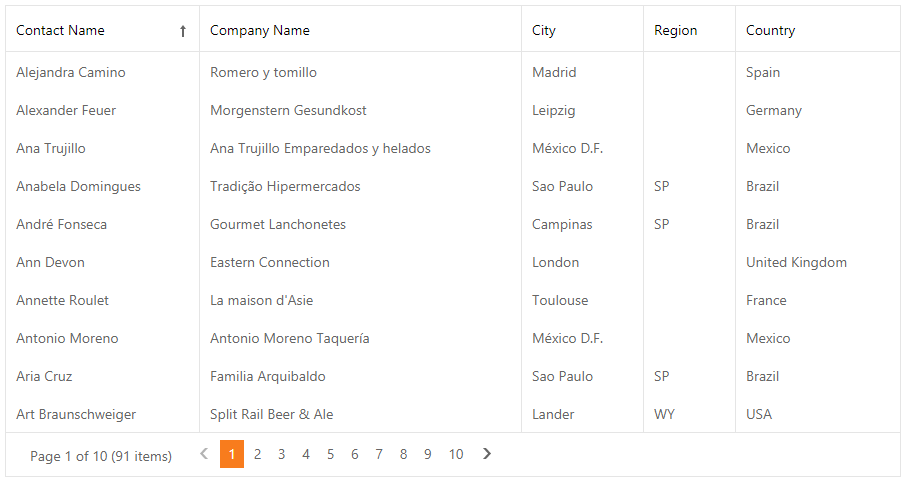
Built-In Pager
The grid provides the built-in pager (SettingsPager) that enables end-users to navigate through data. The pager consists of navigation buttons: “next”, “last”, “previous”, “first”, “All”;
<dx:ASPxGridView ID="grid" >
    ...
    <SettingsPager Position="TopAndBottom">
        <PageSizeItemSettings Items="10, 20, 50" />
    </SettingsPager>
</dx:ASPxGridView>
Set the Mode property to EndlessPaging to enable endless paging mode that allows you to load grid rows on demand when an end user scrolls the grid.
<dx:ASPxGridView ID="GridView" >
    ...
    <SettingsPager Mode="EndlessPaging" PageSize="20" />
</dx:ASPxGridView>
Scroll Data
Use the HorizontalScrollBarMode and VerticalScrollBarMode properties to enable the horizontal and vertical scroll bars.
<dx:ASPxGridView ID="Grid" runat="server" >
    ...
    <Settings HorizontalScrollBarMode="Visible" VerticalScrollBarMode="Visible" VerticalScrollableHeight="300" />
</dx:ASPxGridView>
The grid supports virtual paging mode (VerticalScrollBarStyle) that allows end-users to use the vertical scroll bar to navigate through grid pages.
<dx:ASPxGridView ID="ASPxGridView1" >
    ...
    <Settings VerticalScrollBarMode="Visible" VerticalScrollBarStyle="VirtualSmooth" />
</dx:ASPxGridView>
Keyboard Navigation
The built-in keyboard support allows you to use the keyboard to navigate the grid (KeyboardSupport).
<dx:ASPxGridView runat="server" KeyboardSupport="true" AccessKey="D">
    ...
</dx:ASPxGridView>
Rows Management
Alternate Row
You can highlight alternating (odd) grid rows with a different style (Enabled).
<dx:ASPxGridView ID="grid" >
    ...
    <Styles>
        <AlternatingRow Enabled="true" />
    </Styles>
</dx:ASPxGridView>
Preview Row
A preview row allows you to display large memo fields or custom data across all grid columns (ShowPreview, PreviewFieldName).
<dx:ASPxGridView ID="grid" PreviewFieldName="Notes" >
    ...
    <Settings ShowPreview="true" />
</dx:ASPxGridView>
Grid Lines
The grid allows you to display the horizontal and/or vertical grid lines (GridLines).
<dx:ASPxGridView ID="grid" runat="server" >
    ...
    <Settings GridLines="Vertical" />
</dx:ASPxGridView>
Focused Row
You can focus a row in the grid. Note that you can select several records simultaneously but you can focus only one record at a time.
<dx:ASPxGridView ID="grid" >
    ...
    <SettingsBehavior AllowFocusedRow="true" />
</dx:ASPxGridView>
Customization Tools
Toolbar
The toolbar allows you to group grid commands. The grid stores toolbars (GridViewToolbar) in its Toolbars collection. You can add or remove toolbars, change their availability and position, and populate them with toolbar items (GridViewToolbarItem).
<dx:ASPxGridView runat="server" ID="Grid" >
    <Toolbars>
        <dx:GridViewToolbar>
            <Items>
                <dx:GridViewToolbarItem Command="New" />
                <dx:GridViewToolbarItem Command="Edit" />
                ...
            </Items>
        </dx:GridViewToolbar>
    </Toolbars>
</dx:ASPxGridView>
Customization Dialog
The customization dialog enables end users to sort, group, filter, and hide/show columns in the grid on mobile devices.
<dx:ASPxGridView ID="Grid" runat="server" >
    <SettingsCustomizationDialog Enabled="true" />
    <Toolbars>
        <dx:GridViewToolbar Position="Top" ItemAlign="Right">
            <Items>
                <dx:GridViewToolbarItem Command="ShowCustomizationDialog" />
            </Items>
        </dx:GridViewToolbar>
    </Toolbars>
</dx:ASPxGridView>
Context Menu
The grid provides the following context menu types (Enabled):
- Row (EnableRowMenu)
- Column header (EnableColumnMenu)
- Footer (EnableFooterMenu)
- Group footer (EnableGroupFooterMenu)
- Group panel (EnableGroupPanelMenu)
<dx:ASPxGridView runat="server" ID="Grid" >
    ...
    <SettingsContextMenu Enabled="true" />
</dx:ASPxGridView>
Column Chooser
The column chooser allows end users to use the drag and drop operation to show/hide columns in the grid (EnableCustomizationWindow)
<dx:ASPxGridView ID="grid" >
    ...
    <SettingsBehavior EnableCustomizationWindow="true" />
</dx:ASPxGridView>
Adaptivity
The grid allows you to build adaptive or responsive page layouts. The control can automatically resize or hide its elements when the browser window is resized (SettingsAdaptivity).
<dx:ASPxGridView runat="server" ID="Grid" >
    <SettingsAdaptivity AdaptivityMode="HideDataCellsWindowLimit" HideDataCellsAtWindowInnerWidth="780"
    AllowOnlyOneAdaptiveDetailExpanded="true" AdaptiveDetailColumnCount="2" />
    <Toolbars>
        <dx:GridViewToolbar>
            <SettingsAdaptivity Enabled="true" EnableCollapseRootItemsToIcons="true"
            CollapseRootItemsToIconsAtWindowInnerWidth="400" />
            ...
        </dx:GridViewToolbar>
    </Toolbars>
    ...
</dx:ASPxGridView>
Appearance Customization
Templates
The grid supports template technology and allows you to customize its UI elements appearance and layout.
<dx:ASPxGridView ID="grid" >
    ...
    <Templates>
        <PreviewRow>
            <table>
                <tr>
                    <td style="padding-right: 12px">
                        <dx:ASPxBinaryImage ID="ASPxBinaryImage1" runat="server" Value='<%# Eval("Photo") %>' />
                    </td>
                    ...
                </tr>
            </table>
        </PreviewRow>
    </Templates>
    <Settings ShowPreview="true" />
</dx:ASPxGridView>
Conditional Formatting
You can apply format rules (the GridFormatConditionBase object descendants) to the grid (FormatConditions) to customize the grid data appearance.
<dx:ASPxGridView ID="Grid" >
    ...
    <FormatConditions>
        <dx:GridViewFormatConditionTopBottom FieldName="Freight"
        <dx:GridViewFormatConditionColorScale FieldName="Quantity" Format="BlueWhiteRed" />
        <dx:GridViewFormatConditionIconSet FieldName="Quantity" Format="Ratings4" />
    </FormatConditions>
</dx:ASPxGridView>
Miscellaneous
Cookies Support
The grid supports cookies that allow your site’s visitors to personalize pages. If cookies are enabled, the browser saves grid options and can them restore them in future sessions.
Save and Restore Layout
You can save the grid layout information to a database and then restore it.