Command items allow users to select and delete data rows, switch ASPxGridView to edit mode, update data, etc. A command item is a single command. For instance, the Delete item allows users to delete data rows. There are ten command items: New, Edit, Delete, Select, Update, Clear Filter, Apply Filter, Cancel, Show Adaptive Detail, and Hide Adaptive Detail. The default command item is displayed as a link. You can also display the item as a button or image.
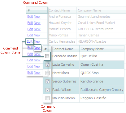
Command columns can also display custom buttons.
The table below lists the main members that affect element appearance and functionality.
| Characteristics |
Members |
| Representation |
ASPxGridViewCommandButtonSettings.RenderMode, GridViewCommandColumn.ButtonRenderMode, GridCommandButtonSettings.RenderMode |
| Accessibility |
ASPxGridViewCommandButtonSettings.NewButton, ASPxGridViewCommandButtonSettings.DeleteButton, ASPxGridViewCommandButtonSettings.UpdateButton, ASPxGridViewCommandButtonSettings.CancelButton, ASPxGridViewCommandButtonSettings.EditButton, ASPxGridViewCommandButtonSettings.SelectButton, GridViewCommandColumn.CustomButtons, ASPxGridViewCommandButtonSettings.ApplyFilterButton |
| Visibility |
GridViewCommandColumn.ShowNewButton, GridViewCommandColumn.ShowNewButtonInHeader, GridViewCommandColumn.ShowDeleteButton, GridViewCommandColumn.ShowUpdateButton, GridViewCommandColumn.ShowCancelButton, GridViewCommandColumn.ShowEditButton, GridViewCommandColumn.ShowSelectButton, GridViewCommandColumn.ShowApplyFilterButton |
| Action |
ASPxGridView.CustomButtonCallback, ASPxClientGridView.CustomButtonClick |
| Style |
GridViewStyles.CommandColumnItem |