Customize the Report Designer Toolbar and Menu
- 4 minutes to read
This document describes how to customize commands in the Report Designer‘s toolbar and menu.
Open an ASP.NET Core application or create a new application to get started with this tutorial. Refer to the Get Started with End-User Report Designer for ASP.NET Core section for step-by-step tutorials on Report Designer integration.
Add and Remove Commands
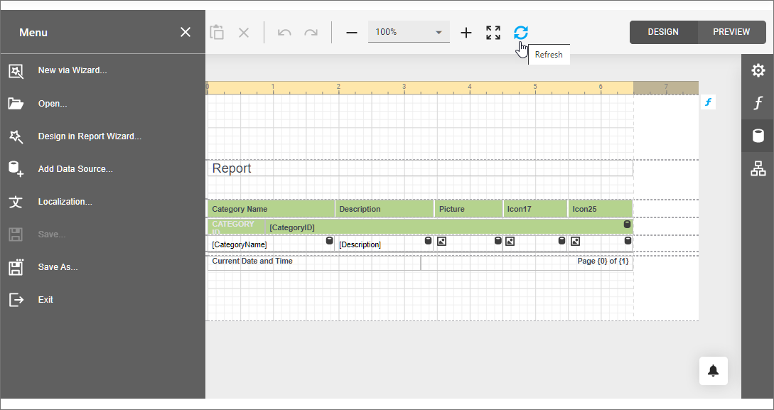
Handle the client-side CustomizeMenuActions event to customize toolbar and menu commands.
Use the event argument to access the Actions collection that contains all the available Report Designer commands. You can add new commands to the collection and modify the existing commands. To obtain an existing command, call the event argument’s GetById method and pass the corresponding DevExpress.Analytics.Tools.ActionId or DevExpress.Reporting.Designer.Actions.ActionId value as a parameter.
Each command exposes the properties listed in the table below.
| Option | Description |
|---|---|
| container | Specify “menu” to display the command in the menu; “toolbar” - to display the command in the main toolbar. |
| disabled | Specifies whether the command is disabled. |
| hasSeparator | Specifies whether the command has a visual separator. |
| hotKey | Specifies the keyboard shortcut to invoke the command. |
| imageClassName imageTemplateName |
Use one of these options to specify the command’s icon: • imageClassName for an icon declared as a CSS class. • imageTemplateName for an icon declared as an HTML template. |
| clickAction | Specifies the client-side action to perform when the command is invoked. |
| text | Specifies the command’s tooltip. |
| visible | Specifies whether the command is visible in the user interface. |
The following example demonstrates how to hide the existing Validate Bindings toolbar command and add a new Refresh command that refreshes the current report tab.
<script type="text/html" id="refresh">
    <svg version="1.1" xmlns="http://www.w3.org/2000/svg" xmlns:xlink="http://www.w3.org/1999/xlink"
        x="0px" y="0px" viewBox="0 0 24 24" style="enable-background: new 0 0 24 24;" xml:space="preserve">
        <path class="dxd-icon-fill" d="M22,2v8h-0.2h-3.09H14l2.94-2.94C15.68,5.79,13.93,5,12,5c-3.87,0-7,3.13-7,7H2C2,6.48,6.48,2,12,2
            c2.76,0,5.26,1.12,7.07,2.93L22,2z M12,19c-1.93,0-3.68-0.79-4.94-2.06L10,14H5.29H2.2H2v8l2.93-2.93C6.74,20.88,9.24,22,12,22
            c5.52,0,10-4.48,10-10h-3C19,15.87,15.87,19,12,19z" />
    </svg>
</script>
<script type="text/javascript">
    function customizeActions(s, e) {

        // Get the "New" action and hide it.
        var newReportAction = e.GetById(DevExpress.Reporting.Designer.Actions.ActionId.NewReport);
        if (newReportAction)
            newReportAction.visible = false;

        // Get the "Validate Bindings" action and hide it.
        var validateBindingsAction = e.GetById(DevExpress.Reporting.Designer.Actions.ActionId.ValidateBindings);
        if (validateBindingsAction)
            validateBindingsAction.visible = false;

        // Add the new 'Refresh' action.
        e.Actions.splice(15, 0, {
            container: "toolbar",
            text: "Refresh",
            imageTemplateName: "refresh",
            visible: true,
            disabled: false,
            hasSeparator: false,
            hotKey: { ctrlKey: true, keyCode: "Z".charCodeAt(0) },
            clickAction: function () {
                s.GetCurrentTab().refresh();
            }
        });
    }
</script>

@{
    var reportDesigner = Html.DevExpress().ReportDesigner("reportDesigner1")
        .Height("1000px")
        .ClientSideEvents(configure => { configure.CustomizeMenuActions("customizeActions"); })
        .Bind("Report");
}
@reportDesigner
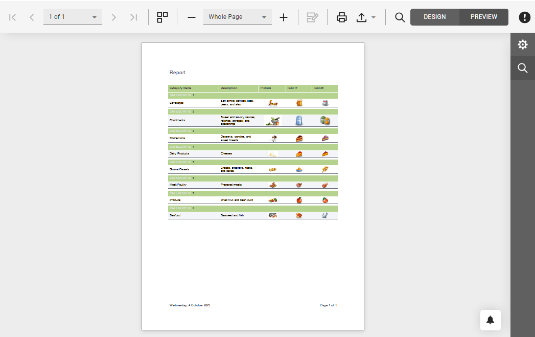
The following image shows the resulting toolbar and menu.
How to Declare a Custom Command’s Icon
You can use two ways to provide a command’s icon.
HTML Templates for SVG Images (Recommended)
This approach allows you to apply a color scheme to SVG icons and make them consistent with the Report Designer control.
The following example demonstrates how to declare a sample HTML template. This template uses the predefined dxd-icon-fill CSS class to color the icon automatically according to the selected scheme.
<script type="text/html" id="refresh">
    <svg version="1.1" xmlns="http://www.w3.org/2000/svg" xmlns:xlink="http://www.w3.org/1999/xlink"
        x="0px" y="0px" viewBox="0 0 24 24" style="enable-background: new 0 0 24 24;" xml:space="preserve">
        <path class="dxd-icon-fill" d="M22,2v8h-0.2h-3.09H14l2.94-2.94C15.68,5.79,13.93,5,12,5c-3.87,0-7,3.13-7,7H2C2,6.48,6.48,2,12,2
            c2.76,0,5.26,1.12,7.07,2.93L22,2z M12,19c-1.93,0-3.68-0.79-4.94-2.06L10,14H5.29H2.2H2v8l2.93-2.93C6.74,20.88,9.24,22,12,22
            c5.52,0,10-4.48,10-10h-3C19,15.87,15.87,19,12,19z" />
    </svg>
</script>
Assign the declared template to the command’s ImageTemplateName property.
CSS Classes
You can add icons (SVG and PNG) as CSS classes with background images.
Note
This approach does not allow you to apply color schemes to icons.
Create an image file (24x24 pixels) and add it to the project (for instance, Refresh.png).
Add a new CSS file (Refresh.css) and declare the CSS class to specify the custom command icon.
.refresh {
background-image: url(../Refresh.png);
background-repeat: no-repeat;
}
Link the added CSS file in your View file.
...
<link href="~/Refresh.css" rel="stylesheet" />
Assign the declared CSS class to the command’s ImageClassName property.
Customize the Report Designer Preview: Toolbar and Menu
Handle the client-side Preview.CustomizeMenuActions event to customize toolbar and menu commands.
The following code snippet disables an existing PrintPage command and registers a custom command:
<script>
    function CustomizeMenuActions(s, e) {
        var actions = e.Actions;

        // Get the "Print Page" action and hide it.
        var printPageAction = e.GetById(DevExpress.Reporting.Viewer.ActionId.PrintPage);
        if (printPageAction)
            printPageAction.visible = false;

        // Add a new action.
        actions.push({
            text: "Custom Command",
            imageClassName: "customButton",
            imageTemplateName: "dxrd-svg-wizard-warning",
            hasSeparator: false,
            disabled: ko.observable(false),
            visible: true,
            hotKey: { ctrlKey: true, keyCode: "Z".charCodeAt(0) },
            clickAction: function () {
                alert('Clicked.');
            }
        })
    };
</script>

@{
    var designerRender = Html.DevExpress().ReportDesigner("reportDesigner")
    .ClientSideEvents(configure =>
        configure.Preview(p => p.CustomizeMenuActions("CustomizeMenuActions")))
        .Height("100%")
        .Bind(Model);
    @designerRender.RenderHtml()
}