Labels and Images
- 2 minutes to read
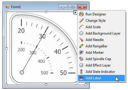
Labels and images serve to display custom text or graphic content within gauges. As other gauge elements, these can be added at design-time using gauge smart-tag or Gauge Designer.
Custom Labels
All types of gauges support custom labels. Custom labels provide the following features.
They can be displayed above or below any other gauge element.
To specify the label’s position along the Z-axis, use the label’s ZOrder property.
Support for HTML formatting of the label’s text.
You can use specific HTML tags to format the label’s text. See Label.Text to learn more.
At design time, you can add a custom label by using the gauge’s smart tag menu.

Then, you can edit the label in one of the following two ways:
select the Label on the gauge and you will get access to its properties in the Property Grid;

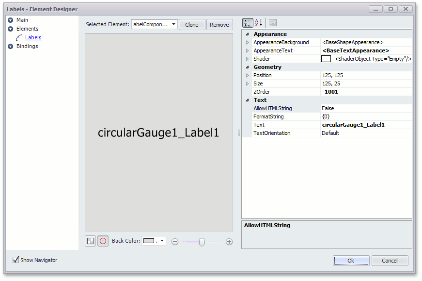
locate the label’s smart tag on the windows form and click Run Designer.

Then, in the invoked designer, you can customize label appearance, geometry and text.

Custom labels are represented by LabelComponent class objects.
When you add a custom label at design time, it’s added to the gauge’s BaseGaugeWin.Labels collection.
Images
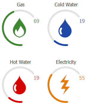
Images are static elements used to decorate your gauges. These elements, as well as custom labels, can reflect the value that this gauge measures (see the figure below).

There are two ways to add an ImageIndicatorComponent object that represents a custom image (these ways are common to all gauge elements).
By clicking the related link within the gauge’s smart-tag.

By clicking the
 icon or cloning existing images in Gauge Designer.
To assign an image to the ImageIndicatorComponent object, use its Image property. The image can be colorized if a Color Scheme is used.
Note
For best visual results, apply the Color Schemes only to monochrome images on a transparent background.
If you need a single gauge to display multiple images that will replace each other, depending on the specific gauge value or an external cause, use State Image Indicators instead.