Stack Layout Mode
- 3 minutes to read
In Stack Layout mode, documents are organized into Stack Groups (StackGroup objects). Stack Groups combine widgets into columns or rows. The direction in which Documents are arranged within Stack Groups depends on the WidgetView.Orientation property.
Group Sizes
Stack Group sizes are measured in absolute or relative units. To set a Stack Group width (vertically oriented Widget View) or height (horizontally oriented View), use its Length property. This property returns an object of the Length type and exposes two properties: Length.UnitType and Length.UnitValue.
If the Length.UnitType property equals Pixel, an integer value stored in the Length.UnitValue property is the width (or height) of the related Stack Group, in pixels. The following figure illustrates three Stack Groups with lengths of 60, 80, and 100 pixels. The View is oriented horizontally.

If the Length.UnitType property equals Star, an integer value stored in the Length.UnitValue property is used as a multiplier that specifies this group’s relative size (compared to other groups with the “Star” unit value). In the figure below, a vertically-oriented Widget View contains three star-measured Stack Groups whose lengths are set to 1, 2, and 3 respectively. The second group is twice as wide as the first group and the third group three times. This ratio persists when users resize the parent form.

Resize Stack Groups
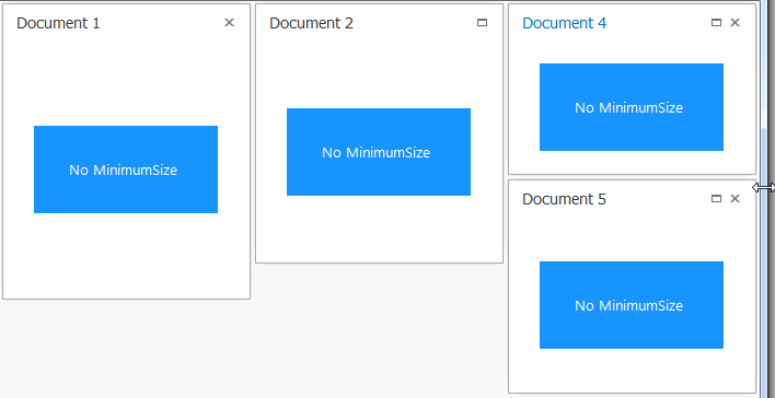
The size of Star-measured Stack Groups depend on the available space in the container. If the parent container is too small, Stack Groups can cut the content of their documents. To avoid this, set the MinimumSize property of a widget content. In this case, Groups shrink until their content reaches the minimum size. When you reduce their size beyond the minimum value, Stack Groups are hidden.
The content’s MinimumSize is not specified
The MinimumSize property is set

When a star-measured Stack Group is hidden, its IsVisible property is set to false and the VisibilityChanged event is raised.
Stack Groups measured in pixels are always visible and cannot be resized. If the parent container becomes too small, Stack Groups display scroll bars.
Drag-and-Drop Documents and Groups
Users can drag widgets between Stack Groups. The number of child documents within a Stack Group cannot exceed the number specified in the IStackGroupDefaultProperties.Capacity property. When you drag a document, the sequence of WidgetView.BeginDragging, WidgetView.Dragging, and WidgetView.EndDragging events are fired.
In the animation above, Widgets show previews of their future locations when a user drags them. You can switch the WidgetView.FreeLayoutProperties.ItemDragStyle property to “DockingHints” to disable these previews and enable standard docking hints.
If the IStackGroupProperties.AllowDragging property is enabled, users can also drag Group captions to re-arrange Stack Groups. Group captions can be set with the StackGroup.Caption property.
Add, Populate and Remove Stack Groups in Code
//create a new Stack Group
StackGroup newStackGroup = new StackGroup();
widgetView.StackGroups.Add(newStackGroup);
//populate the Group
Document doc = widgetView.AddDocument(userControl1);
newStackGroup.Items.Add(doc);
//remove the Group
widgetView.StackGroups.Remove(newStackGroup);
...
widgetView.StackGroups.Remove(newStackGroup);