Table Layout Mode
- 2 minutes to read
The Table Layout Mode provides a more flexible Widget View layout. If in Stack Layout Mode you can host your documents only within either vertically or horizontally oriented Stack Groups, the Table Layout mode defines a grid of multiple columns and rows. Widgets can occupy one or several cells of this grid.
To enable this mode, set the View’s WidgetView.LayoutMode property to TableLayout. Rows and columns are the RowDefinition and ColumnDefinition class objects stored within the WidgetView.Rows and WidgetView.Columns collections, respectively. The easiest way to customize the Widget View’s table layout is to use the Layout tab of the Document Manager Designer. Here, you can add or remove rows and columns with the corresponding buttons, and drag your widgets to the desired table cells. The following figure illustrates this Designer functionality.

Each column and row has its own Length property that works in the exact same way as for the Stack Group objects: you can specify either a strict pixel-based size for your row (column), or use the adaptive star-based size.
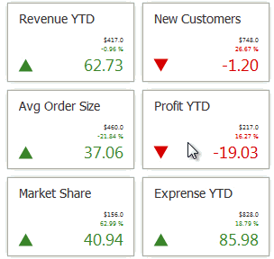
To place a document within the desired grid cell, use the Document.RowIndex and Document.ColumnIndex properties. Widgets can also stretch across multiple adjacent cells. To do so, set the Document.RowSpan and/or Document.ColumnSpan property to a positive integer value, greater than 1. The figure below illustrates a sample Widget View with the Table Layout Mode applied.

When you drag a Document within a table layout WidgetView, the Documents begin to wobble - all Documents that can swap positions with the current Document are displayed with a wobble animation (see the animation below). If you wish to disable this animation, set the WidgetView.AllowDragDropWobbleAnimation property to DefaultBoolean.False.