Buttons
- 3 minutes to read
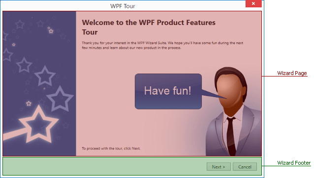
End-users navigate through wizard windows by clicking navigation buttons. The DevExpress Wizard control provides four embedded navigation buttons - Next, Back, Finish and Cancel. These buttons are located in a separate footer region below the page area (see the figure below).
Navigation buttons belong to the wizard footer region, which is separate from pages. However, each individual page provides four boolean Show… properties (e.g., WizardPage.ShowFinish). Using these properties you can display different button sets for different pages. The following mark-up illustrates an example.
<dxco:WizardPage ShowBack="False" ShowFinish="True"  Title="Title String" Header="Header">
   . . .
</dxco:WizardPage>
Pages of welcome, regular and completion types have their own default button presets. For instance, if a regular page in an XAML sample above had no explicitly specified buttons, it would have displayed a default set of Next, Back and Cancel buttons.
In case your page content already contains buttons that you intend to use for navigation, you can completely hide the entire footer region with its default buttons by setting the WizardPage.ShowFooter property to false.
Button Availability
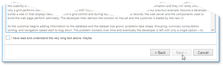
Wizard navigation buttons support enabled and disabled states. To display a button as disabled, set the related Allow… property to false (e.g., the WizardPage.AllowFinish property for a Finish button). This feature can be used to prompt an end-user to perform a specific action. For instance, the following figure illustrates a regular wizard page that displays long text and a check box. The ‘Next’ button is disabled unless users tick the check box.
In this case, you can bind the WizardPage.AllowNext property to a CanGoNext property from code-behind.
<dxco:Wizard.ItemContainerStyle>
   <Style TargetType="dxco:WizardPage">
      <Setter Property="Header" Value="{x:Null}" />
      <Setter Property="AllowNext" Value="{Binding CanGoNext}" />
      . . .
   </Style>
</dxco:Wizard.ItemContainerStyle>
public class ReadEulaPageViewModel {
   public ReadEulaPageViewModel() {
         CanGoNext = false;
   }

   public virtual bool CanGoNext { get; set; }
}
A check box in its turn is bound to the IsAgreed property.
<CheckBox
    Content="I have read and understand the very long text above. Maybe."
    IsChecked="{Binding IsAgreed, Mode=TwoWay,
    UpdateSourceTrigger=PropertyChanged}"/>
public class ReadEulaPageViewModel {
   public virtual bool IsAgreed { get; set; }
}
Then, you can easily synchronize these properties, so that the check box will affect the page WizardPage.AllowNext property.
protected void OnIsAgreedChanged() {
      CanGoNext = IsAgreed;
   }
Note
Refer to the MVVM Framework documentation to learn more about property bindings and update notifications.
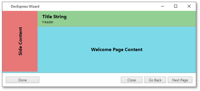
Custom Buttons
Using the Wizard.FooterTemplate property, you can manually template the footer region. This includes implementing your own buttons with custom content and behavior. In order to assign default navigation behavior to these buttons, use attached IsButton… properties. Note that each button can still have its Click event handler and thus can perform both navigation and your own custom action. The following XAML mark-up illustrates an example.
<dxco:Wizard.FooterTemplate>
    <DataTemplate>
        <dxco:WizardDialogFooter>
            <Grid>
                <Grid.ColumnDefinitions>
                    <ColumnDefinition Width="120"/>
                    <ColumnDefinition/>
                    <ColumnDefinition Width="80"/>
                    <ColumnDefinition Width="80"/>
                    <ColumnDefinition Width="90"/>
                </Grid.ColumnDefinitions>
                <dxco:WizardButton Grid.Column="0" Content="Done" dxco:Wizard.IsButtonFinish="True" />
                    <dxco:WizardButton Grid.Column="2" Content="Close" dxco:Wizard.IsButtonCancel="True" Click="WizardButton_Click_1"/>
                    <dxco:WizardButton Grid.Column="3" Content="Go Back" dxco:Wizard.IsButtonBack="True" />
                    <dxco:WizardButton Grid.Column="4" Content="Next Page" dxco:Wizard.IsButtonNext="True" />
            </Grid>
        </dxco:WizardDialogFooter>
    </DataTemplate>
</dxco:Wizard.FooterTemplate>
public partial class MainWindow : Window {
    public bool abortExit;
    public MainWindow() {
        InitializeComponent();
        wizard.Cancel += wizard_Cancel;
    }

    void wizard_Cancel(object sender, DevExpress.Xpf.Core.CancelRoutedEventArgs e) {
        if(abortExit) e.Cancel = true;
    }

    private void WizardButton_Click_1(object sender, RoutedEventArgs e) {
        if(ThemedMessageBox.Show("Cancel installation and close the wizard?", "Confirmation", MessageBoxButton.YesNo) == MessageBoxResult.No) abortExit = true;
        else abortExit = false;
    }
}
The result is shown below.