TileNav Pane
- 3 minutes to read
A TileNavPane is a hierarchical tile menu (consisting of up to three levels) that provides navigation in a touch-friendly manner.
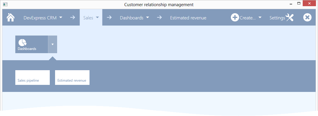
In the non-expanded state, the Tile Nav Pane is a nav bar that provides the Main Button, from which navigation starts, and navigation breadcrumbs that help an end-user to keep track of the current location in the navigation hierarchy. It is also possible to add custom buttons to the nav bar that will perform an action on a click.
Each navigation hierarchy level is rendered as a dropdown bar, in which elements are presented by tiles. The top hierarchy level is a bar displaying categories (TileNavCategory) as tiles. The second hierarchy level is a bar displaying items (TileNavItem) as tiles. And the last hierarchy level is a bar displaying sub-items (TileNavSubItem) as tiles.
To specify the top-level navigation elements, use the TileNavPane.Categories collection. For each category, you can specify child elements using the TileNavCategory.Items collection. Finally, for each item, you can specify sub-items via the TileNavItem.Items collection.
A click on the Main Button shows top level navigation elements, i.e., TileNavCategory objects stored in the TileNavPane.Categories collection.
The figure below demonstrates a sample Tile Nav Pane displaying the contents of the TileNavPane.Categories collection.

Example
The following example shows how to create a TileNavPane, populate it with navigation elements and add custom buttons to the nav bar.
In the XAML markup, four buttons are added to the TileNavPane.NavButtons collection. Buttons added to this collection are displayed in the nav bar. The first, which is aligned at the left margin of the nav bar, is the Main Button. The IsMain property of this button is set to true. Other buttons are aligned to the right using the HorizontalAlignment property. The second button contains items, and so a drop-down tile bar is invoked when this button is clicked.
Button glyphs are differently aligned (the GlyphAlignment property) and the rightmost button does not have a textual content (the Content property). All glyphs are specified to be displayed with the glyph theming feature enabled (the AllowGlyphTheming property).
One category (TileNavCategory) is added the TileNavPane.Categories collection. This category contains one child item, which in turn contains two sub-items. The textual and graphical content of tiles is specified with the TileContent and TileGlyph properties. Textual content of the corresponding buttons in the nav bar is specified with the Content property.
The result of the markup in this example is shown below.

xmlns:dxnav="http://schemas.devexpress.com/winfx/2008/xaml/navigation"
xmlns:dx="http://schemas.devexpress.com/winfx/2008/xaml/core"
<!-- ... -->
<dxnav:TileNavPane x:Name="tileNavPane1">
    <dxnav:TileNavPane.NavButtons>
        <dxnav:NavButton Content="DevExpress CRM" IsMain="True" Glyph="{dx:DXImageGrayscale Image=Home_32x32.png}" AllowGlyphTheming="True"/>
        <dxnav:NavButton Content="Create..." HorizontalAlignment="Right" AllowGlyphTheming="True" Click="NavButton_Click_3" Glyph="{dx:DXImageGrayscale Image=Add_32x32.png}">
            <dxnav:TileNavItem Content="Staff">
                <dxnav:TileNavSubItem Content="Manager"/>
                <dxnav:TileNavSubItem Content="Seller"/>
                <!-- add sub-items here, if required -->
            </dxnav:TileNavItem>
            <dxnav:TileNavItem Content="Client"/>
            <!-- add items here, if required -->
        </dxnav:NavButton>
        <dxnav:NavButton Content="Settings" GlyphAlignment="Right" Glyph="{dx:DXImageGrayscale Image=Customization_32x32.png}" AllowGlyphTheming="True" HorizontalAlignment="Right" Click="NavButton_Click_2"/>
        <dxnav:NavButton HorizontalAlignment="Right" Glyph="{dx:DXImageGrayscale Image=Cancel_32x32.png}" AllowGlyphTheming="True" Click="NavButton_Click_1"/>
    </dxnav:TileNavPane.NavButtons>
    <dxnav:TileNavCategory Content="Sales">
        <dxnav:TileNavItem Content="Dashboards" TileGlyph="{dx:DXImageGrayscale Image=Pie_32x32.png}" AllowGlyphTheming="True">
            <dxnav:TileNavSubItem Content="Sales pipeline" Click="TileNavSubItem_Click_1"/>
            <dxnav:TileNavSubItem Content="Estimated revenue"/>
            <!-- add sub-items here, if required -->
        </dxnav:TileNavItem>
        <!-- add items here, if required -->
    </dxnav:TileNavCategory>
    <!-- add categories here, if required -->
</dxnav:TileNavPane>