Scheduling Area
- 3 minutes to read
This topic describes the scheduling area that is used to schedule or view user events under various Time Views.
The scheduling area is represented by the TcxSchedulerCustomView class. To allow end-users to view schedules in a number of different ways, the scheduler control provides seven View types: Agenda, Day, Week, Weeks, Year, TimeGrid, and Gantt. An end-user can switch between them using the Date Navigator or pop-up menu.
Day View

This View lets the user events in the scheduling area be displayed or scheduled on a day-by-day basis or by a number of days.
The scheduling area displays the time blocks with working hours shown in a lighter color than nonworking hours. Time blocks are used to schedule user events. The increments of time blocks are changeable and specified by the TcxSchedulerDayView.TimeScale property. To set or change the working hours, use the scheduler’s OptionsView.WorkStart and OptionsView.WorkFinish properties. Days containing working hours are workdays. The default workdays are Monday through to Friday. The scheduler’s OptionsView.WorkDays property specifies which days should be assigned to a workweek.
The left side of the scheduling area is occupied by the time ruler bar, which displays the time of the time blocks. By default, only the primary time ruler is displayed. To display the second time ruler, set the TcxSchedulerOptionsView.ShowAdditionalTimeZone property to True. To set the time rulers use the scheduler’s OptionsView.CurrentTimeZone and OptionsView.AdditionalTimeZone properties. To specify names for the time rulers, use the scheduler’s OptionsView.CurrentTimeZoneLabel and OptionsView.AdditionalTimeZoneLabel properties. Note: the time ruler bar is only visible in the Day View.
When a user event is scheduled for a time that is not currently displayed in the scheduling area a yellow rectangle appears on the time ruler bar, it contains an ellipsis with a small arrow indicating in which direction the scheduling area‘s content should be scrolled in order to bring the user event into view. The same scroll button is displayed when the user event is outside of the day’s cell when working under the Week, Weeks, Year or TimeGrid View. For details on the scroll button see the following topics: TcxScheduler.OnCustomDrawButton, TcxCustomScheduler.OnMoreEventsButtonClick, TcxSchedulerCustomResourceViewHitTest.HitAtButton, and TcxSchedulerMoreEventsButtonViewInfo.
Agenda View

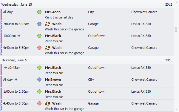
The Agenda View lists the user events in a chronological order grouped by day.
Week View

The Week View lets the user events in the scheduling area be displayed or scheduled by week.
Weeks View

The Weeks View lets the user events in the scheduling area be displayed or scheduled by two or more weeks.
Year View

The Year View lets the user events in the scheduling area be displayed or scheduled by year. Note: an end-user can switch from this View to only Day View by selecting the “Go to This Day”, Today, or “Go to Date…” item the pop-up menu.
TimeGrid View

The TimeGrid View displays user events in chronological order from left to right. Note: an end-user can switch from this View to only Day View by selecting the “Go to This Day”, Today, or “Go to Date…” item the pop-up menu.
Gantt View

The Gantt View displays user events as horizontal bars along the time axis. These bars can be linked to each other into a task series and optionally show the completion percentage.