Filter Panel and Filter Builder Dialog in Blazor TreeList
- 20 minutes to read
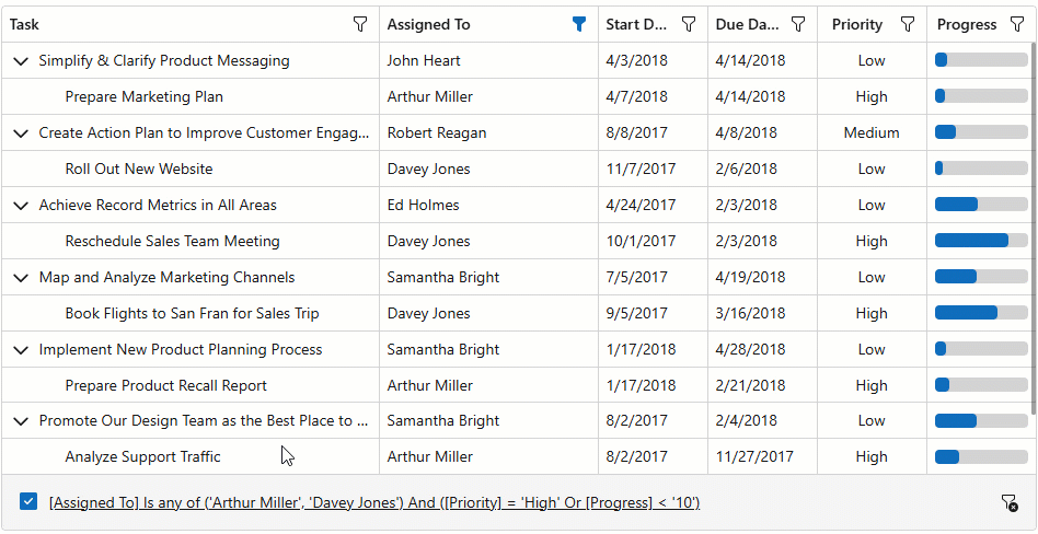
The DevExpress Blazor TreeList component includes a built-in filter panel and filter builder dialog. The panel displays the current filter condition and provides controls to temporarily disable or clear it. Users can click the condition to open the filter builder dialog, where they can edit and combine filter criteria for TreeList columns.
Add a Filter Panel
Assign Auto to FilterPanelDisplayMode to display the filter panel only when TreeList data is filtered. To always display the filter panel, set the FilterPanelDisplayMode property to Always:
@inject EmployeeTaskService EmployeeTaskService
<DxTreeList Data="TreeListData" KeyFieldName="Id" ParentKeyFieldName="ParentId"
FilterMenuButtonDisplayMode="TreeListFilterMenuButtonDisplayMode.Always"
FilterPanelDisplayMode="TreeListFilterPanelDisplayMode.Always">
<Columns>
<DxTreeListDataColumn FieldName="Name" Caption="Task" />
<DxTreeListDataColumn FieldName="EmployeeName" Caption="Assigned To" />
<DxTreeListDataColumn FieldName="StartDate" />
<DxTreeListDataColumn FieldName="DueDate" />
<DxTreeListDataColumn FieldName="Priority">
<EditSettings>
<DxComboBoxSettings Data="Priorities" ValueFieldName="Value" TextFieldName="Text" />
</EditSettings>
</DxTreeListDataColumn>
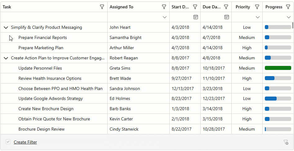
<DxTreeListDataColumn Caption="Progress" FieldName="Status">
<CellDisplayTemplate>
<DxProgressBar Value="Convert.ToDouble(context.Value)" Thickness="0.875em" Size="100%"
MinValue="0" MaxValue="100" ShowLabel="false" />
</CellDisplayTemplate>
</DxTreeListDataColumn>
</Columns>
</DxTreeList>
@code {
List<EmployeeTask> TreeListData { get; set; }
protected override void OnInitialized() {
TreeListData = EmployeeTaskService.GenerateData();
}
record Priority(int Value, string Text);
static readonly IReadOnlyList<Priority> Priorities = new Priority[] {
new Priority(-1, "Low"),
new Priority(0, "Medium"),
new Priority(1, "High"),
};
}
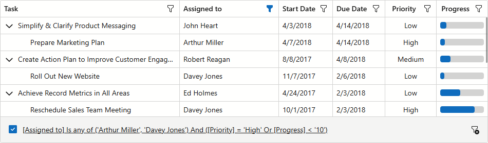
Customize the Filter Panel
Handle the CustomizeElement event to customize filter panel appearance. Check if e.ElementType is TreeListElementType.FilterPanel to determine whether the processed element is the filter panel.
The following code snippet customizes the filter panel’s border:
@inject EmployeeTaskService EmployeeTaskService

<DxTreeList Data="TreeListData"
            KeyFieldName="Id"
            ParentKeyFieldName="ParentId"
            CustomizeElement="OnCustomizeElement"
            FilterMenuButtonDisplayMode="TreeListFilterMenuButtonDisplayMode.Always"
            FilterPanelDisplayMode="TreeListFilterPanelDisplayMode.Always">
    <Columns>
        <DxTreeListDataColumn FieldName="Name" Caption="Task" />
        <DxTreeListDataColumn FieldName="EmployeeName" Caption="Assigned To" />
        <DxTreeListDataColumn FieldName="StartDate" />
        <DxTreeListDataColumn FieldName="DueDate" />
        <DxTreeListDataColumn FieldName="Priority">
            <EditSettings>
                <DxComboBoxSettings Data="Priorities" ValueFieldName="Value" TextFieldName="Text" />
            </EditSettings>
        </DxTreeListDataColumn>
        <DxTreeListDataColumn Caption="Progress" FieldName="Status">
            <CellDisplayTemplate>
                <DxProgressBar Value="Convert.ToDouble(context.Value)" Thickness="0.875em" Size="100%"
                            MinValue="0" MaxValue="100" ShowLabel="false" />
            </CellDisplayTemplate>
        </DxTreeListDataColumn>
    </Columns>
</DxTreeList>

@code {
    List<EmployeeTask> TreeListData { get; set; }

    protected override void OnInitialized() {
        TreeListData = EmployeeTaskService.GenerateData();
    }
    void OnCustomizeElement(TreeListCustomizeElementEventArgs e) {
        if (e.ElementType == TreeListElementType.FilterPanel) {
            e.CssClass = "custom-filter-panel";
        }
    }
    record Priority(int Value, string Text);
    static readonly IReadOnlyList<Priority> Priorities = new Priority[] {
        new Priority(-1, "Low"),
        new Priority(0, "Medium"),
        new Priority(1, "High"),
    };
}
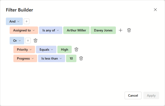
Open the Filter Builder Dialog
The filter builder dialog is a centralized viewer/editor for the TreeList component’s filter conditions. To open this dialog, users can click the current filter criteria in the filter panel. Call the ShowFilterBuilder() method to open this dialog from code.
The following code snippet adds a toolbar button that opens the filter builder dialog:
@inject EmployeeTaskService EmployeeTaskService

<DxTreeList @ref="TreeList" Data="TreeListData" KeyFieldName="Id" ParentKeyFieldName="ParentId"
            FilterMenuButtonDisplayMode="TreeListFilterMenuButtonDisplayMode.Always"
            FilterPanelDisplayMode="TreeListFilterPanelDisplayMode.Always">
    <Columns>
        <DxTreeListDataColumn FieldName="Name" Caption="Task" />
        <DxTreeListDataColumn FieldName="EmployeeName" />
        <DxTreeListDataColumn FieldName="StartDate" />
        <DxTreeListDataColumn FieldName="DueDate" />
    </Columns>
    <ToolbarTemplate>
        <DxToolbar ItemRenderStyleMode="ToolbarRenderStyleMode.Contained">
            <Items>
                <DxToolbarItem Alignment="ToolbarItemAlignment.Right"
                               Text="Filter Builder" RenderStyle="ButtonRenderStyle.Secondary"
                               Click="() => TreeList.ShowFilterBuilder()"  />
            </Items>
        </DxToolbar>
    </ToolbarTemplate>
</DxTreeList>

@code {
    ITreeList TreeList { get; set; }
    List<EmployeeTask> TreeListData { get; set; }

    protected override void OnInitialized() {
        TreeListData = EmployeeTaskService.GenerateData();
    }
}
Filter Builder Fields
Field Generation
The TreeList automatically generates and configures available filter builder fields based on the following column settings:
The filter field hierarchy is based on the column band hierarchy. The following code snippets demonstrate how filter fields are generated based on TreeList columns:
<Columns>
    <DxTreeListDataColumn FieldName="Name" Caption="Task" />
    <DxTreeListDataColumn FieldName="EmployeeID" Caption="Assigned To" >
        <EditSettings>
            <DxComboBoxSettings Data="Employees" ValueFieldName="EmployeeID" TextFieldName="EmployeeName" />
        </EditSettings>
    </DxTreeListDataColumn>
    <DxTreeListBandColumn Caption="Timeline">
        <DxTreeListDataColumn FieldName="StartDate" />
        <DxTreeListDataColumn FieldName="DueDate" />
    </DxTreeListBandColumn>
</Columns>
<Fields>
    <DxFilterBuilderField FieldName="Name" Type="@typeof(string)" Caption="Task" />
    <DxFilterBuilderField FieldName="EmployeeID" Caption="Assigned To" Type="@typeof(int)">
        <EditSettings>
            <DxComboBoxSettings Data="Employees" ValueFieldName="EmployeeID" TextFieldName="EmployeeName" />
        </EditSettings>
    </DxFilterBuilderField>
    <DxFilterBuilderField FieldName="Timeline" Caption="Timeline" AllowSelection="false">
        <Fields>
            <DxFilterBuilderField FieldName="StartDate" Type="@typeof(DateTime)"
                                  Caption="Start Date" CaptionFullPath="Timeline.Start Date" />
            <DxFilterBuilderField FieldName="DueDate" Type="@typeof(DateTime)"
                                  Caption="Due Date" CaptionFullPath="Timeline.Due Date" />
        </Fields>
    </DxFilterBuilderField>
</Fields>
Field Visibility
The TreeList sets initial field visibility based on the corresponding column’s visibility. The filter builder dialog automatically updates field visibility once a user displays or hides a column. The dialog automatically hides filter fields generated for bands if these fields no longer contain visible children.
To always display or hide a field, set FilterBuilderFieldDisplayMode to Never/Always. The following code snippet hides the Start Date filter field:
@inject EmployeeTaskService EmployeeTaskService

<DxTreeList Data="TreeListData" KeyFieldName="Id" ParentKeyFieldName="ParentId"
            FilterMenuButtonDisplayMode="TreeListFilterMenuButtonDisplayMode.Always"
            FilterPanelDisplayMode="TreeListFilterPanelDisplayMode.Always">
    <Columns>
        <DxTreeListDataColumn FieldName="Name" Caption="Task" />
        <DxTreeListDataColumn FieldName="EmployeeName" />
        <DxTreeListDataColumn FieldName="StartDate"
                              FilterBuilderFieldDisplayMode="GridColumnFilterBuilderFieldDisplayMode.Never"/>
        <DxTreeListDataColumn FieldName="DueDate" />
    </Columns>
</DxTreeList>

@code {
    List<EmployeeTask> TreeListData { get; set; }

    protected override void OnInitialized() {
        TreeListData = EmployeeTaskService.GenerateData();
    }
}
Filter Builder Template
Specify a FilterBuilderTemplate to apply the following customizations:
- Display custom filter fields
- Display custom content within the filter builder dialog
- Change settings of the integrated Filter Builder component
To use autogenerated fields in this template, call the context.RenderDefaultFields method within the Filter Builder component’s Fields tag.
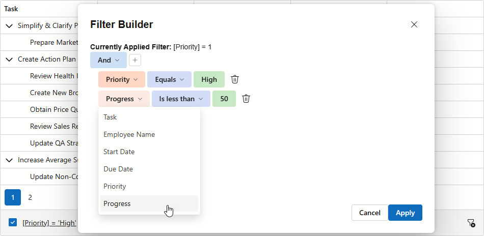
The following code snippet customizes the filter builder dialog as follows:
- Displays the applied filter condition above the Filter Builder component
- Limits available logical operators to
AndandOr - Adds a Progress filter field
@inject EmployeeTaskService EmployeeTaskService

<DxTreeList @ref="TreeList" Data="TreeListData" KeyFieldName="Id" ParentKeyFieldName="ParentId"
            FilterPanelDisplayMode="TreeListFilterPanelDisplayMode.Always">
    <Columns>
        <DxTreeListDataColumn FieldName="Name" Caption="Task" />
        <DxTreeListDataColumn FieldName="EmployeeName" />
        <DxTreeListDataColumn FieldName="StartDate" />
        <DxTreeListDataColumn FieldName="DueDate" />
        <DxTreeListDataColumn FieldName="Priority">
            <EditSettings>
                <DxComboBoxSettings Data="Priorities" ValueFieldName="Value" TextFieldName="Text" />
            </EditSettings>
        </DxTreeListDataColumn>
    </Columns>
    <FilterBuilderTemplate>
        <b>Currently Applied Filter:</b> @(context.TreeList.GetFilterCriteria()?.ToString() ?? "No filter")
        <DxFilterBuilder @bind-FilterCriteria="context.FilterCriteria"
            GroupOperatorTypes="[FilterBuilderGroupOperatorType.And, FilterBuilderGroupOperatorType.Or]">
            <Fields>
                @context.RenderDefaultFields()
                <DxFilterBuilderField FieldName="Status" Caption="Progress" Type="@typeof(int)">
                    <EditSettings>
                        <DxSpinEditSettings MinValue="0" MaxValue="100" />
                    </EditSettings>
                </DxFilterBuilderField>
            </Fields>
        </DxFilterBuilder>
    </FilterBuilderTemplate>
</DxTreeList>

@code {
    ITreeList TreeList { get; set; }
    List<EmployeeTask> TreeListData { get; set; }

    record Priority(int Value, string Text);
    static readonly IReadOnlyList<Priority> Priorities = new Priority[] {
        new Priority(-1, "Low"),
        new Priority(0, "Medium"),
        new Priority(1, "High"),
    };

    protected override void OnInitialized() {
        TreeListData = EmployeeTaskService.GenerateData();
    }
}
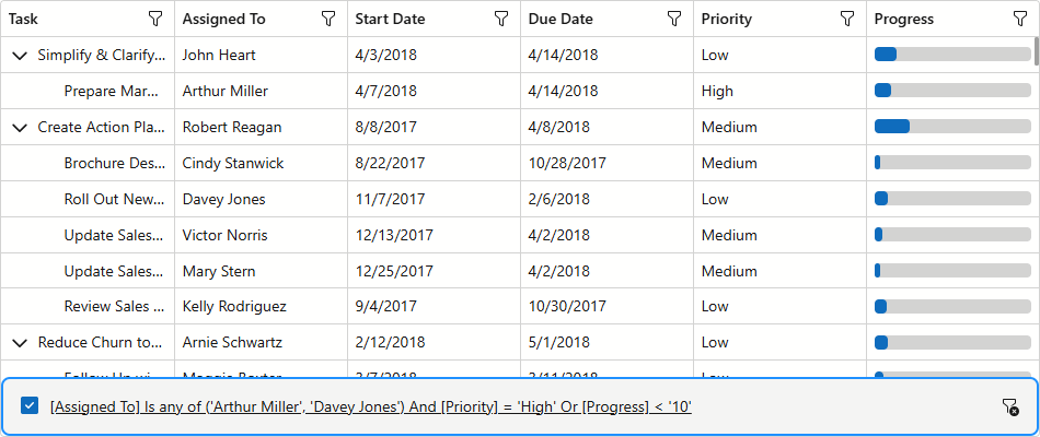
Filter Synchronization
The TreeList component automatically synchronizes filter changes across the following UI elements:
- Column filter menus
- Filter row
- Filter panel
- Filter builder dialog
Of these elements, only the filter panel and filter builder can display all filter conditions. Other elements have limitations, for example, column filter menus do not support the Contains operator, and filter row cells cannot display the Betweencondition. To ensure the entire filter expression is visible, add a filter panel to the TreeList. The panel also provides access to the filter builder dialog.
Note
The TreeList updates a column’s FilterRowOperatorType once users apply filters to column data using another UI element. For instance, after a user selects a filter menu value, the column’s FilterRowOperatorType switches to Equals. The operator type remains Equals even after the filter is cleared.
You can extend filter row UI and display filter operators for each column. Refer to the following example for additional information: Incorporate a selector for filter row operator type.