Windows 11 UI
- 6 minutes to read
DevExpress WinForms controls support a Windows 11-inspired UI through the WXI skin.

WXI Skin
The vector-based DevExpress WXI Skin replicates key Windows 11 visual elements for DevExpress-powered WinForms apps. Like other DevExpress vector-based skins, the WXI Skin leverages soft palettes, subtle contrasts, and larger control sizes to enhance usability. WXI also increases paddings between controls to improve readability.

Compact Mode
The WXI Skin includes two variants: WXI and WXI Compact. Use WXI Compact to reduce control margins and increase form content density—which is especially useful for data-entry-intensive applications.

The following code snippet applies the WXI Skin:
// Apply the WXI skin with its default palette.
DevExpress.LookAndFeel.UserLookAndFeel.Default.SetSkinStyle(SkinStyle.WXI);

// Apply WXI Compact.
DevExpress.LookAndFeel.UserLookAndFeel.Default.SetSkinStyle(SkinStyle.WXICompact);

// Apply WXI with the "Sharpness" palette.
DevExpress.LookAndFeel.UserLookAndFeel.Default.SetSkinStyle(SkinSvgPalette.WXI.Sharpness);

// Apply WXI Compact with the "Sharpness" palette.
DevExpress.LookAndFeel.UserLookAndFeel.Default.SetSkinStyle(SkinSvgPalette.WXICompact.Sharpness);
Global Compact Mode Behavior
The WindowsFormsSettings.CompactUIMode global setting specifies how the runtime skin selector interprets WXI variants:
// The global Compact UI Mode is off. The "WXI" runtime option applies WXI.
WindowsFormsSettings.CompactUIMode = DevExpress.Utils.DefaultBoolean.False;

// The global Compact UI Mode is on. The "WXI" runtime option applies WXI Compact.
WindowsFormsSettings.CompactUIMode = DevExpress.Utils.DefaultBoolean.True;
Set the WindowsFormsSettings.CompactUIMode property to DefaultBoolean.Default to allow users to choose between the two variants at runtime.
Use the UserLookAndFeel.Default.CompactUIModeForced property to check the mode:
Form Corner Rendering
In Windows 11 environments, the WXI Skin renders rounded window corners automatically. To override this behavior or extend it to other skins, use the WindowsFormsSettings.AllowRoundedWindowCorners property:
WindowsFormsSettings.AllowRoundedWindowCorners = DefaultBoolean.True;
Ribbon UI
The WXI Skin applies rounded corners to the RibbonControl’s Item Panel. If this causes mismatches with rectangular controls beneath the Ribbon, resolve the issue using one of the following techniques:

Use the Classic Ribbon Style
Disable corner rounding for Ribbon controls:
// Disable corner rounding for a specific Ribbon control.
ribbonControl1.ItemPanelStyle = RibbonItemPanelStyle.Classic;

// Disable corner rounding for all Ribbon controls in the project.
WindowsFormsSettings.RibbonItemPanelStyle = RibbonItemPanelStyle.Classic;

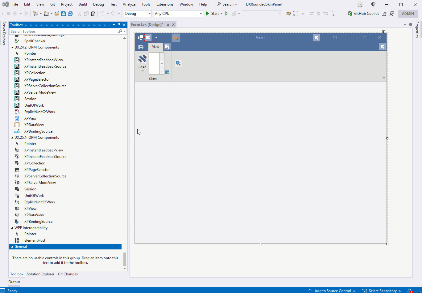
Add a Rounded Skin Panel
Use the RoundedSkinPanel to wrap child controls and align them with the Ribbon’s rounded edges:
The RoundedSkinPanel displays rounded corners and adds padding around its content when the WXI skin is applied. In other skins, the panel has the standard (rectangular) border without padding around the panel’s content. Use the BorderStyle property to implicitly specify the panel’s border style.
See the following animation to get started:
Warning
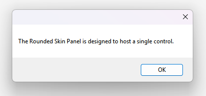
The RoundedSkinPanel control is designed to host only one UI control (such as a Data Grid, TreeList, or Spreadsheet). However, it can contain multiple nested RoundedSkinPanel controls, while hosting only a single primary UI control. The following message appears if you add more than one UI control to a RoundedSkinPane at design time:
The following code snippet creates a RoundedSkinPanel control that hosts two RoundedSkinPanel controls:
using DevExpress.XtraEditors;
using DevExpress.XtraEditors.Controls;
using DevExpress.XtraGrid;
using DevExpress.XtraGrid.Views.Grid;
using DevExpress.XtraTreeList;
using System.Windows.Forms;

namespace DXApplication {
    public partial class Form1 : DevExpress.XtraBars.Ribbon.RibbonForm {
        RoundedSkinPanel roundedSkinPanel1, roundedSkinPanel2, roundedSkinPanel3;
        GridControl gridControl1, gridControl2;
        public Form1() {
            InitializeComponent();
            // Create the first GridControl
            GridControl gridControl1 = new GridControl() { Dock = DockStyle.Fill };
            // Assign a GridView to the first GridControl.
            gridControl1.MainView = new GridView();
            // Create the first RoundedSkinPanel and set it to fill the form.
            roundedSkinPanel1 = new RoundedSkinPanel() { Dock = DockStyle.Fill };
            // Add the GridControl to the first panel.
            roundedSkinPanel1.Controls.Add(gridControl1);

            // Create a TreeList.
            TreeList treeList1 = new TreeList() { Dock = DockStyle.Fill };
            // Create the second RoundedSkinPanel, dock it to the left, and set its width.
            roundedSkinPanel2 = new RoundedSkinPanel() { Dock = DockStyle.Left, Width = 300 };
            // Add the TreeList to the second panel.
            roundedSkinPanel2.Controls.Add(treeList1);

            // Create the second GridControl.
            GridControl gridControl2 = new GridControl() { Dock = DockStyle.Fill };
            // Assign a GridView to the second GridControl.
            gridControl2.MainView = new GridView() { BorderStyle = BorderStyles.NoBorder };
            // Create the third RoundedSkinPanel, dock it to the bottom, and set its height.
            roundedSkinPanel3 = new RoundedSkinPanel() { Dock = DockStyle.Bottom, Height = 200 };
            // Add the second GridControl to the third panel.
            roundedSkinPanel3.Controls.Add(gridControl2);

            // Add the bottom panel and the left panel to the first panel.
            roundedSkinPanel1.Controls.Add(roundedSkinPanel3);
            roundedSkinPanel1.Controls.Add(roundedSkinPanel2);

            // Add the first panel (containing all other panels) to the form.
            this.Controls.Add(roundedSkinPanel1);
        }

    }
}
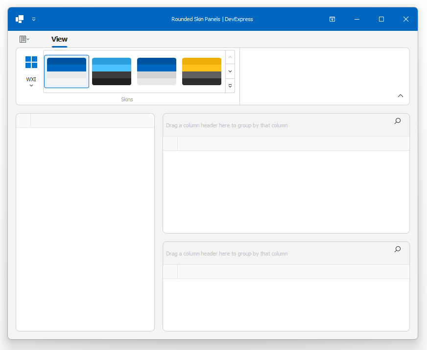
The following screenshot shows the result:
Specific notes:
- The
RoundedSkinPaneldoes not support a right-to-left (RTL) layout. - The
RoundedSkinPanelcannot host the MapControl. - Use the Layout Control’s RoundedPanelIntegrationMode property to specify whether the Layout Control automatically adapts its padding within a
RoundedSkinPanelcontainer.
Use the Layout Control
For forms with many UI controls, integrate the Layout Control or Data Layout Control to align controls with the Ribbon and maintain consistent spacing. Layout containers automatically apply paddings compatible with the WXI Skin.

In the WXI Skin, use the LayoutControl.OptionsView.RoundedPanelIntegrationMode property to specify how the Layout Control interacts within a Rounded Skin Panel container:
- Adaptive (Default): The Layout Control’s padding is disabled. The
RoundedSkinPanelborder is hidden. - Manual: The Layout Control’s default padding is applied. The
RoundedSkinPanelborder is displayed. Use this mode to manually control layout appearance.
using DevExpress.XtraLayout;

layoutControl1.OptionsView.RoundedPanelIntegrationMode = RoundedPanelIntegrationMode.Adaptive;
Dock Panels
To align Dock Panel content with Ribbon corners:
- Move the Dock UI to a
UserControl. - Set
UserControlpaddings manually or place theUserControlinside aRoundedSkinPanel.

Use the DockManager’s Light style to suppress extra borders:
using DevExpress.XtraBars.Docking2010.Views;

dockManager1.Style = DockingViewStyle.Light;