Appearances
- 6 minutes to read
Beyond skins, DevExpress WinForms controls offer appearance customization options for individual UI elements (such as cells, rows, column headers, buttons, lines, etc.). Appearance objects encapsulate styling properties that allow you to modify colors, fonts, and text-related settings of UI elements.
Appearances and Appearance Settings
There are several ways to customize appearance settings:
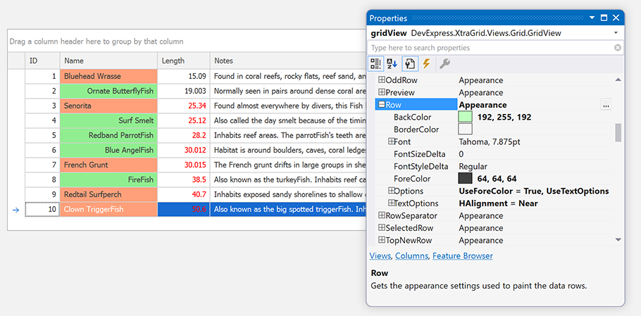
Appearance settings at control level specify how the control’s elements are painted by default. For example, the GridView.Appearance property specifies visual elements’ appearance in the Data Grid control’s default View.
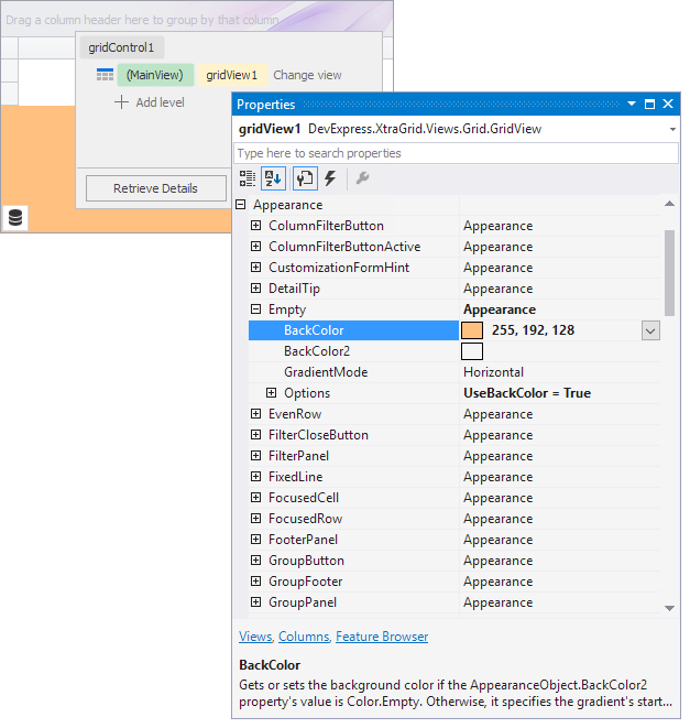
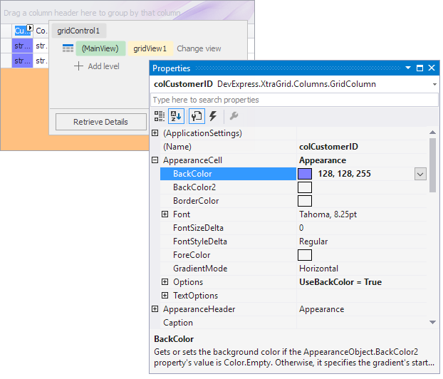
Appearance settings at visual element level specify an element’s look-and-feel. For instance, the GridColumn.AppearanceCell and GridColumn.AppearanceHeader properties specify this column’s appearance:
In many controls, the visual element’s appearance can be customized at control and visual element levels. The latter appearance settings have a higher priority.
For certain controls, you can customize appearance settings using events. For example, the GridView.RowCellStyle event allows you to provide appearance settings for individual cells in a Data Grid. The GridView.CustomDrawColumnHeader event can be handled to paint column headers manually.
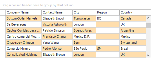
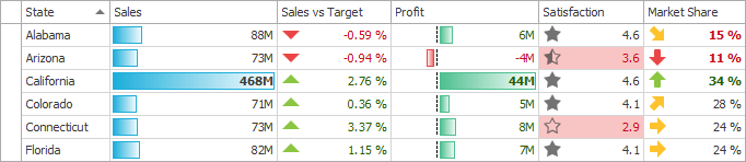
Conditional formatting - allows you to highlight cells that meet certain conditions.
The following controls support this feature:
Dedicated components can be used to manage multiple controls’ appearance settings simultaneously.
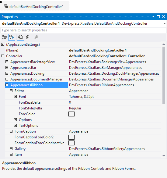
- DefaultBarAndDockingController and BarAndDockingController - Allow you to manage the appearance of controls and components included in the XtraBars library - bars, dock panels, Ribbon controls, App UI Manager (DocumentManager) and tabbed windows (XtraTabbedMdiManager).
Controls store their appearance settings in AppearanceObject/AppearanceObjectEx class objects. These settings specify the background and foreground colors, font, word wrapping, text trimming, and other attributes.
The AppearanceObject.Options property determines which appearance settings are in effect and which are ignored. When an AppearanceObject’s style setting (such as BackColor, ForeColor, Font, or TextOptions.HAlignment) is set to a non-default value, the corresponding Options.Use~ option (for instance, Options.UseBackColor, Options.UseForeColor, Options.UseFont, or Options.UseTextOptions) is automatically set to true in the following cases:
- The AppearanceObject belongs to a control/component (or its element), and this control/component has been completely loaded (see the control’s
IsLoadingproperty to check the load status); - The AppearanceObject belongs to a grid column/band or tree list column/band, and the column/band belongs to a grid/tree list control;
- The AppearanceObject is standalone, that is, it does not belong to any control or component.
In other cases, the Options.Use~ options are not automatically enabled. You may need to enable these options manually for the style settings to be in effect.
For example, if the AppearanceOptions.UseBackColor option is set to false, the current AppearanceObject’s BackColor setting is ignored, and the control’s background is painted using the default settings. To obtain the actual appearance settings that are used to paint the control’s elements, use the control’s PaintAppearance property (for example, GridView.PaintAppearance).
Note
In some paint schemes (for instance, a skin and Office2003), the scheme defines some visual elements’ background (for example, a column header in Data Grid) and it cannot be set to a custom value. Changing these elements’ AppearanceObject.BackColor setting has no effect unless you change the paint scheme.
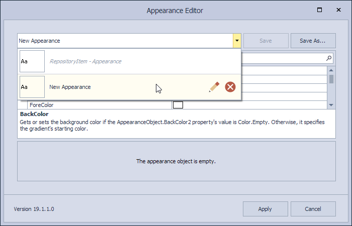
Appearance Editor - Re-Using Appearance Settings
The Appearance Editor allows you to customize and save appearance settings and apply them to other objects at design time. Click the ellipsis button next to a control’s Appearance property to invoke the Appearance Editor dialog. Customize the appearance settings as required and click the “Save As…” button to save the current appearance settings as a template.
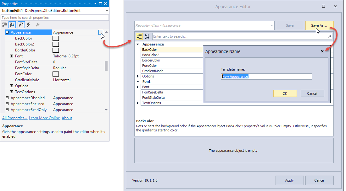
When you invoke the Appearance Editor for another control/visual element, you can access saved templates from a drop-down selector. Choose a template and click “Apply” to apply these settings to the current AppearanceObject.
Appearance Priority
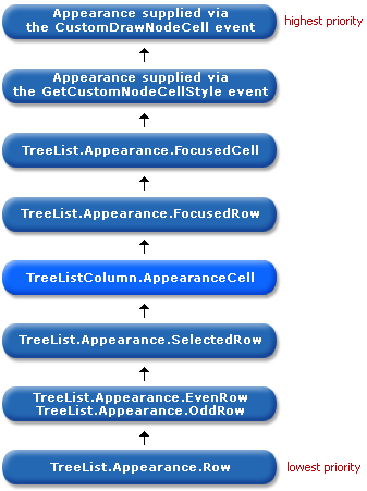
In compound controls, a visual element’s appearance is usually determined by multiple AppearanceObject properties with different priorities. Appearance settings with a lower priority are only in effect if the higher-priority appearance settings are not used (the Options.UseBackColor, Options.UseForeColor, Options.UseFont, etc. are disabled).
The following image shows the default appearance priority used to paint a cell in the Tree List:
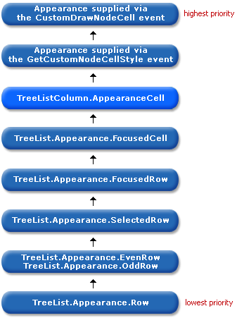
In the Data Grid, Tree List and Vertical Grid controls, you can change the order in which appearance settings are applied when painting control cells. In these controls, the AppearanceCell/Appearance properties their columns provide are AppearanceObjectEx class properties. This class exposes the AppearanceOptionsEx.HighPriority option for raising the appearance priority.
The image below shows the cell appearance hierarchy in Tree List when a column’s AppearanceCell.Options.HighPriority option is enabled. Note that the column’s AppearanceCell setting takes priority over the focused node and focused cell appearances.
Print and Export Appearances
The Data Grid, Tree List, and other controls support the printing/exporting functionality. These controls expose the AppearancePrint property which provides the appearance settings that are used when printing or exporting the controls. Enable the following option to use these settings:
- Data Grid: GridOptionsPrint.UsePrintStyles
- Tree List: TreeListOptionsPrint.UsePrintStyles
- Pivot Grid: PivotGridOptionsPrint.UsePrintAppearance
If this option is set to false, the control is printed/exported as it is displayed on the form.
See Printing and Exporting to learn more.
Save and Restore Appearances
The appearance settings used to paint DevExpress .NET controls can be saved to the system registry, an XML file or written to a stream using the methods listed in the table below.
| Method | Description |
|---|---|
| BaseAppearanceCollection.SaveLayoutToRegistry | Saves the appearance settings to a system registry path. |
| BaseAppearanceCollection.SaveLayoutToStream | Saves the appearance settings to a stream. |
| BaseAppearanceCollection.SaveLayoutToXml | Saves the appearance settings to a XML file. |
Once saved, the appearance settings can be applied to other controls. The following table lists the methods used to restore the saved appearance settings:
| Method | Description |
|---|---|
| BaseAppearanceCollection.RestoreLayoutFromRegistry | Restores the appearance settings stored at the specified system registry path. |
| BaseAppearanceCollection.RestoreLayoutFromStream | Restores the appearance settings from the specified stream. |
| BaseAppearanceCollection.RestoreLayoutFromXml | Restores the appearance settings stored in the specified XML file. |
The following example code shows how to write and read the appearance settings used to paint Grid Control elements to/from an XML file:
string fileName = "C:\\appearanceLayout.xml";
gridControl1.MainView.Appearance.SaveLayoutToXml(fileName);
// ...
gridControl1.MainView.Appearance.RestoreLayoutFromXml(fileName);