Flyout Panel
- 5 minutes to read
FlyoutPanel is a container that you can show in a position relative to a linked control. The panel can stretch across its parent container, supports animation effects and displays an optional beak element.

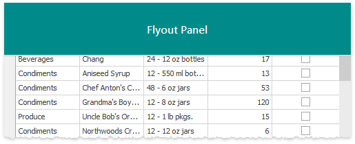
Regular Flyout Panel

Beak Flyout Panel
On-Form Access
When you drop a Flyout Panel from the Visual Studio Toolbox onto a form, the panel automatically receives a child FlyoutPanelControl container. Unlike the panel itself, which is borderless, this container has borders painted according to the current application skin. If you need no borders, remove this container and place custom controls directly onto a panel.
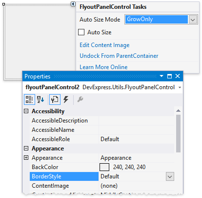
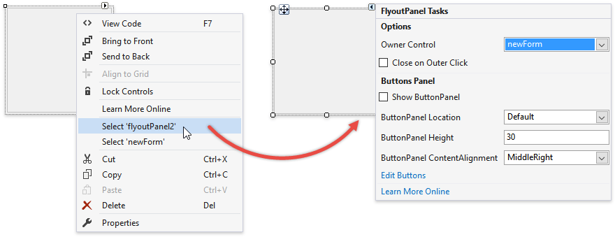
If you have not removed this inner container, you will automatically select it every time you click a panel. To select the FlyoutPanel itself, right-click it and choose “Select ‘<your_panel_name>’”. Then, you will be able to utilize the panel smart tag, which provides quick access to most relevant panel options.
Alternatively, you can press the ESC key.
Panel Owner
A newly added panel reminds you to specify its FlyoutPanel.OwnerControl property.
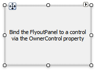
A Flyout Panel must have a parent UI element at all times, since a panel only appears on screen relatively to its parent. Use the panel smart tag to set a parent.
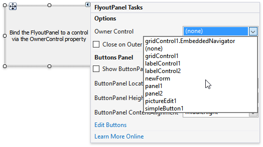
A Flyout Panel must have a form, user control or a regular panel as a parent. Primitive UI elements (buttons, editors, labels, etc.) should be parents of beak panels only.
Alignment
Once you have set a panel parent, use the FlyoutPanelOptions.AnchorType property to set a relative position for the panel. This property is stored within the FlyoutPanel.Options group. With Top, Right, Bottom and Left anchor types a panel will stretch across its parent container.
TopLeft and TopRight anchor types align a panel to the top corners of a parent. In these modes Flyout Panels do not stretch. Additionally, you can shift the panel inwards by setting horizontal and vertical offsets (the FlyoutPanelOptions.HorzIndent and FlyoutPanelOptions.VertIndent properties).
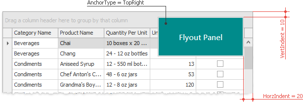
Finally, the Manual anchor type allows you to align a Flyout Panel to any position relative to the owner control’s top left corner. Utilize the FlyoutPanelOptions.Location property to specify panel coordinates in this manual mode.

Show and Hide Flyout Panels
Flyout Panels are initially hidden. To display a panel, call its FlyoutPanel.ShowPopup method. The optional method parameter allows you to skip animation effects and display the panel immediately. If the FlyoutPanelOptions.CloseOnOuterClick property equals true, end-users will be able to hide a panel by clicking anywhere outside it. Otherwise, you will need to call the FlyoutPanel.HidePopup method to close the panel.
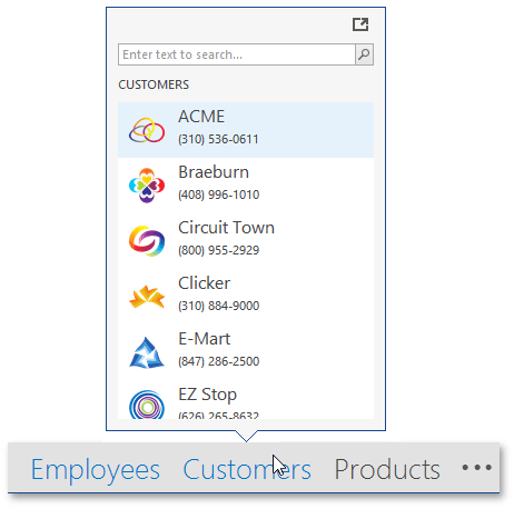
Beak Panels
Call the FlyoutPanel.ShowBeakForm method to display a beak panel instead of a regular panel. To hide this panel, utilize the FlyoutPanel.HideBeakForm method.
Beak panels have a few minor differences when compared to standard Flyout Panels.
- Beak panels should accept simple controls (buttons, editors, labels, etc.) as parents (the FlyoutPanel.OwnerControl property).
- Beak panels ignore the FlyoutPanelOptions.AnchorType property and are displayed in a default position (above the related UI element, the beak is at the form’s bottom). The beak form tends to be displayed in its entirety, so the position of the beak and/or the form itself may vary due to insufficient free space. To force the beak form to be displayed at a specific location, use the FlyoutPanel.ShowBeakForm method overloads that take location as a parameter.
- If animation is enabled, it is always the Fade animation, regardless of the FlyoutPanelOptions.AnimationType setting.
Animation
By using the FlyoutPanelOptions.AnimationType property you can select whether Fade or Slide animation effects should follow a panel changing its visibility. To show and hide flyout panels with no animation, call the FlyoutPanel.ShowPopup, FlyoutPanel.ShowBeakForm, FlyoutPanel.HidePopup and FlyoutPanel.HideBeakForm method overloads with the “immediate” parameter set to true.
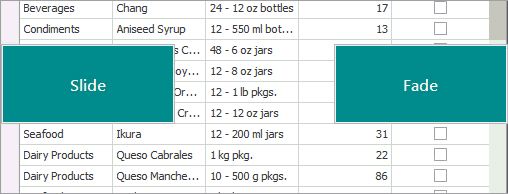
For beak panels the FlyoutPanelOptions.AnimationType property has no effect as they support Fade animation only. Also, it is recommended you utilize Fade animation for regular Flyout Panels with manual alignment.
Button Panel
You can supply a Flyout Panel with push and/or check buttons.
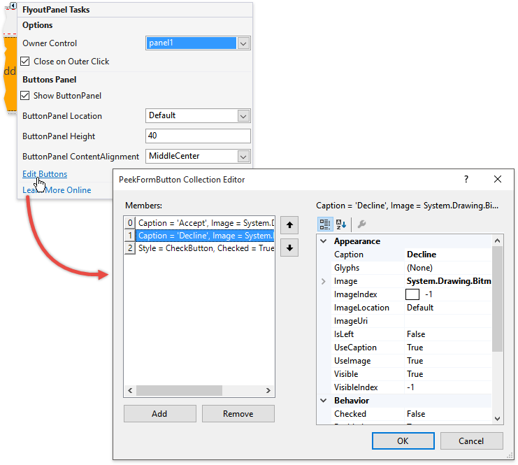
Buttons are sited inside a button panel that becomes visible if the FlyoutPanelButtonOptions.ShowButtonPanel property equals true. This property (as well as the others that affect the button panel) is accessed through the FlyoutPanel.OptionsButtonPanel section. To add buttons, invoke the Flyout Panel smart tag and click “Edit Buttons”. In the collection editor dialog that appears, click “Add” to create buttons and utilize the property grid to the dialog’s right to customize button settings (caption, image, button type, etc.).
To respond to end-users clicking Flyout Panel buttons, handle the FlyoutPanel.ButtonClick event as in the following sample.