CheckEdit
- 2 minutes to read
Overview
The CheckEdit control is a check box editor. In addition to the standard True/False states, CheckEdit supports the Indeterminate state.
The CheckEdit control offers the following features.
Optional indeterminate state
Setting the CheckEdit.IsThreeState property to true allows the CheckEdit control to hold a null value. This is called the Indeterminate state.
Read-only operation mode
To prevent an end-user from changing a check box value, set the CheckEdit‘s BaseEdit.IsReadOnly property to true.
WPF templates support
The CheckEdit control fully supports WPF templates. The image below illustrates a CheckEdit modified by a custom template.

Optimized for in-place editing
CheckEdit can be used standalone or as an in-place editor nested in a container control. The CheckEditSettings class implements the in-place editing functionality. See In-place Editors to learn more.
Standalone CheckEdit
To add a standalone CheckEdit to a Window, drag it from the Toolbox.
The following sample demonstrates how to create a CheckEdit using XAML markup.
<dxe:CheckEdit IsThreeState="True" IsChecked="{x:Null}" IsReadOnly="False"/>
In-place CheckEdit
To embed a CheckEdit into a container control, use the CheckEditSettings class.
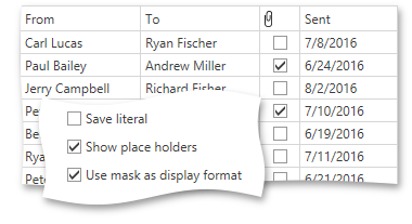
The following sample demonstrates how to embed a CheckEdit into a GridControl column.
<dxg:GridControl Name="grid">
    <dxg:GridControl.Columns>
        <dxg:GridColumn FieldName="Processed">
        <dxg:GridColumn.EditSettings>
            <dxe:CheckEditSettings IsThreeState="True"/>
        </dxg:GridColumn.EditSettings>
    </dxg:GridColumn>
</dxg:GridControl.Columns>
</dxg:GridControl>