ComboBoxEdit
- 2 minutes to read
Overview
The ComboBoxEdit control is a dropdown list that supports various operation modes.
The ComboBoxEdit control offers the following features.
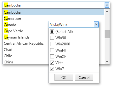
Lookup functionality
The editor can load values for its dropdown list from a data field. The actual edit value (usually, ID) is fetched from a different field.
Customizable dropdown list size and optional size grip
You can specify the dropdown list size using the ComboBoxEdit‘s PopupBaseEdit.PopupWidth and PopupBaseEdit.PopupHeight properties. To enable the size grip, set the ComboBoxEdit‘s PopupBaseEdit.ShowSizeGrip property to true. The size grip allows end-users to change the dropdown size at runtime.
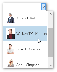
Customizable item appearance
You can completely change the appearance of ComboBoxEdit items using WPF templates. Use the ComboBoxEdit‘s LookUpEditBase.ItemTemplate property to specify the item template.
Optional OK and Cancel buttons
Use the ComboBoxEdit‘s PopupBaseEdit.PopupFooterButtons property to display the “OK” and “Cancel” buttons within the dropdown.
Token mode
Token and CheckedToken operation modes are inspired by modern mail-clients. These modes support multiple items selection.
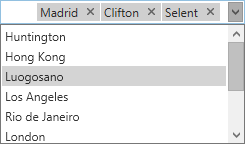
Set the ComboBoxEdit‘s BaseEdit.StyleSettings property to the TokenComboBoxStyleSettings object to enable the Token Combo Box operation mode.
For a complete list of ComboBoxEdit operation modes, see ComboBoxEdit operation modes.
Optimized for in-place editing
ComboBoxEdit can be used standalone or as an in-place editor nested in a container control. The ComboBoxEditSettings class implements the in-place editing functionality. See In-place Editors to learn more.
Edit Values
The BaseEdit.EditValueChanged event occurs when the editor’s edit value is changed. Handle the LookUpEditBase.PopupContentSelectionChanged event if you need to perform custom actions when another item within the editor’s dropdown is selected (highlighted).
Standalone ComboBoxEdit
To add a standalone ComboBoxEdit to a Window, drag it from the Toolbox.
The following sample demonstrates how to create a CheckedTokenComboBoxEdit using XAML markup.
<dxe:ComboBoxEdit PopupFooterButtons="OkCancel" ShowSizeGrip="True">
    <dxe:ComboBoxEdit.StyleSettings>
        <dxe:CheckedTokenComboBoxStyleSettings/>
    </dxe:ComboBoxEdit.StyleSettings>
    <dxe:ComboBoxEditItem Content="Item1"/>
    <dxe:ComboBoxEditItem Content="Item2"/>
    <dxe:ComboBoxEditItem Content="Item3"/>
</dxe:ComboBoxEdit>
In-place ComboBoxEdit
To embed a ComboBoxEdit into a container control, use the ComboBoxEditSettings class.
The following sample demonstrates how to embed a ComboBoxEdit into a GridControl column.
<dxg:GridControl Name="grid">
    <dxg:GridControl.Columns>
        <dxg:GridColumn FieldName="Office Number">
            <dxg:GridColumn.EditSettings>
                <dxe:ComboBoxEditSettings/>
            </dxg:GridColumn.EditSettings>
        </dxg:GridColumn>
    </dxg:GridControl.Columns>
</dxg:GridControl>