This section describes the DevExpress controls that perform navigation within your application, from simple side bars to Windows Modern inspired tile bars.
|
|
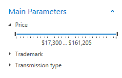
| The AccordionControl is an advanced navigation control that allows you to create hierarchical user interfaces that are compact and easy to navigate. Key features include:
- an unlimited number of hierarchy levels;
- data-binding support;
- integrated search field.
Learn more…
|
|
|
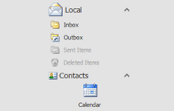
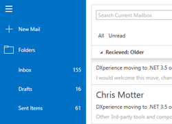
| The Navigation Bar is a well-known variation of the side navigation bar that features collapsible groups with items within it. Key features include:
- three available Views that affect NavBar Control behavior and appearance;
- layout flexibility and runtime customization options;
- the capability to embed any control to a NavBar item;
- a set of built-in commands that allow you to program various actions in XAML markup;
- interaction with OfficeNavigationBar.
Learn more…
|
|
|
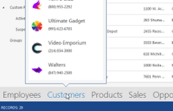
| An Outlook 2013-inspired navigation bar that supports integration with the Navigation Bar. Supports the following features:
- automatically retrieves Navigation Bar groups and presents them as its own items;
- a built-in Customization Button that allows end-users to display more or fewer items and re-arrange them as needed;
- supports Peek Panels that can be attached to Office Navigation Bar items and displayed on hover.
Learn more…
|
|
|
| A hierarchical multi-level tile menu that provides navigation in a touch-friendly manner. Key features include:
- supports three levels of navigation for displaying categories, items and sub-items;
- the top-level bar can host regular and drop-down buttons;
- embedded Home button;
- built-in navigation breadcrumbs that help your end-users to keep track of their current location in the navigation hierarchy;
- various animation effects.
Learn more…
|
|
|
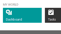
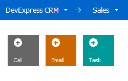
| A simple navigation bar with tiles. Any tile within a Tile Bar can display an associated drop-down control. This goes for any object, including another Tile Bar for implementing multi-level navigation bars.
Learn more…
|
|
|
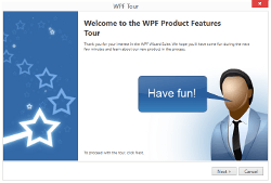
| The WPF Wizard Control is a handy tool for building wizards - dialogs with multiple pages that guide your end-users through a specific process (e.g., product installation). The list below outlines main Wizard Control features:
- three types of pages, each with its own mark-up and set of features;
- embedded wizard buttons;
- various page templates;
- rich navigation capabilities;
- suits for creating both simple wizards, where pages change one by one in a strict order, and wizards with a non-linear page sequence, where one page can lead to various other pages depending on the specific criteria.
|
|
|
| The WPF Hamburger Menu is used to implement the navigation UI that emulates popular web applications. Its features include:
- adaptive layout;
- different types of navigation items: regular, check and radio buttons, and hyperlinks;
- sub menus displaying items in side panels and “favorite” items directly in the main menu;
- MVVM Support.
|
See Also