The GridControl (GridControl) is a powerful editing and data shaping component for end-users to display and manage large amounts of data. The GridControl features specific data binding modes designed to work with large amounts of data keeping user interfaces always responsive. The GridControl enables a flexible UI with a wide-variety of views, including the Tree List View and Card View. It also features highly intuitive data shaping capabilities, including sorting, grouping, and summary calculation, and a rich set of filtering options such as the Filter Panel and Auto-Filter Row.
This section lists visual elements available in the GridControl and in Views. The topics are categorized into groups that contain descriptions of elements belonging to a particular View or relating to a specific feature.
The GridControl also supports an unbound mode where specific columns (or all of them) display custom data not bound to a data field. This section contains help articles and tutorials, related to all supported data binding scenarios. You will also find documentation articles and tutorials related to the server mode. In this mode, the GridControl loads data and displays it on the screen in portions instead of loading the entire data set. This mode significantly speeds up your applications that use large data sources.
The GridControl uses Views to represent data from a bound data source. These Views specify how records and record fields are arranged. They provide multiple edit, display and customization options, and allow you to change the look and feel. You can use one of the following View types to display data according to your needs.
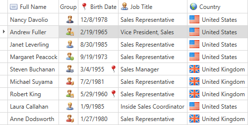
Table View - displays data in a two-dimensional table.
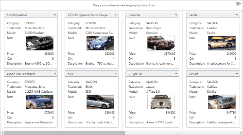
Card View - displays data as cards. Each card arranges fields vertically in a single column.
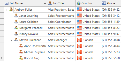
TreeList View - displays grid records in a tree. Each data record is represented as a tree node.
The Grid View provides the most traditional way to display data source records - a table where columns represent related data fields and each row is an individual data source record. This section provides detailed information about customizing this layout, available to you and your end-users. Covers such aspects as:
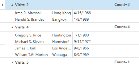
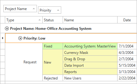
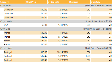
The GridControl can group data against one or multiple columns. If you group data in a grid by a single column, records with identical values in the corresponding column will be arranged into data groups. Each data group is identified by a group row, which you can expand to access its underlying data rows. If you then group data by another column, data rows within each group are combined into second level groups according to the values of the new group column.
This section provides the overall information about grouping, including:
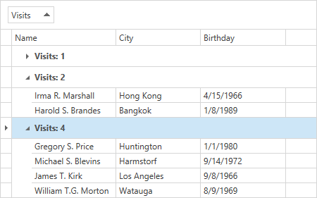
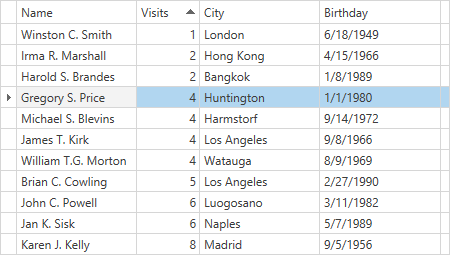
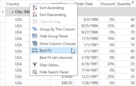
The Data Grid Views allow you to sort data by an unlimited number of columns. When sorting is applied to a View, records are re-arranged to meet current sort settings. The GridControl manages the automatic sorting for all types of data sources. The grid sorts the data itself and does not delegate this functionality to the underlying data source. This section covers sorting capabilities available to you at design time and in code, or to your users at runtime. These are:
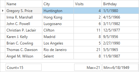
The GridControl allows you to display brief information about groups of rows or specific columns. For instance, you can obtain the number of records or maximum value, etc. Such information is called a summary. This topic provides comprehensive information about summaries, such as:
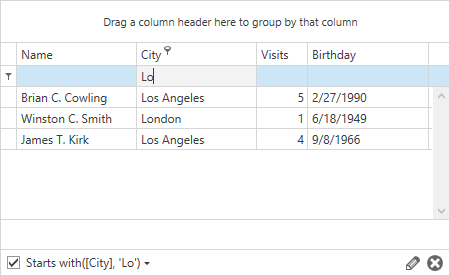
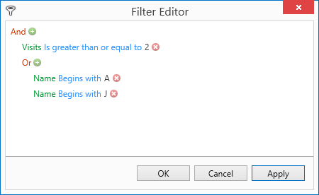
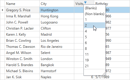
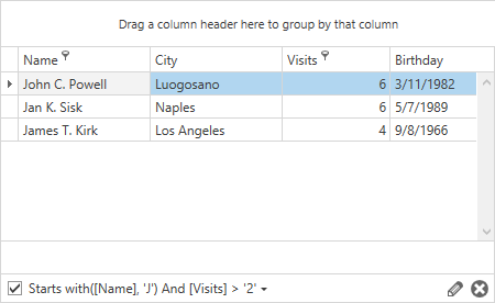
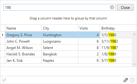
This section contains information about different ways of filtering and locating your data rows. You will find articles and tutorials, related to the following features:
This topic provides information on focus movement between cells at runtime. Moving the cell focus at runtime may be useful when you need to facilitate end-user input. This enables you to move focus to desired cells automatically, so end-users don’t need to navigate through the Views themselves. This topic only describes the basics of focus movement between cells.
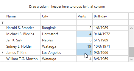
The GridControl supports single row selection, multiple row selection and multiple cell selection modes. The latter is only available in the TableView and TreeList views. This topic provides information on these modes and related methods.
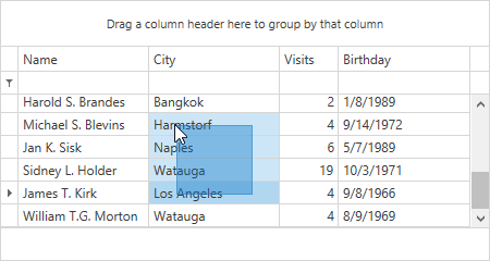
The marquee selection feature allows end-users to select a range of rows, cells or cards by dragging over items with the mouse.
Marquee Selection
Multiple Cell Selection Mode
Master-Detail
The GridControl supports master-detail data presentation. This type of data representation requires the presence of at least two data tables - master and detail. These tables are linked by a one-to-many relationship, i.e., a single row in the first table can be related to one or more rows in the second table, but a row in the second table can be related to only one row in the first table. Master and detail tables are also called parent and child tables.
Note that a master-detail mode can be more complex than just two tables linked together. Each master table can be linked to multiple child tables and each child table in turn can be a master of another table and so on. The GridControl allows you to represent master-detail relationships of any complexity. Refer to help articles in this section to learn more.
The GridControl control allows you to save the information on its layout to a data store (an XML file or stream) and restore it when required. This information may include the visibility, position and size of visual elements, filter, sorting, grouping and summary information, etc.
The GridControl control provides a fast and flexible way to bring the active View’s contents to the printed page, or export to a file or stream in various formats - PDF, RTF, XLS, etc. A View provides multiple methods, allowing you to export or print its contents.
Hit testing allows you to recognize which element is located at the specified screen coordinates. For instance, you may have to determine which part of a View a user has clicked or double-clicked.
Appearance and Conditional Formatting
Topics in this section describe different concepts and techniques of changing the way your Data Grid control looks.
The GridControl allows you to provide the desired data layout, appearance and visual presentation of its elements (e.g. cells, rows, summaries, etc.). The variety of styles enable you to group together property values and apply them to grid elements.
The GridControl provides a conditional formatting feature, which allows you to change the appearance of individual cells or rows based on specific conditions. This feature helps to highlight critical information, identify trends and exceptions, and compare data.
Columns and Views provide multiple properties that allow you to define templates and change the visual presentation of their elements. A template is applied to multiple elements in the same scope. This topic shows how to implement custom logic to provide a different visual appearance for individual grid elements.
When printing a grid, the appearance of its data cells is defined by the DisplayTemplate specified in a cell’s printing style. This topic describes the creation of custom cell printing styles.
The cell merging feature allows your applications to deliver data clarity and avoid duplication by merging neighboring data cells across different rows whenever they display matching values.
Custom Selected Row Style
Cell Merging
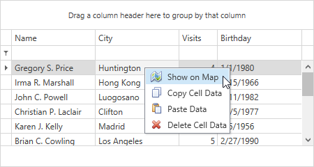
Popup Menus
The GridControl can display four types of popup menus that enable an end-user to manage data and customize a View by showing and hiding its UI elements. This section describes how to make the following customizations:
Not only do the design-time features described in this section speed up the design process of your Data Grid control, they also allow you to create a fully working application from scratch without writing a single line of code.
The GridControl can be bound to a data source using Drag and Drop. After you add the data source to your project, you can generate data-bound GridControls by dragging items from the Data Sources window to the WPF Designer.
The GridControl features the Items Source Configuration Wizard. It’s an easy-to-use data binding wizard that supports various data types and binding options.
The GridControl provides design-time enhancements allowing you to automatically create columns for all fields in a data source to which the grid is bound at runtime.