LookUpEdit
- 2 minutes to read
Overview
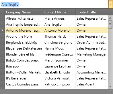
The LookUpEdit control is an advanced dropdown editor. Its dropdown contains a fully-functional data grid. The LookupEdit control supports multiple operation modes.
The LookupEdit control offers the following features.
Multiple operation modes
For a complete list of available operation modes, see LookupEdit operation modes.
Embedded GridControl
The LookupEdit control inherits many of the Data Grid‘s features including customizable columns collection, data summaries, sorting, grouping and filtering dropdown list data by column values.
Token mode
Token and SearchToken operation modes are inspired by modern mail-clients. These modes support multiple items selection.
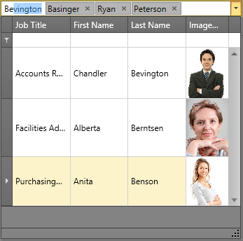
Set the LookUpEdit‘s BaseEdit.StyleSettings property to the TokenLookUpEditStyleSettings object to enable the Token operation mode.
For the complete list of LookUpEdit operation modes, see LookUpEdit operation modes.
Optional Search field
To display the Search field within the dropdown, use one of the following LookupEdit operation modes.
- SearchLookupEdit
- SearchTokenLookupEdit
Optimized for in-place editing
LookUpEdit can be used standalone or as an in-place editor nested in a container control. The LookUpEditSettings class implements the in-place editing functionality. See In-place Editors to learn more.
Edit Values
The BaseEdit.EditValueChanged event occurs when the editor’s edit value is changed. Handle the LookUpEditBase.PopupContentSelectionChanged event if you need to perform custom actions when another item within the editor’s dropdown is selected (highlighted).
Standalone LookUpEdit
To add a standalone LookUpEdit to a Window, drag it from the Toolbox.
The following sample demonstrates how to create a LookUpEdit and activate its Token mode using XAML markup.
<dxg:LookUpEdit>
    <dxg:LookUpEdit.StyleSettings>
        <dxg:TokenLookUpEditStyleSettings NewTokenPosition="Far"/>
    </dxg:LookUpEdit.StyleSettings>
</dxg:LookUpEdit>
In-place LookUpEdit
To embed a LookUpEdit into a container control, use the LookUpEditSettings class.
The following sample demonstrates how to embed a LookUpEdit into a GridControl column.
<dxg:GridControl>
    <dxg:GridColumn FieldName="Examiner">
        <dxg:GridColumn.EditSettings>
            <dxg:LookUpEditSettings>
                <dxg:LookUpEditSettings.StyleSettings>
                    <dxg:SearchLookUpEditStyleSettings/>
                </dxg:LookUpEditSettings.StyleSettings>
            </dxg:LookUpEditSettings>
        </dxg:GridColumn.EditSettings>
    </dxg:GridColumn>
    <dxg:GridControl.View>
        <dxg:TableView/>
    </dxg:GridControl.View>
</dxg:GridControl>