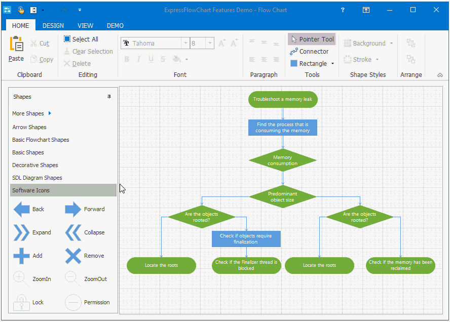
FlowChart Editor Dialog
- 4 minutes to read
The Ribbon-Based FlowChart Editor (Ribbon-based Editor, for short) dialog provides a variety of tools that help users create charts and diagrams of any complexity. You can create/rearrange/remove chart symbols and customize their appearance.
- You can use the Ribbon-based Editor to pre-populate the Flow Chart control at design time or display it at runtime to enable end-users to customize the chart. To invoke the Ribbon-based Editor, double-click the control or choose the “Editor…” menu item in its context menu at design time
The editor consists of the Shapes pane, editing area, and ribbon toolbar that includes the Home, Design, and View tabs.
Shapes pane
This pane contains shape templates that you can drag to the editing area for further customisation. The Shapes pane has the following categories:
Arrow Shapes;
Basic Flowchart Shapes;
Basic Shapes;
Decorative Shapes;
SDL Diagram Shapes;
Software Icons.
Home tab
This tab groups the FlowChart editor features into the following categories that contain:
Category Name | Description |
|---|---|
Clipboard | The Cut, Copy and Paste buttons that you can use to cut/copy a whole chart or an individual chart symbol/connection and insert it to the editing area. You can press the “Ctrl+X”, “Ctrl+C”, and “Ctrl+V” key combinations instead. |
Editing | The Editing tab includes the following buttons:
|
Font | Font settings applicable to one or more selected chart symbols and/or connections. |
Paragraph | Text positioning settings. Use this group to align custom text within the selected chart symbol(s)area. |
Tools | The “Pointer Tools”, “Connector”, and “Rectangle” buttons that allow you to do the following:
|
Shape Styles | Chart symbol color settings. Clicking the Background or Stroke button invokes the Color Editor dialog where you can choose a background color for the selected chart symbol(s) or outline color for the chart element(s). Additionally, you can adjust chart element colors by using the corresponding sections in the “Edit Object” and “Edit Connection” dialogs. |
Arrange | Z-order settings. Click the “Bring To Front” and “Send To Back” buttons to position selected chart symbol(s) on top of or below all others. |
Designer | The “Close And Apply Changes” button that closes the Chart Editor dialog and applies all the pending changes. |
Design tab
This tab includes the Options and Layout groups that allow you to toggle the reference grid positioning mode and choose a connection line type.
View tab
The View tab includes the Grid, Antialiasing, and Zoom buttons that allow users to toggle the reference grid and antialiasing within the editing area, and zoom the chart in or out.
Built-in Chart Element Editors
The “Edit Object“ and “Edit Connection“ dialogs provide additional chart element editing options.
Use these editors to adjust the diagram element’s dimensions, line style, and visual content. To invoke either of them, double-click the required element within the designer area or click the Properties context menu item.
Edit Object Dialog
This dialog includes the General, Image and Frame tabs. The tabs item descriptions are shown below.
General Tab

The Height and Width fields allow you to set the chart symbol dimensions.
Use the Text and Text Layout UI elements to enter text and align it within the chart symbol.
The Shape Type and Line Width define the chart symbol’s outline shape and width.
The Shape and Background color boxes allow you to specify the chart symbol’s outline and background colors, respectively. Clicking either of them invokes the Edit Color dialog that provides the capability to change the current color.
The Transparent check box defines whether the chart symbol intersects other items.
Image Tab
The image list browser displays the content of the image list associated with the FlowChart control.

The Image Layout combo box lists the available image positions within the chart symbol area.
The Clear Image button removes the image from the chart symbol.
Frame Tab

The Edge and Border Style check box groups allow you to set the additional shadow effects of the chart symbol.
Edit Connection Dialog

Use the Text and Text Font UI elements to enter text and customize its style.
The Source and Destination sections provide the capability to set the connection’s start and end point, shape dimensions, style, and specify the anchor points that bind the connection and two chart symbols.
Use the Color box to select the connection’s line color. Clicking the box invokes the “Color Editor” dialog that provides the capability to change the current color.