.NET MAUI Slider & Range Slider: Tick Mark
- 2 minutes to read
The tick marks divide the track into equal parts. To display tick marks and specify the distance between them, set the ValueStep property to a value equal to or greater than 1.
The following example changes tick mark appearance in DXSlider and DXRangeSlider controls:
<dxe:DXSlider Value="25" TickmarkStep="25" >
    <dxe:DXSliderBase.TickmarkAppearance>
        <dxe:DXSliderTickmarkAppearance
            ActiveBackgroundColor="#d65418"
            BackgroundColor="#faccb6"
            DisabledActiveBackgroundColor="#cc9621"
            DisabledBackgroundColor="#fae3b1"
            CornerRadius="10"
            Height="25"
            Width="3" />
    </dxe:DXSliderBase.TickmarkAppearance>
</dxe:DXSlider>

<dxe:DXRangeSlider StartValue="15" EndValue="85" TickmarkStep="25">
    <dxe:DXSliderBase.TickmarkAppearance>
        <dxe:DXSliderTickmarkAppearance
            ActiveBackgroundColor="#d65418"
            BackgroundColor="#faccb6"
            DisabledActiveBackgroundColor="#cc9621"
            DisabledBackgroundColor="#fae3b1"
            CornerRadius="10"
            Height="25"
            Width="3" />
    </dxe:DXSliderBase.TickmarkAppearance>
</dxe:DXRangeSlider>
If you want to display tick marks on a slider, set the TickmarkStep property to a value equal or grater than 1.
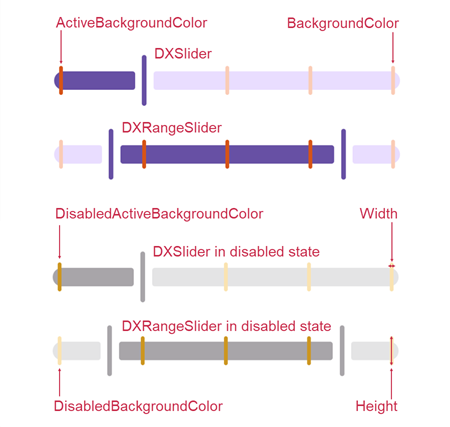
Use the following properties to change tick mark appearance in DXSlider and DXRangeSlider controls:
- DXSliderTickmarkAppearance.ActiveBackgroundColor
- Gets or sets the background color of the tick mark in the active state. This is a bindable property.
- DXSliderTickmarkAppearance.BackgroundColor
- Gets or sets the background color of the tick mark. This is a bindable property.
- DXSliderTickmarkAppearance.DisabledActiveBackgroundColor
- Gets or sets the background color of the tick mark in active and disabled states. This is a bindable property.
- DXSliderTickmarkAppearance.DisabledBackgroundColor
- Gets or sets the background color of the tick mark in the disabled state. This is a bindable property.
- DXSliderTickmarkAppearance.CornerRadius
- Gets or sets the corner radius of the tick mark. This is a bindable property.
- DXSliderTickmarkAppearance.Height
- Gets or sets the tick mark height. This is a bindable property.
- DXSliderTickmarkAppearance.Width
- Gets or sets the tick mark width. This is a bindable property.