Customize Chip Appearance
- 5 minutes to read
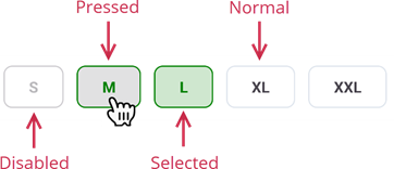
DevExpress chip controls for .NET MAUI ship with a wide variety of appearance settings you can use to customize chips in different states. Four states are available for chips: normal, selected, pressed, or disabled (the chip IsEnabled property is set to false).
Customize Text
This section lists options that specify chip text and configure text appearance:
Add Text
- Chip.Text
- Specifies text caption for a standalone chip control (Chip).
- ChipGroup.DisplayMember
- Specifies a data member that stores text for chips in chip groups (ChoiceChipGroup, FilterChipGroup, and InputChipGroup).
Specify Text Color in Different States
- Chip.TextColor | ChipGroup.ChipTextColor
- Specify the chip text color.
- Chip.DisabledTextColor | ChipGroup.ChipDisabledTextColor
- Define the text color for chips in the disabled state.
- Chip.SelectedTextColor | SelectableChipGroup.ChipSelectedTextColor
- Define the text color for chips in the selected state. Note InputChipGroup does not support this option.
- Chip.SelectedDisabledTextColor | SelectableChipGroup.ChipSelectedDisabledTextColor
- Specify the text color for chips that are selected and disabled. Note InputChipGroup does not support this option.
- Chip.PressedTextColor | ChipGroup.ChipPressedTextColor
- Specify the text color for chips in the pressed state.
Specify Font Settings
- Chip.FontFamily | ChipGroup.ChipFontFamily
- Allow you to set the font family for chips.
- Chip.FontSize | ChipGroup.ChipFontSize
- Allow you to set the font size for chips.
- Chip.FontAttributes | ChipGroup.ChipFontAttributes
- Allow you to set the font attributes for chips.
Customize Icons
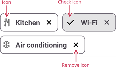
A chip can display the following icons:
- Chip Icon – an icon that, along with text, illustrates the purpose of the chip.
- Check Icon – an icon displayed when a chip is selected (usually, a check mark).
- Remove Icon – an icon that allows a user to remove a chip (usually, a cross mark).
Add an Icon to a Chip
- Chip.Icon
- Specifies an icon for a standalone chip control (Chip).
- ChipGroup.IconMember
- Specifies a data member that stores icons for chips in chip groups (ChoiceChipGroup, FilterChipGroup, and InputChipGroup).
- Chip.IconIndent | ChipGroup.ChipIconIndent
- Specify the gap between the chip icon and text.
- Chip.IconSize | ChipGroup.ChipIconSize
- Specify the icon size.
- Chip.RoundedIcon | ChipGroup.ChipRoundedIcon
- Specify to round off icon corners.
- Chip.IsIconVisible | ChipGroup.ChipIsIconVisible
- Specify whether to show the chip icon.
Specify Icon Color in Different States
- Chip.IconColor | ChipGroup.ChipIconColor
- Specify the icon color.
- Chip.DisabledIconColor | ChipGroup.ChipDisabledIconColor
- Define the icon color in the disabled state.
- Chip.SelectedIconColor | SelectableChipGroup.ChipSelectedIconColor
- Specify the icon color in the selected state.
- Chip.SelectedDisabledIconColor | SelectableChipGroup.ChipSelectedDisabledIconColor
- Specify the icon color for chips that are selected and disabled. Note InputChipGroup does not support this option.
- Chip.PressedIconColor | ChipGroup.ChipPressedIconColor
- Specify the icon color in the pressed state.
Customize the Check Icon
- Chip.CheckIcon | ChipGroup.ChipCheckIcon
- Specify the check icon’s image source.
- Chip.IsCheckIconVisible
- Specifies whether to show the check icon in a chip.
- Chip.CheckIconColor | ChipGroup.ChipCheckIconColor
- Define the check icon color.
- Chip.DisabledCheckIconColor | ChipGroup.ChipDisabledCheckIconColor
- Specify the check icon color in the disabled state.
- Chip.PressedCheckIconColor | ChipGroup.ChipPressedCheckIconColor
- Specify the check icon color in the pressed state.
Customize the Remove Icon
- Chip.RemoveIcon | ChipGroup.ChipRemoveIcon
- Specify the remove icon’s image source.
- Chip.IsRemoveIconVisible
- Specifies whether to show the remove icon in standalone chips.
- Chip.RemoveIconColor | ChipGroup.ChipRemoveIconColor
- Define the remove icon color.
- Chip.DisabledRemoveIconColor | ChipGroup.ChipDisabledRemoveIconColor
- Specify the remove icon color in the disabled state.
- Chip.SelectedRemoveIconColor | SelectableChipGroup.ChipSelectedRemoveIconColor
- Specify the remove icon color in the selected state. Note InputChipGroup does not support this option.
- Chip.PressedRemoveIconColor | ChipGroup.ChipPressedRemoveIconColor
- Specify the remove icon color in the pressed state.
- Chip.SelectedDisabledRemoveIconColor | SelectableChipGroup.ChipSelectedDisabledRemoveIconColor
- Specify the remove icon color for chips that are selected and disabled. Note InputChipGroup does not support this option.
Customize Background
- Chip.BackgroundColor | ChipGroup.BackgroundColor
- Specify the color that fills chip background.
- Chip.DisabledBackgroundColor | ChipGroup.ChipDisabledBackgroundColor
- Specify the color that fills chip background in the disabled state.
- Chip.SelectedBackgroundColor | SelectableChipGroup.ChipSelectedBackgroundColor
- Specify the color that fills chip background in the selected state. Note InputChipGroup does not support this option.
- Chip.PressedBackgroundColor | ChipGroup.ChipPressedBackgroundColor
- Specify the color that fills chip background in the pressed state.
Customize Borders
- Chip.BorderColor | ChipGroup.ChipBorderColor
- Specify the chip outline color.
- Chip.DisabledBorderColor | ChipGroup.ChipDisabledBorderColor
- Specify the chip outline color in the disabled state.
- Chip.SelectedBorderColor | SelectableChipGroup.ChipSelectedBorderColor
- Specify the chip outline color in the selected state. Note InputChipGroup does not support this option.
- Chip.PressedBorderColor | ChipGroup.ChipPressedBorderColor
- Specify the chip outline color in the pressed state.
- Chip.BorderThickness | ChipGroup.ChipBorderThickness
- Specify the chip outline thickness.
- Chip.CornerRadius | ChipGroup.CornerRadius
- Define the corner radius for chips.
Specify Offsets
- Chip.Padding | ChipGroup.Padding
- Specify the gap between the chip border and chip content.
- Chip.Margin | ChipGroup.Margin
- Define the offset between the chip and other visual controls.
Enable Animation
You can show ripple effects over chips when users select and unselect chips. To do so, use the following options:
- Chip.UseRippleEffect
- Specifies whether to enable ripple effects for the chip.
- ChipGroup.ChipUseRippleEffect
- Specifies whether to enable ripple effects for chips in the chip group.
Specify Fill Mode in Chip Groups
In chip groups, specify the ChipGroup.BoxMode property to specify whether chips are filled or outlined:
- BoxMode = “Outlined”

- BoxMode = “Filled”

Apply a Template to Chip Content
You can create a template that configures the appearance of chip content, and then use the following properties to assign it to chips:
- ContentTemplate
- Specifies a content template for standalone chips.
- ChipContentTemplate
- Specifies a content template for chips in chip groups.
See Also